DEEP PURPLE - In Rock 12" Vinyl LP Album

- The album that turned volume, drama, and danger into hard rock

Album Front Cover Photo of DEEP PURPLE - In Rock Visit: https://vinyl-records.nl/

Deep Purple – In Rock didn’t just arrive in 1970, it kicked the door off its hinges and rewired what hard rock could be. This was the moment the band stopped flirting with heaviness and committed fully, becoming a benchmark for everything that followed in hard rock and early heavy metal. The sound is raw, loud, and gloriously confrontational: guitars slicing like steel, organ tones roaring like overheated machinery, and a rhythm section that never blinks. Tracks like “Speed King” and “Into the Fire” hit with pure forward momentum, while “Child in Time” stretches tension until it snaps, proving volume could coexist with drama. Produced by the band themselves, the album feels unapologetically self-assured, as if compromise had been physically removed from the room. Even decades later, it remains a fan favorite and a scene-defining statement—an album that sounds less like a product of its time and more like the moment hard rock decided to grow teeth and keep them.

Table of Contents

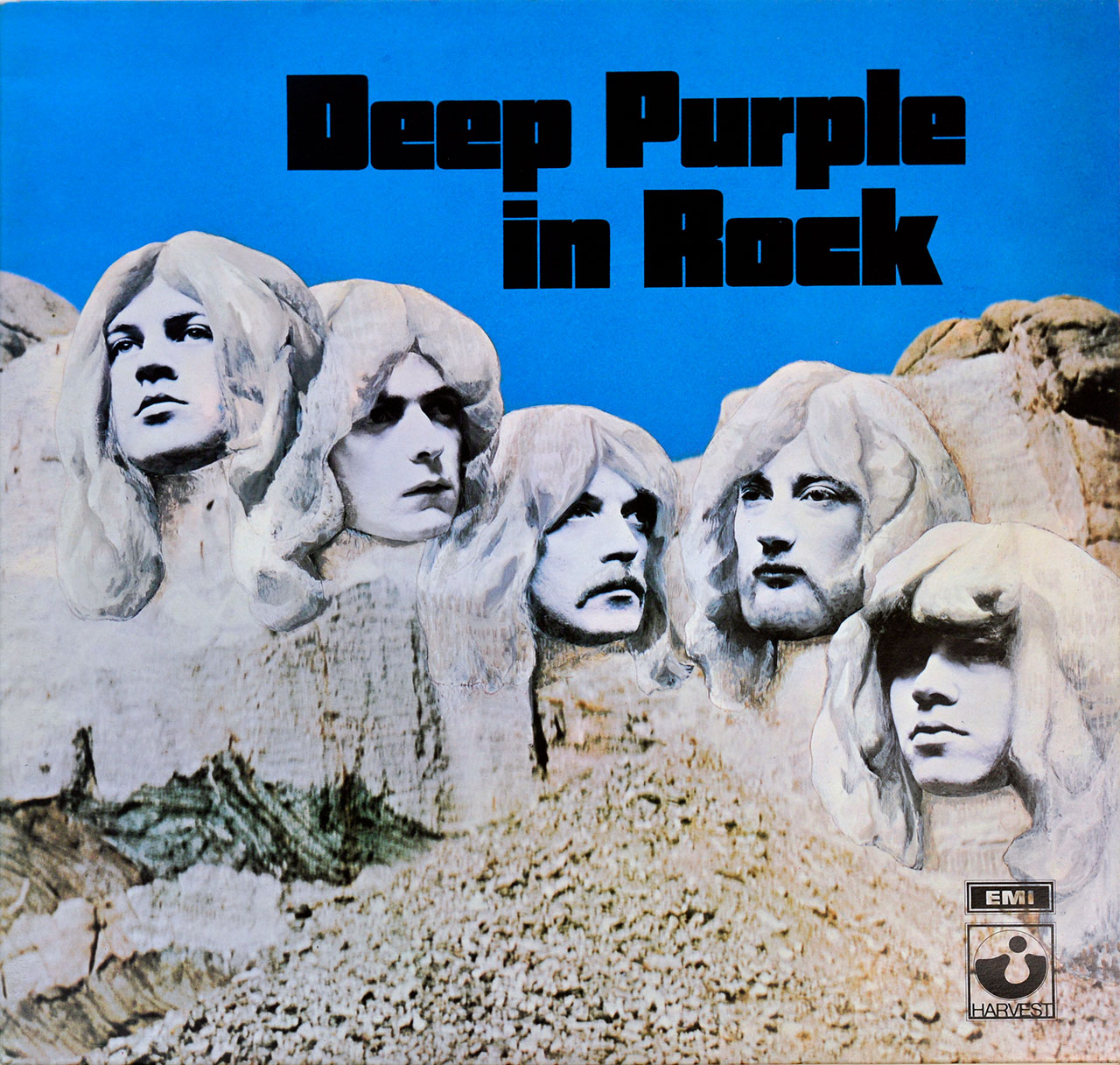
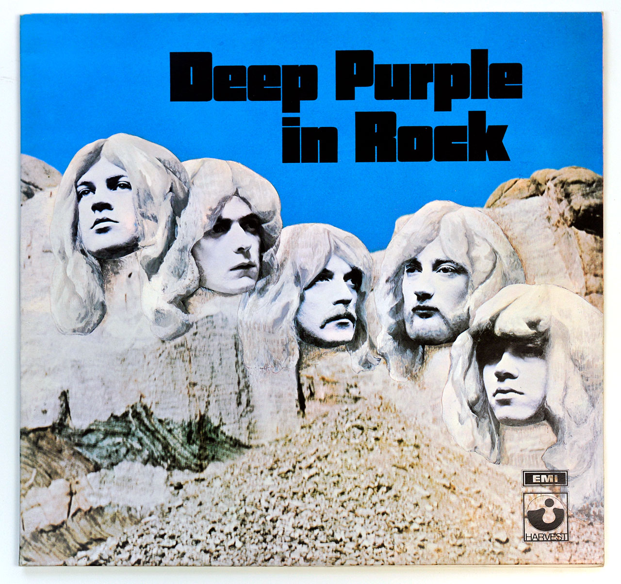
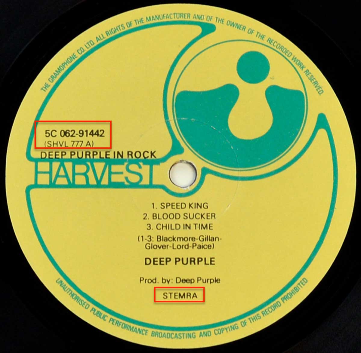
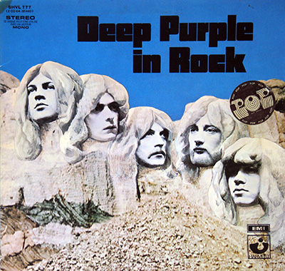
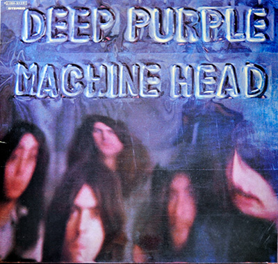
"In Rock" (1970) Album Description:

Deep Purple walked into 1970 and made a very specific promise on "In Rock": the songs would be loud, the band would sound like one animal, and nobody would apologize for any of it. This is the record where the riffs stop flirting and start throwing furniture, the organ quits behaving like decoration, and the vocals climb so high they feel borderline irresponsible. The funny part is how controlled it all is beneath the noise, like the band learned the rules just long enough to break them efficiently.

England, 1970: the air felt tense, so the amps got bigger

Britain didn’t drift into 1970 on a flower-scented breeze; it lurched. A general election lands in June and suddenly the country’s mood looks even more divided than the pub conversations made it sound. Add the background hum of Cold War anxiety, and you get a culture that’s jittery, a little impatient, and weirdly hungry for something that feels decisive. "In Rock" doesn’t “reflect” that so much as it barrels through it, like a band trying to out-shout the headlines.

Hard rock at the time still had one foot in blues manners and one foot in psychedelic sprawl. This album puts both feet on the stage edge and leans forward. The message isn’t subtle: crank it, tighten it, hit harder, and keep going until somebody complains.

The line-up shift that actually mattered

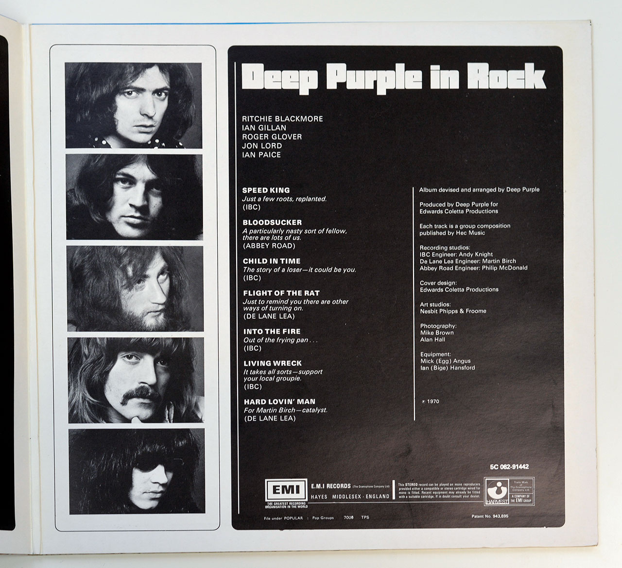
The cause-and-effect story is simple and brutal: a new singer and bassist show up, and suddenly the band sounds like it has a spine. Ian Gillan brings that sharp, theatrical bite, but he doesn’t sing like a polite frontman; he sings like he’s trying to tear a hole in the ceiling and see who flinches first. Roger Glover’s bass doesn’t just follow the guitar, it anchors the whole thing so the band can speed up without turning into a bar fight.

The rest of the machine is already dangerous. Ritchie Blackmore’s guitar has that clipped, surgical attack that turns even quick runs into threats. Jon Lord’s Hammond isn’t “warm,” it’s abrasive and overdriven, like a factory siren learned how to play chords. Ian Paice plays with swing in his bones, but he hits like he’s late for something.

How it sounds when the band stops being polite

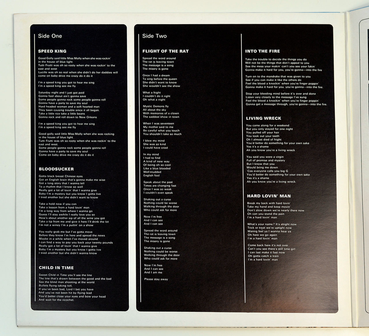
"Speed King" opens like somebody kicked open a studio door and yelled “roll tape.” The tempo feels impatient, the breaks snap back into place, and the whole thing has that sweaty, live-wire push where you can almost hear the room getting smaller. The guitar and organ don’t share space so much as wrestle for it, and the rhythm section keeps the fight from turning sloppy.

"Into the Fire" has the blunt shove of a club PA that’s a little too hot: thick riff, tight pulses, no scenic detours. Then there’s "Child in Time" stretching the room wide, building from tense quiet to a long, escalating pressure that ends up sounding like a warning siren with a melody. It’s the one moment where the album lets the air in, and it uses that air to scare you.

Peer pressure: who else was roaring that year

The scene in 1970 was crowded with bands who all wanted the crown, but they wanted different crowns. Led Zeppelin had the swaggering blues heft and the supernatural thump. Black Sabbath were pushing doom and dread like a new religion. The Who could turn volume into a narrative weapon, while Free kept a stripped, heavy groove that felt human and bruised. Bands like Uriah Heep were also starting to lean into big melodrama and thickened sound, but "In Rock" doesn’t wait for anyone to catch up.

What separates Purple here is the sheer density of the attack: the organ is a lead weapon, the guitar is all edges, and the vocals refuse to behave. It’s not “heavier” in some abstract scoring system. It’s more confrontational, more compressed, more willing to sound like the band might break something on purpose.

Behind the glass: who did what, practically

The production credit is the band themselves, and that matters because it explains the attitude: no smoothing, no soft lighting, no asking permission. The recording trail runs through London rooms that each leave fingerprints. IBC Studios captures the punch and directness, the sense of “get the take and move.” De Lane Lea brings that pressured, workmanlike grit where the sound feels pushed. Abbey Road shows up like a disciplined finishing move, tightening edges without neutering the threat.

Engineers get named in a way that reads like a map: Andy Knight attached to IBC, Martin Birch tied to De Lane Lea, Philip McDonald linked with Abbey Road. This is the practical stuff that decides whether the record hits you in the chest or just makes a nice noise in the background. The cover side of the operation is similarly no-nonsense: Edwards Coletta Productions handling cover design and production, Nesbit Phipps & Froome executing the art studio work, and photos credited to Mike Brown and Alan Hall. Nothing mystical here, just people doing the job and leaving evidence.

A quick listening map for the impatient
  • Need immediate impact: "Speed King" then "Into the Fire".
  • Want the long pressure build: "Child in Time".
  • Prefer the nastier corners: "Bloodsucker" and "Hard Lovin’ Man".
Controversy: not a scandal, just a recurring argument

There wasn’t a big public meltdown attached to this release, no courtroom circus, no dramatic banning. The messier story is smaller and more interesting: the organ figure at the heart of "Child in Time" traces back to a 1969 track called "Bombay Calling" by It’s a Beautiful Day, and the borrowing didn’t exactly stay one-way. People still argue about it like it happened yesterday, mostly because rock fans love a theft story almost as much as they love a riff.

The bigger misconception is the lazy one: that "In Rock" is only about volume. The volume is real, sure, but the real trick is the discipline underneath it. This band is controlling the chaos, not drowning in it, and that’s why the record still hits like a shove instead of a nostalgia piece.

One quiet anchor, because records don’t live in museums

Late-night radio, low volume at first so nobody wakes up, then the chorus hits and the hand reaches for the knob anyway. That’s how this album sneaks into your habits: not by asking nicely, but by daring you to keep it quiet.

References

Collector notes

Album Front Cover:

How can the album cover be distinguished from other versions of this album

  • Near the center top are the band-name "Deep Purple" and the album title "In Rock"
  • In the bottom right corner there are the "EMI" company logo and the "Harvest" company logo.
Album Back Cover

How does the album back cover be different from other versions

  • In the top left corner of the album back cover there is the catalognr "5C 062-91442" and belows this there is "(1E 062 o 91442)
  • There is NO barcode on the back cover
Record Label

Record label information:

  • The record labels are yellow and green with black print.
  • There is NO Label Code on the labels.
  • The Rights Society "STEMRA" is printed near the center bottom.
  • The catalognr "5C 062-91442" is printed on the left-hand side near 9 o'clock, with (SHVL 777 A) right below it.
  • The rim-texr runs from 10 o'clock to 2 o'clock and 8 o'clock to 5 o'clock, both texts are printed in the English text.

Album Key Details: Genre, Label, Format & Release Info

Music Genre:

Hard Rock, Heavy Metal

Label & Catalognr:

Harvest – 5C 062-91442, Harvest – 1E 062 º 91442

Album Packaging

This 12" LP black vinyl music record comes comes in a Fold Open Cover (FOC), which is also also known as a Gatefold cover. The inner pages of this album cover contains photos, artwork, album production details and lyrics of all the songs.

Media Format:

Record Format: 12" Vinyl Stereo Gramophone Record
Total Weight: 280g

Release Details:

Release Date: 1978

Release Country: Netherlands

Production & Recording Information:

Producers:
  • Deep Purple – Producer (for Edwards Coletta Productions)
Sound & Recording Engineers:
  • Andy Knight – Recording Engineer (IBC Studios)
    Andy Knight was the recording engineer at IBC Studios, where key parts of this album were captured with a focus on clarity and punch, keeping the band tight while letting the rhythm section hit hard without smearing the detail.
  • Philip McDonald – Recording Engineer (Abbey Road Studios)
    Philip McDonald handled recording duties at Abbey Road Studios, bringing a controlled, professional balance to the sessions that kept the performances powerful without losing definition or stereo focus.
Recording Location:
Recording sessions took place in London at IBC Studios, De Lane Lea Studios, and Abbey Road Studios between October 1969 and March 1970.
Album Cover Design & Artwork:
  • Edwards Coletta Productions – Cover Design & Production
    Edwards Coletta Productions handled the album’s cover design, translating the music’s aggression and seriousness into a visual statement that matched the record’s weight and intent.
  • Nesbit Phipps & Froome – Art Studios
    Nesbit Phipps & Froome executed the artwork and layout work that gave the album its finished visual form, ensuring the packaging carried the same authority as the music inside.
Photography:
  • Mike Brown – Photography
    Mike Brown contributed photography used on the album packaging, capturing the band in a way that reinforced the album’s seriousness and no-nonsense attitude.
  • Alan Hall – Photography
    Alan Hall provided additional photography for the album artwork, contributing images that supported the stark, direct visual tone matching the album’s sound.
Recording Studios:
  • IBC Studios – Recording Studio (London)
    IBC Studios (London) is where the album’s recording really kicked off, with the first sessions running 14–21 October 1969 and further work continuing on and off into mid-January 1970. Several core tracks were cut there on 8-track—“Child in Time”, “Speed King”, “Into the Fire” and “Living Wreck”—with later overdubs added as the schedule allowed. Andy Knight, with Kevin Barry also present, helped bottle the band’s stage volume without turning it into mush.
  • De Lane Lea Studios – Recording Studio (London)
    De Lane Lea Studios hosted crucial January 1970 sessions, capturing the band at full force under tight schedules. Tracks including “Hard Lovin’ Man”, “Bloodsucker”, and later “Flight of the Rat” were tied to this studio, with Martin Birch engineering and the sound pushed hard without sanding off the danger.
  • Abbey Road Studios – Recording Studio (London)
    Abbey Road Studios provided the final layer of control and balance, most notably completing “Bloodsucker” after its De Lane Lea sessions. With Philip McDonald engineering, the studio locked the album’s aggression into a cleaner, more disciplined frame without softening the impact.

Band Members / Musicians:

Band Line-up:
  • Ian Gillan – Vocals

    Fun bit: the guy who hit those stratospheric notes also played Jesus (1970) before he went full purple thunder.

    Ian Gillan, the razor-throated storyteller who helped turn Deep Purple into a stadium engine (1969–1973), then came back for the 1984 reunion and later tours. Before the purple thunder I cut my teeth in Episode Six (1965–1969). In 1970 I also sang Jesus on the original "Jesus Christ Superstar" album—pure theatre, no cape. I went jazz-rock with the Ian Gillan Band (1975–1978), cranked it harder with Gillan (1978–1982), and even took a wild detour fronting Black Sabbath on "Born Again" (1983). Solo records and guest spots followed, but that operatic scream and sly phrasing always gave the game away, whether I was whispering a blues line or detonating a high note over a Marshall stack.

  • Ritchie Blackmore – Guitarist, Songwriter

    The guy who made the guitar sound both medieval and radioactive, often in the same solo.

    Ritchie Blackmore is the sort of name I see on a sleeve and instantly expect sparks: born Richard Hugh Blackmore (1945), he’s an English guitarist who helped hard-rock riffing grow teeth and then politely refused to stop. His era-stamps are basically whole chapters of rock history: Deep Purple (1968–1975, 1984–1993), where the riffs got louder, sharper, and more dramatic; Rainbow (1975–1984, 1993–1997), where he leaned into melody and fantasy like it was a weapon; and Blackmore’s Night (1997–present), where the electric storm calms down into Renaissance-folk textures without losing that unmistakable Blackmore touch. I love that arc: from amp-stacks and arena thunder to lutes-and-candles vibes, like he just swapped dragons for different dragons.

    "Blackmore Signature Strats" I’ve spent too many nights chasing that Blackmore chime. Fender’s Artist Series Strat is a love letter to his ‘70s obsession—Olympic White with a graduated scalloped rosewood board that makes your fingers feel like they’re floating. The electronics are pure Ritchie logic: two Seymour Duncan Quarter Pounds for the bite and a dummy middle pickup. It’s a prop, a plastic decoy for us mortals. Then there’s the Fender Japan ST72-145RB. MIJ builds have a surgical precision, keeping the ‘72 vibe alive for the obsessive collector. We hunt these like lost relics, justifying the cost because a standard neck feels one-dimensional by comparison. It’s a specialized tool for a very specific kind of madness. But then, isn't that the whole point?

  • Roger Glover – Bass, Producer, Songwriter

    If the groove feels like a tank with manners, his name is usually somewhere nearby.

    Roger Glover is one of those credit lines I trust on sight: a Welsh bassist, producer, and songwriter who helped define the heavyweight “engine room” of classic hard rock. I mainly tag him to two eras that just refuse to die: Deep Purple (1969–1973, 1984–present), where his bass and writing instincts locked in with that Mark II bite, and Rainbow (1979–1984), where he wasn’t just playing low-end—he was also steering the sound as lyricist and producer. He came up through Episode Six, then spent the 1970s stacking production work and side projects like it was a second career (because, yeah, it basically was), but those Purple and Rainbow years are the real “mythology in the liner notes” stuff.

 
  • Jon Lord – Keyboards

    On my best days, that Hammond roar still sounds like cathedral pipes hijacked by a Marshall stack—and Jon Lord is the reason.

    Jon Lord, British keyboardist, composer, and co-founder of Deep Purple, never played “background” the way polite musicians do—he attacked the keys like they owed him money, then turned around and wrote with the discipline of a trained composer. The story starts in the R&B trenches with The Artwoods (1964–1967), then detonates when he helps launch Deep Purple (1968–1976; 1984–2002), where that distorted Hammond became a lead instrument with teeth. After Purple’s first collapse, the road briefly rerouted through Paice Ashton Lord (1976–1978), and then straight into David Coverdale’s orbit with Whitesnake (1978–1984), adding class, weight, and that unmistakable “burning organ” halo to bluesy hard rock. Underneath all the volume, the man kept one foot in the concert hall—because some people can shred and still hear the orchestra in their heads.

  • Ian Paice – Drums

    The human engine room of Deep Purple: swing, snap, and zero wasted motion.

    Ian Paice, the drummer who turned Deep Purple's thunder into clockwork groove, never flashy, always lethal. From Maze in the mid-60s he joined Deep Purple in 1968, anchoring every era: the Mark I-IV years (1968-1976) and the long-haul return (1984-present). After the split I followed him through Paice Ashton Lord (1976-1978), Whitesnake (1979-1982), and Gary Moore's early-80s line-ups and sessions (1982-1984). He's the only Purple member to play on every studio album, and you can tell why: his swing sits inside the backbeat, pushing the band forward without rushing. Listen for the tight hi-hat chatter, snare cracks like a starter pistol, and fills that sing without stepping on the riff.

Complete Track-listing:

Tracklisting Side One:
  1. Speed King
  2. Bloodsucker
  3. Child in Time
Video: Deep Purple - Child in Time
Tracklisting Side Two:
  1. Flight of the Rat
  2. Into the Fire
  3. Living Wreck
  4. Hard Lovin' Man
Video: Deep Purple - Into the Fire (Live, 1971, German TV)

Disclaimer: Track durations shown are approximate and may vary slightly between different country editions or reissues. Variations can result from alternate masterings, pressing plant differences, or regional production adjustments.

Album Front Cover Photo
Front cover of Deep Purple – In Rock Dutch Harvest LP with sculpted band faces emerging from a rocky landscape under a flat blue sky, bold black album title at top right, and the boxed EMI logo stacked above the Harvest label logo in the bottom right corner, printed on unlaminated matte card with visible age wear.

Halfway out of the jacket, the sleeve already feels honest in that late-70s way: dry, slightly rough card stock with no lamination pretending to protect it. The blue sky has dulled into something closer to workwear denim, uneven where the ink thinned over time, and the surface shows faint pressure shadows from decades of being slid back into racks too tightly. This isn’t a sleeve that ever tried to age gracefully, and it stopped caring sometime around its second owner.

The stone faces dominate once the glare shifts, especially the eyes and cheekbones, where the grayscale still punches through despite the ink bleeding slightly into the paper fibers. There’s a mild softness along the hairlines that feels more like printing reality than artistic intent. Some areas are darker than others, not symmetrical, not corrected, and that unevenness quietly mirrors the record inside. The rock texture below looks almost granular up close, with tiny breaks where the print never fully settled.

The typography remains blunt to the point of irritation. “Deep Purple in Rock” sits heavy and unapologetic in the upper right, the spacing tight, the weight aggressive, like balance was a secondary concern. It doesn’t charm; it asserts. Under angled light, the black ink looks thicker than the surrounding colors, catching reflections that make it seem almost raised, though it’s just density doing the work.

Down in the bottom right corner, the boxed EMI logo stacked above the Harvest emblem is the quiet tell for collectors, crisp and square against the rougher imagery. The box edges stay sharp even when the rest of the sleeve softens, which always feels deliberate, like branding was non-negotiable even if the art wasn’t. Light edge wear runs along the bottom, a soft corner ding confirms shop life rather than neglect, and there’s no attempt to hide any of it. This sleeve doesn’t flatter itself, and that’s exactly why it still convinces.

Album Back Cover Photo
Back cover of Deep Purple – In Rock Dutch Harvest LP with the Mount Rushmore-style band faces under a flat blue sky and bold black title, plus the catalog numbers printed in the upper left corner: 5C 062-91442 with (1E 062 o 91442) below and “stereo”, on unlaminated matte card showing age wear.

Halfway out of the jacket, this side immediately gives itself away as the “information corner” variant: the same big blue sky and stone heads, but the upper left is cluttered with small print that’s meant for shop racks and filing brains, not romance. The catalog number “5C 062-91442” sits up there like a stamp, with “(1E 062 o 91442)” tucked underneath and “stereo” below that, all in tiny black type that looks slightly softer at the edges than the big title. That little block is the kind of thing collectors read before they even notice the art, because habits are hard to kill.

The huge “Deep Purple in Rock” lettering is still there, heavy and blunt, but the eye keeps drifting back to that top-left corner because it breaks the otherwise clean sky. Under imperfect light, the black title ink looks denser than the small catalog text, like it soaked in deeper or was laid down with more confidence. The sky itself has that aged, slightly uneven tone, and the matte surface shows faint scuffs that don’t shine so much as they go cloudy, the way old sleeves do when they’ve been handled by people who don’t wash their hands after a cigarette.

The stone faces are familiar, but they read differently here because the usual “branding corner” is gone, leaving more empty space to the right. The grayscale faces have a mild grain to them, and the transitions in the hair and shadows look a bit mottled up close, not damaged, just printed with the kind of real-world inconsistency that comes from mass production. The rocky foreground looks busier than it should, full of tiny speckle detail that can turn to mush if the print run wasn’t sharp, but this one mostly holds together.

Edge wear is where the decades show up first, especially along the bottom and the right side where sleeves get dragged in and out. There’s a slight softening at the corners and a faint pressure ripple that suggests it spent time squeezed between tighter jackets. The annoyance here is simple: the small catalog block is useful, sure, but it also feels like someone took a clean sky and poked it with a biro. Still, those numbers are exactly why this back cover matters, and pretending otherwise is for people who don’t sort their records properly.

Photo One of Inside Page Gatefold Cover
Inside gatefold spread of Deep Purple – In Rock Dutch Harvest LP showing black lyric panels for Side One and Side Two songs printed in white text on matte black paper, with visible fold lines, slight ink wear, and uneven texture typical of late-1970s gatefold inner pages.

Opened flat on the desk, the gatefold immediately gives off that faint resistance you only get from older sleeves, where the fold has stiffened just enough to complain. The black panels dominate, swallowing light instead of reflecting it, and the paper feels thinner here than the outer jacket, almost brittle in comparison. Fingers pick up a slight drag when moving across the surface, and there’s a dusty softness to the black that tells you this has been opened and closed more than a few times.

Side One sits on the left, packed tight with lyrics in small white type that doesn’t waste space on elegance. The alignment isn’t perfectly uniform; some lines sit a hair closer than others, and once noticed, it’s hard to unsee. Ink density varies subtly, especially around the song headers like “Speed King” and “Bloodsucker,” where the white looks slightly less crisp, as if the press was already warming up by the time this run went through.

The center fold shows its age first. There’s a faint vertical stress line running top to bottom, not cracked, but polished smooth by repetition. Under angled light, that fold catches differently, creating a dull sheen that the rest of the panel doesn’t share. It’s the kind of wear that never photographs well but jumps out immediately when the sleeve is in your hands.

Side Two on the right feels marginally darker, whether by ink batch or coincidence, and the long lyric blocks for “Flight of the Rat” and “Hard Lovin’ Man” make the page feel heavier, more crowded. There’s a mild annoyance here: no breathing room, no visual pause, just text marching downward like it expects you to keep up. Corners show light rubbing, and there’s a faint discoloration near the bottom edge where the paper has absorbed decades of air and storage. This isn’t presentation for display; it’s functional, slightly unforgiving, and absolutely of its time.

Photo Two of Inside Page Gatefold Cover
Inside gatefold page of Deep Purple – In Rock Dutch Harvest LP showing five black-and-white band portraits on the left and a black text panel on the right listing band members, track notes, recording studios, engineers, production credits, EMI Records Hayes Middlesex England address, copyright 1970, catalog number 5C 062-91442, and Harvest/EMI logos printed at the bottom right.

Opened to the second gatefold page, the mood shifts immediately from lyric utility to something closer to documentation. The left side stacks five black-and-white portraits in a narrow column, each framed tightly enough to feel confrontational. The paper here is smoother than the lyric spread, but still matte, and the portraits show that familiar late-60s contrast where shadows go deep and highlights flatten just a touch. Hair dominates most frames, eyes stare just past the camera, and the cropping feels impatient, like the photographer was done waiting for anyone to relax.

The right-hand panel is a slab of black filled with white text, laid out with zero interest in decoration. Band names run down the top in block capitals, followed by short track notes that read like half-finished thoughts rather than explanations. The spacing between sections is uneven, and once noticed, it nags slightly, especially where the vertical divider line drifts closer to the text than it should. This isn’t elegance; it’s information shoved into place because it had to go somewhere.

Closer inspection turns this page into a credit map. Recording studios and engineers are listed bluntly, with IBC, De Lane Lea, and Abbey Road named without ceremony. Production and cover design credits sit nearby, and the overall effect feels more like a ledger than liner notes. The ink here is dense, almost velvety, and under angled light the black absorbs glare while the white text stays sharp, suggesting this page was printed with more care than the lyric panels.

Down in the bottom right corner, everything a collector looks for is packed tightly together. The EMI Records box with “Hayes Middlesex England” anchors the area, flanked by the Harvest logo and legal text that mentions stereo compatibility and patent numbers. The catalog number “5C 062-91442” sits nearby, small but legible, doing its job without flair. There’s slight rubbing along the lower edge and a faint scuff that cuts through part of the legal text, the kind of wear that comes from shelves, not abuse. It’s busy, slightly cramped, and unapologetically official, which makes it oddly satisfying once the eye adjusts.

Close up of record’s label
Close up of Side One record’s label
Close-up of Deep Purple “In Rock” Side One Harvest label: yellow background with green Harvest logo and large ‘HARVEST’ text, catalog 5C 062-91442 with (SHVL 777 A) in a white box at upper left, track list 1–3 (Speed King, Bloodsucker, Child in Time), ‘Prod. by: Deep Purple’, boxed STEMRA at bottom; green rim text around edge; photo includes red highlight boxes around catalog and STEMRA.

Side One’s Harvest label hits like a traffic sign: a flat yellow field with that thick green ink sitting on top of it, slightly glossy where the light catches the curved print. The photo even has two red “look here” boxes drawn on it—one around the catalogue block at the upper left, one around the rights society at the bottom—helpful, but also a bit like someone shouting in a library.

Top left, a white rectangle carries the Dutch-market identifiers: “5C 062-91442” with “(SHVL 777 A)” directly underneath. That little bracketed code is the side/matrix-style identifier, and it’s doing the practical work collectors actually care about: confirming you’re looking at Side One, not some random label swap. Just below, the title line reads “DEEP PURPLE IN ROCK” in compact caps, then the big HARVEST wordmark stretches across the left half in chunky, geometric letters that almost feel cut out of the background.

The label’s main graphic is the Harvest emblem printed in green at the upper right: a circular badge with a simplified, almost human-like form—one round “head” dot and broader shapes underneath—more symbol than illustration, like a logo designed to survive being seen from across a record shop. A thick green curve wraps around the centre hole like a stylized stalk or hook, tying the badge to the HARVEST text so the whole thing reads as one continuous brand stamp rather than separate pieces.

Dead centre, the spindle hole interrupts everything (as it should), and the track list sits neatly below it in a straight, no-nonsense stack: “1. SPEED KING”, “2. BLOOD SUCKER”, “3. CHILD IN TIME”. Under that, songwriting is credited as “(1-3: Blackmore-Gillan-Glover-Lord-Paice)”, then “DEEP PURPLE”, and the production line “Prod. by: Deep Purple”. At the bottom, “STEMRA” appears inside a small box—Dutch rights society marking, and a quiet clue you’re in Netherlands territory even if the rest of the label is doing its standard EMI-family layout.

Around the outer edge, green rim text runs along the curve—legal language about rights reserved and unauthorised performance/broadcasting/copying prohibited—printed in a way that always looks sharper on the label than it ever does in real life when you’re squinting at it under a desk lamp. No label code is visible here, and the whole design stays stubbornly functional: bold identity, clear catalogue, tight track listing, and just enough paperwork in the margins to remind you vinyl was never meant to be “simple.”

Harvest, Netherlands-market label

This is the classic Harvest look: a yellow label with strong green branding, used here for Deep Purple’s “In Rock” Side One. The presence of “STEMRA” (the Dutch rights society) and the “5C” catalogue prefix are the practical tells that this copy was aimed at the Netherlands market, even though the rim text and layout follow the familiar EMI-family template.

Colours
Yellow background with green print; black vinyl visible as a thick outer ring.
Design & Layout
White catalogue box at upper left; Harvest emblem in a circle at upper right; large “HARVEST” wordmark across the left; centred track list and credits around the spindle hole; rim text around the edge.
Record company logo
Harvest emblem: a circular badge with a simplified, human-like form (dot “head” with broader abstract shapes) plus a thick curved green line that links the emblem to the label’s overall “Harvest” branding.
Band/Performer logo
No separate band logo; the album title “DEEP PURPLE IN ROCK” appears as text under the catalogue block.
Unique features
Catalogue presented as “5C 062-91442” with “(SHVL 777 A)”; boxed “STEMRA”; songwriting credit line “(1-3: Blackmore-Gillan-Glover-Lord-Paice)”; photo includes red highlight rectangles around catalogue and STEMRA (not part of the original label print).
Side designation
Side One is implied by the “(SHVL 777 A)” identifier and the three-track listing for Side One.
Rights society
STEMRA (Dutch rights society), printed in a small boxed label near the bottom centre.
Catalogue number
5C 062-91442; secondary identifier: (SHVL 777 A).
Rim text language
English legal rim text printed in green around the outer edge.
Track list layout
Centred, numbered 1–3: “Speed King”, “Blood Sucker”, “Child In Time”, followed by songwriting and production credits.
Rights info placement
Rim text along the outer edge; “STEMRA” boxed near the bottom centre.
Pressing info
Market identifiers appear in the upper-left catalogue box (“5C …” and “SHVL … A”); no explicit “Made in …” line is visible on this label close-up.
Background image
Solid colour field (yellow) with green graphic elements; no photo background.

All images on this site are photographed directly from the original vinyl LP covers and record labels in my collection. Earlier blank sleeves were not archived due to past storage limits, and Side Two labels are often omitted when they contain no collector-relevant details. Photo quality varies because the images were taken over several decades with different cameras. You may use these images for personal or non-commercial purposes if you include a link to this site; commercial use requires my permission. Text on covers and labels has been transcribed using a free online OCR service.

Index of DEEP PURPLE Vinyl Records and Album Cover Gallery

DEEP PURPLE - 24 Carat Purple (Germany)
 DEEP PURPLE - 24 Carat Purple (Germany) album front cover vinyl record

Purple 1C 038-1576031 , 1975 , Germany

Released on Deep Purple's own record label, '24 Carat' marked Deep Purple's debut compilation album, representing a pivotal period in their hard rock journey. This 12" LP encapsulates the band's evolution, featuring iconic tracks that defined their sound.

24 Carat Purple 12" Vinyl LP
DEEP PURPLE - Anthology (Europe)
 DEEP PURPLE - Anthology (Europe) album front cover vinyl record

EMI 152 Y 79 6130   , 1991 , EEC

Deep Purple's 'Anthology' is a musical treasure trove spanning 150 minutes, carefully curated across three LPs. This vinyl masterpiece not only delivers the band's iconic sound but also includes the original 4-page 12" booklet, offering fans a nostalgic journey through the band's history.

Anthology 12" Vinyl 3LP
DEEP PURPLE - Burn (Italy)
 DEEP PURPLE - Burn (Italian Release) album front cover vinyl record

Purple Records 3C 064-94837   , 1974 , Italy

Deep Purple's 'Burn' marked a pivotal transition with new members David Coverdale and Glenn Hughes, forming the 'Mark III' lineup. This Italian release of the album is distinguishable by the S.I.A.E 'Rights Society' imprint at 9 o'clock on the record label.

Burn (Italian Release) 12" Vinyl LP
DEEP PURPLE - Come Taste the Band (European Releases)
DEEP PURPLE - Come Taste the Band (English Release) album front cover vinyl record

Deep Purple's "Come Taste the Band" is a pivotal album in their discography, marking a shift with Tommy Bolin on guitar. The 1975 European LP releases captured this new era, featuring iconic tracks like "Gettin' Tighter" and "Comin' Home".

- Come Taste the Band (English Release) - Come Taste the Band (French Release) - Come Taste the Band (German Release) - Come Taste the Band (Netherlands Release)
DEEP PURPLE -  Deepest Purple (Gt Britain Release) album front cover vinyl record
DEEP PURPLE - Deepest Purple (Gt Britain & French Release)

"Deepest Purple: The Very Best of Deep Purple" is the compilation album by the British hard rock band Deep Purple, released in 1980. It features the original hits of Deep Purple before their 1984 reunion.

- Deepest Purple (Gt Britain Release) - Deepest Purple (French Release)
DEEP PURPLE - Self-titled aka DEEP PURPLE III (European Releases)
DEEP PURPLE - Self-titled aka DEEP PURPLE III (Netherlands Release) album front cover vinyl record

Deep Purple's 'Deep Purple III' (1976, Netherlands) marks a pivotal moment in the band's history. Originally released in 1969 on Harvest Records in the UK, it stands as the third studio album and the final one with the original lineup.

- DEEP PURPLE III (Netherlands Release) - DEEP PURPLE III (Dutch Release, with Label Code) - DEEP PURPLE III (German Release)
DEEP PURPLE - Fireball (European & USA Releases)
DEEP PURPLE - Fireball (German Release)
 album front cover vinyl record

Harvest 1C 062-92 726 , 1971 , Germany

Deep Purple's 'Fireball' album, in its original European release, boasts a unique addition - 'Demon's Eye' replacing 'Strange Kind of Woman.' This gatefold 12" vinyl LP provides an authentic experience

- Fireball (German Release) - Fireball (German Release, Fame Records) - Fireball (Netherlands Release) - Fireball (USA Release)
DEEP PURPLE - The House Of Blue Light (German & Hungarian Releases
DEEP PURPLE - The House Of Blue Light (Germany) album front cover vinyl record

Deep Purple's 'The House of Blue Light' in its German 12" vinyl LP release represents a significant chapter in the band's history. This album captures the reunion of the re-formed Mark II lineup and showcases meticulous production and sound engineering, resulting in an auditory masterpiece.

- The House Of Blue Light (Germany) - The House of Blue Light (Hungary)
DEEP PURPLE In Concert Unreleased BBC-Tapes (Holland)
DEEP PURPLE  In Concert Unreleased BBC-Tapes (Holland)
 album front cover vinyl record

Harvest 1A 138-64158 , 1980 , Holland

Deep Purple's 'In Concert Unreleased BBC Tapes,' in a gatefold cover 12" vinyl LP album, offers a captivating glimpse into the band's live prowess. Recorded in 1970 and 1972 for the BBC's 'In Concert' series, these unreleased performances are a treasure trove for fans.

In Concert Unreleased BBC-Tapes 12" Vinyl LP
DEEP PURPLE - In Rock (European Releases)
DEEP PURPLE - In Rock 1st Pressing (France) album front cover vinyl record

Deep Purple's "In Rock" (1970), a landmark in hard rock, shook the European music scene with its raw energy. Original European LP pressings are sought after by collectors for their powerful sound and iconic gatefold cover. Tracks like "Speed King" and "Child in Time" showcase the Mark II lineup's prowess

- In Rock 1st Pressing (France) - In Rock 1st Pressing (Gt Britain) - In Rock (Holland, Fame Records) - In Rock (Italy) - In Rock (Netherlands)
Deep Purple - Last Concert in Japan (German Release)
Thumbnail of  album front cover

Purple Records 1C 064-60 900 , 1977 , Germany

This album by DEEP PURPLE released in March 1977. It records the last Japanese concert of the Mark IV-lineup with Tommy Bolin. This album was recorded on December 15, 1975 at the Tokyo Budokan,

Last Concert in Japan 12" Vinyl LP
DEEP PURPLE - Machine Head (European Releases)
Thumbnail of DEEP PURPLE - Machine Head (Italy) album front cover


"Machine Head" is the sixth studio album released by English rock band "Deep Purple". It was recorded through December 1971 in Montreux, Switzerland, and released in March 1972. "Machine Head" is often cited as influential in the development of the heavy metal music genre.

- Machine Head (Italy) - Machine Head (Italy Francis-Day) - Machine Head Black Border/Frame (Gt Britain) - Made in Europe (French Release)
DEEP PURPLE - Made in Europe (USA Release)
DEEP PURPLE  - Made in Europe (USA) album front cover

PR 2995,Warner Records 1976, Made in USA

The USA release of "Deep Purple - Made in Europe" on a 12" vinyl LP album is a live recording capturing the band's performances in Austria, Germany, and France during April 1975. Engineered by Mick McKenna, Tapani, and Martin Birch, and mixed by Ian Paice and Martin Birch,

Made in Europe 12" Vinyl LP
DEEP PURPLE - Made in Japan (International Releases)
DEEP PURPLE - Made in Japan (Europe) album front cover

"Deep Purple - Made in Japan Live 2LP" is a monumental double live album by the English rock band. Recorded during their inaugural tour of Japan in August 1972, this album captures the raw energy and musical brilliance of Deep Purple's live performances. Originally released in December 1972

- Made in Japan (European Release) - Made in Japan (French Release) - Made in Japan (German Release) - Made in Japan (Gt Britain Release) - Made in Japan (Italian Release) - Made in Japan (Netherlands Release)
DEEP PURPLE - Mark I and II (Germany)
DEEP PURPLE -  Mark I and II (Germany) album front cover

Purple Records 1C 188-94 865 , 1973 , Germany

"Deep Purple - Mark I and II" is a 2LP gatefold 12" vinyl album that offers a comprehensive journey through the band's evolution. The gatefold cover features captivating artwork and photos within its pages. Liner notes by Jens Larsen provide insights in both English and German

Mark I and II 12" Vinyl 2LP
DEEP PURPLE - The Mark 2 Purple Singles (Netherlands) 12" Vinyl LP
DEEP PURPLE - The Mark 2 Purple Singles (Netherlands)  album front cover

Purple Records – 1A 062-61695, Purple Records – 5C 062-61695 , 1979 , Holland

The Mark 2 Purple Singles" record is a compilation album of tracks previously released as 7" singles of the "Mark II" period of the British Rock band "Deep Purple". Their Mark 2 period was from July 1969 until June 1973.

The Mark 2 Purple Singles 12" Vinyl LP
DEEP PURPLE - Nobody's Perfect (Germany)
DEEP PURPLE - Nobody's Perfect (Germany) album front cover

Polydor 835 898 , 1988 , West-Germany

"Nobody's Perfect" is a live double LP album by the British rock band Deep Purple, released in 1988. This album captures the band's electrifying live performances and showcases their enduring musical prowess. Featuring classic tracks, it stands as a testament to Deep Purple's status as rock legends

Nobody's Perfect 12" Vinyl LP
DEEP PURPLE - Perfect Strangers (German Releases)
DEEP PURPLE - Perfect Strangers (Germany) album front cover

Polydor 823 777 (823777) / Digital Master Mix , 1984 , West-Germqany

"Perfect Strangers" is the eleventh studio album by DEEP PURPLE, released in November 1984. It represents the first album recorded by the reformed (and most successful and popular) 'Mark II' line-up.

- Perfect Strangers (Germany) - Perfect Strangers Club Edition (Germany)
DEEP PURPLE - Powerhouse (Germany)
DEEP PURPLE - Powerhouse (Germany) album front cover

Purple Records 1C 064-60 072 , 1977 , Germany

"Powerhouse" (1977, Germany) is a compilation album by Deep Purple, featuring a collection of previously unreleased live and studio tracks from the band's prime era. This album offers a nostalgic journey back to the halcyon days of Deep Purple, capturing their electrifying performances and musical prowess.

Powerhouse 12" Vinyl LP
DEEP PURPLE - In Live Concert At The Royal Albert Hall with .....
DEEP PURPLE - Concerto For Group And Orchestra (Europe) album front cover

Harvest 1C 038-157592 1 DMM , 1977 , Germany/Netherlands

The International releases of "Deep Purple - Live at the Royal Albert Hall" offers fans a spectacular musical experience. This album captures the band's live concert at the Royal Albert Hall, featuring the groundbreaking "Concerto for Group and Orchestra" composed by Jon Lord.

- In Live Concert At The Royal Albert Hall (European Release) - In Live Concert At The Royal Albert Hall (France) - In Live Concert At The Royal Albert Hall (Germany) - In Live Concert At The Royal Albert Hall (Gt Britain) - In Live Concert At The Royal Albert Hall (Italy) - In Live Concert At The Royal Albert Hall (USA)
DEEP PURPLE - Shades of Deep Purple (Netherlands)
DEEP PURPLE - Shades of Deep Purple (Netherlands) album front cover

Harvest – 5C 038-04175 , 1977 , Netherlands

"Shades of Deep Purple" (1977, Netherlands) marks the debut full-length album from the British rock band Deep Purple. It encapsulates the prevailing psychedelic and progressive rock sound of late 1960s Britain. This album serves as a historical snapshot, showcasing the band's early musical exploratio

Shades of Deep Purple 12" Vinyl LP
DEEP PURPLE - The Deep Purple Singles A's & B's (Gt Britain)
DEEP PURPLE - The Deep Purple Singles A's & B's (Gt Britain) album front cover

EMI Harvest FA 3212 SHSM 2026A , 1978 , Gt Britain

"Deep Purple - Singles A's & B's" on 12" vinyl LP is a compilation album that offers a treasure trove of rare A-sides and B-sides from Deep Purple's singles. This collection provides a unique opportunity for fans and collectors to explore the band's lesser-known tracks and discover hidden gems.

The Deep Purple Singles A's & B's 12" Vinyl LP
DEEP PURPLE - Slaves and Masters (Germany)
DEEP PURPLE  - Slaves and Masters (Germany) album front cover

RCA PL90535 , 1990 , Germany

"Slaves and Masters" (1990, Germany) is a significant album in Deep Purple's discography. Released in 1990, it represents a unique chapter as the only album featuring singer Joe Lynn Turner, who replaced Ian Gillan in the previous year. This transitional period in the band's history brought a different vocal style

Slaves and Masters 12" Vinyl LP
DEEP PURPLE - Stormbringer (Eurospean Release)
DEEP PURPLE  - Stormbringer (Germany)
 album front cover

"Stormbringer" is the ninth studio album by DEEP PURPLE, released in December 1974. On this album, the soul and funk elements that were only hinted are much more prominent. Many fans consider Stormbringer to be a major turning point in the band, and the mark of an era's end.

Stormbringer (Germany) Stormbringer (Italy)
DEEP PURPLE - Who Do We Think We Are (Gt Britain & French Release)
DEEP PURPLE  - Who Do We Think We Are (Gt Britain)
 album front cover

Who Do We Think We Are! is a hard rock album by DEEP PURPLE. Recorded in Rome July 72 and Frankfurt Oct 72 on Rolling Stones Mobile. It was their seventh studio album, and the last one with the classic Mk II lineup of the group until 1984.

- Who Do We Think We Are (Gt Britain) - Who Do We Think We Are (France)

DEEP PURPLE: Related Rock Bands and Similar Music

Cream

Another influential British rock band, featuring Eric Clapton on guitar. Cream explored a wider range of styles than Led Zeppelin, but their blues-rock foundation and improvisational jams share some similarities. Cream

Jimi Hendrix

A legendary guitarist known for his innovative playing style and use of effects pedals. While not strictly a band, Hendrix's influence on rock guitar is undeniable, and his music shares some elements of blues and psychedelia with Led Zeppelin. Jimi Hendrix

Led Zeppelin

Pioneered hard rock and heavy metal, with influences from blues and psychedelia. Known for their powerful vocals, driving riffs, and complex instrumentals Led Zeppelin

The Who

Pioneered power pop and mod rock, known for their energetic live performances and Pete Townshend's distinctive guitar work. The Who's music is often heavier and more aggressive than Led Zeppelin's, but both bands share a love for extended jams and powerful vocals. The Who