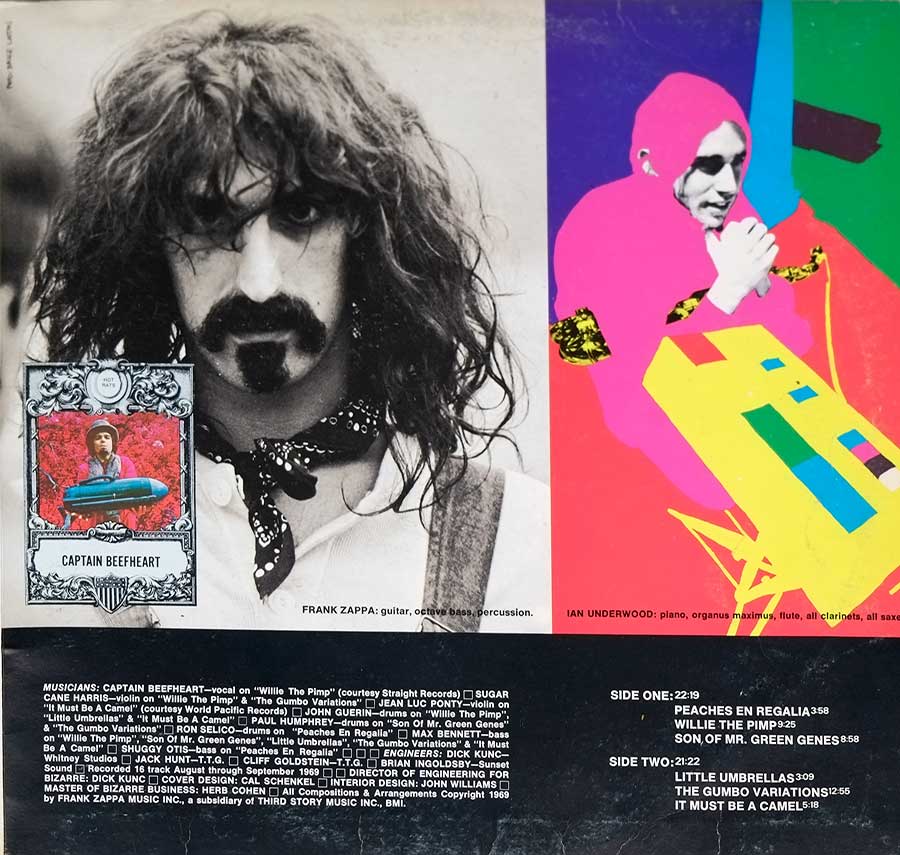
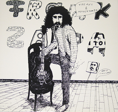
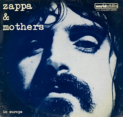
Captain Beefheart (Don Glen Vliet, 1941–2010) is the guy I file under “blues mutated in a lab.” He steered the Magic Band from 1964 to 1982, barking impossible rhythms until they somehow walked. In 1969 he dropped "Trout Mask Replica"—a record that still sounds like the tape machine is arguing back. Through the 70s he kept twisting the knife: "Lick My Decals Off, Baby" (1970), "Clear Spot" (1972), and the comeback with "Shiny Beast (Bat Chain Puller)" (1978) and "Doc at the Radar Station" (1980). He crossed streams with Frank Zappa on the 1975 "Bongo Fury" tour/album. After "Ice Cream for Crow" (1982) he quit music cold and went full-time painter, leaving the rest of us to decode the wreckage.
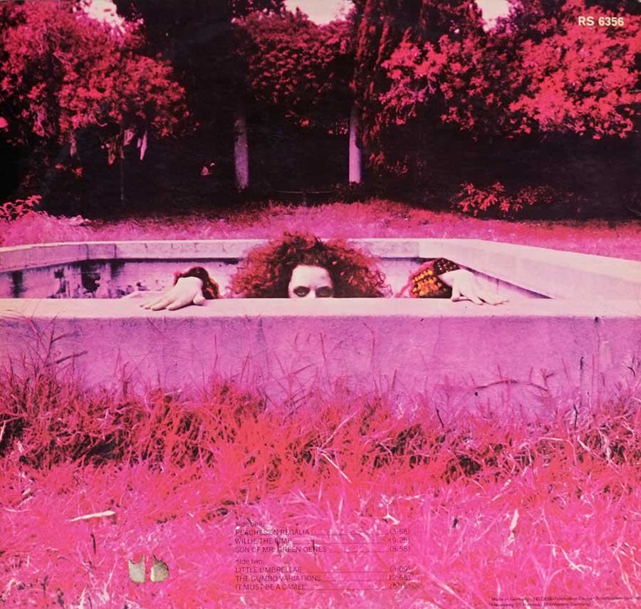
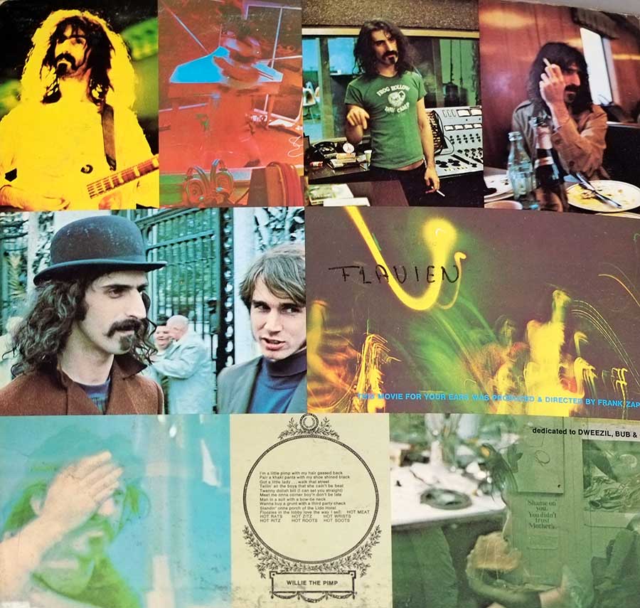
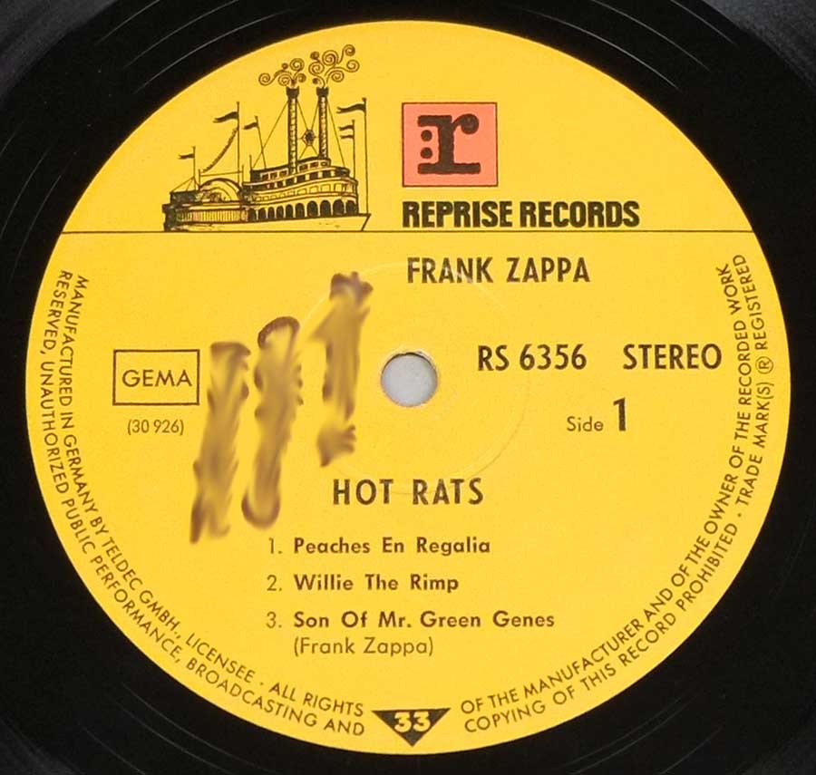
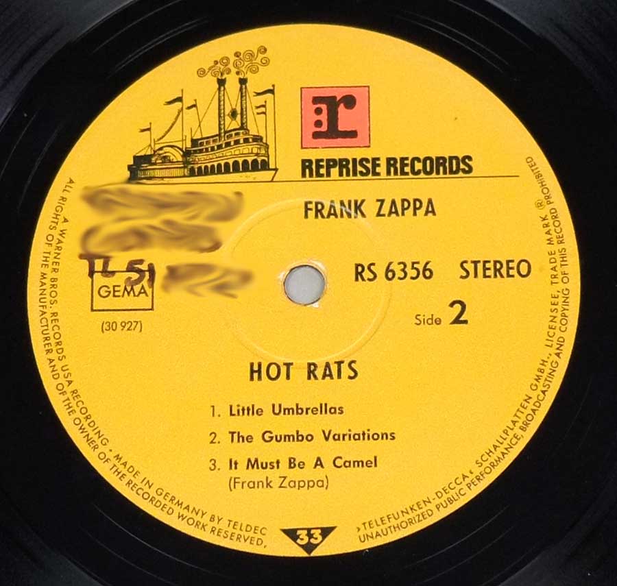
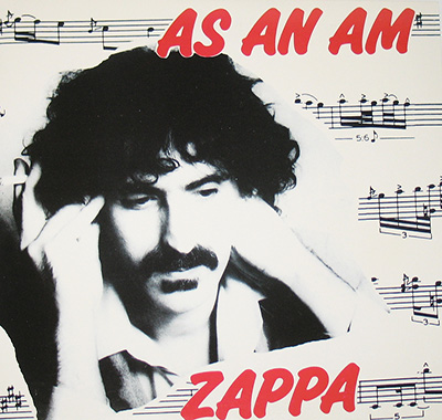
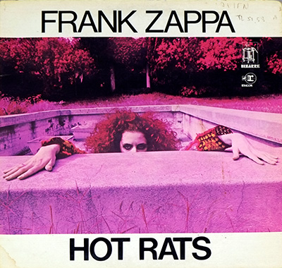
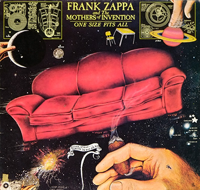
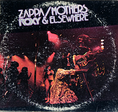
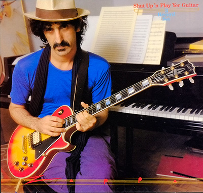
FRANK ZAPPA – Hot Rats 12" Vinyl LP Album
- Reprise TELDEC German Gatefold LP Release
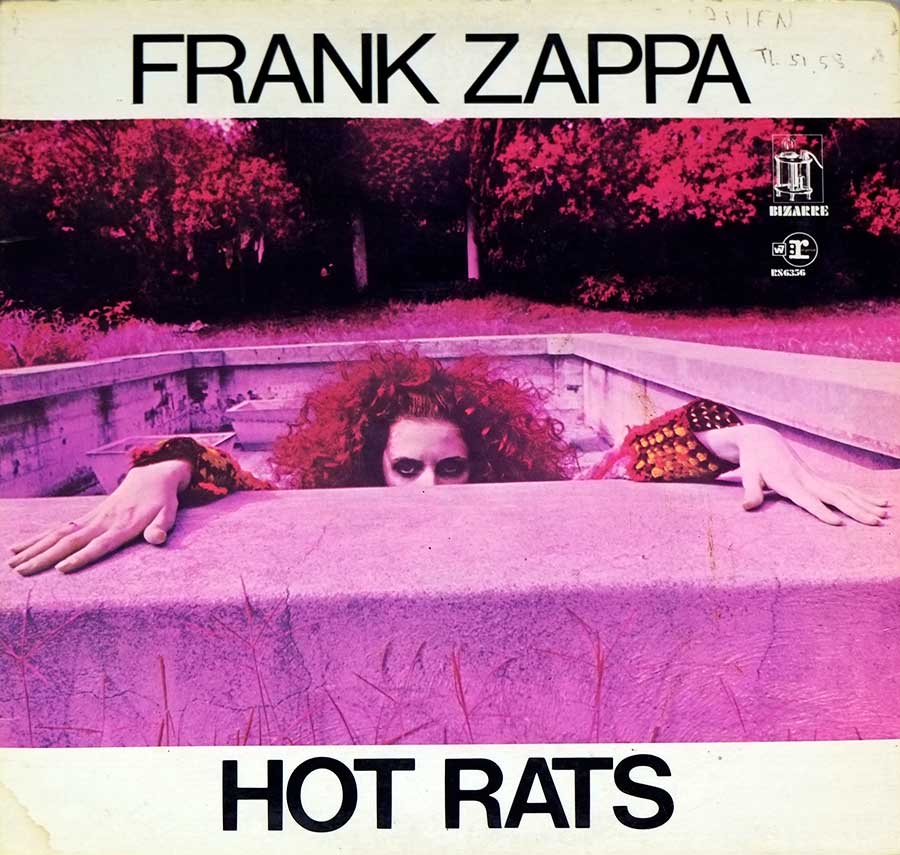
Hot Rats isn’t just an album — it’s the moment Frank Zappa broke free from gravity. This 1969 beast slithers out of the speakers like a neon-pink serpent, fusing jazz, rock, swamp-boogie and sheer cosmic weirdness into something that still feels dangerous. From the explosive swagger of Willie the Pimp to the unreal, almost cartoon-bright precision of Peaches en Regalia, every second is Zappa flexing his studio wizardry. It’s wild, it’s brilliant, it’s unrepeatable — the kind of record that rewires your brain before you even notice what’s happening.