Grace Jones - Island Life - 12" Vinyl LP Album

- the sleeve that bends reality and dares you to look twice

Album Front cover Photo of Grace Jones - Island Life - 12" Vinyl LP Album https://vinyl-records.nl/

A hyper-stylized studio setup: Grace Jones stretched into an anatomically impossible pose, one leg lifted, arms extended, gripping a microphone. The glossy skin tones contrast sharply with the flat pale background, wooden floorboards grounding the scene. The image feels constructed, almost sculptural, with tension between elegance and distortion.

"Island Life" matters because it does not feel like a lazy odds-and-ends package. Released in December 1985, it caught Grace Jones at the point where the records, the attitude, and the image had fused into one hard, unmistakable presence. The front cover still lands like a slap: Jean-Paul Goude's impossible pose, built as a composite rather than a straight photograph, turns Jones into something sharper than a pop star - part sculpture, part threat, part nightclub myth. Open the sleeve and it only gets stranger. The interior photos do not soften her for mass taste; they push further, including the unforgettable shot with the nose-bone, which gives the whole set more bite than most compilations ever manage. This one does not just collect songs. It stares back.

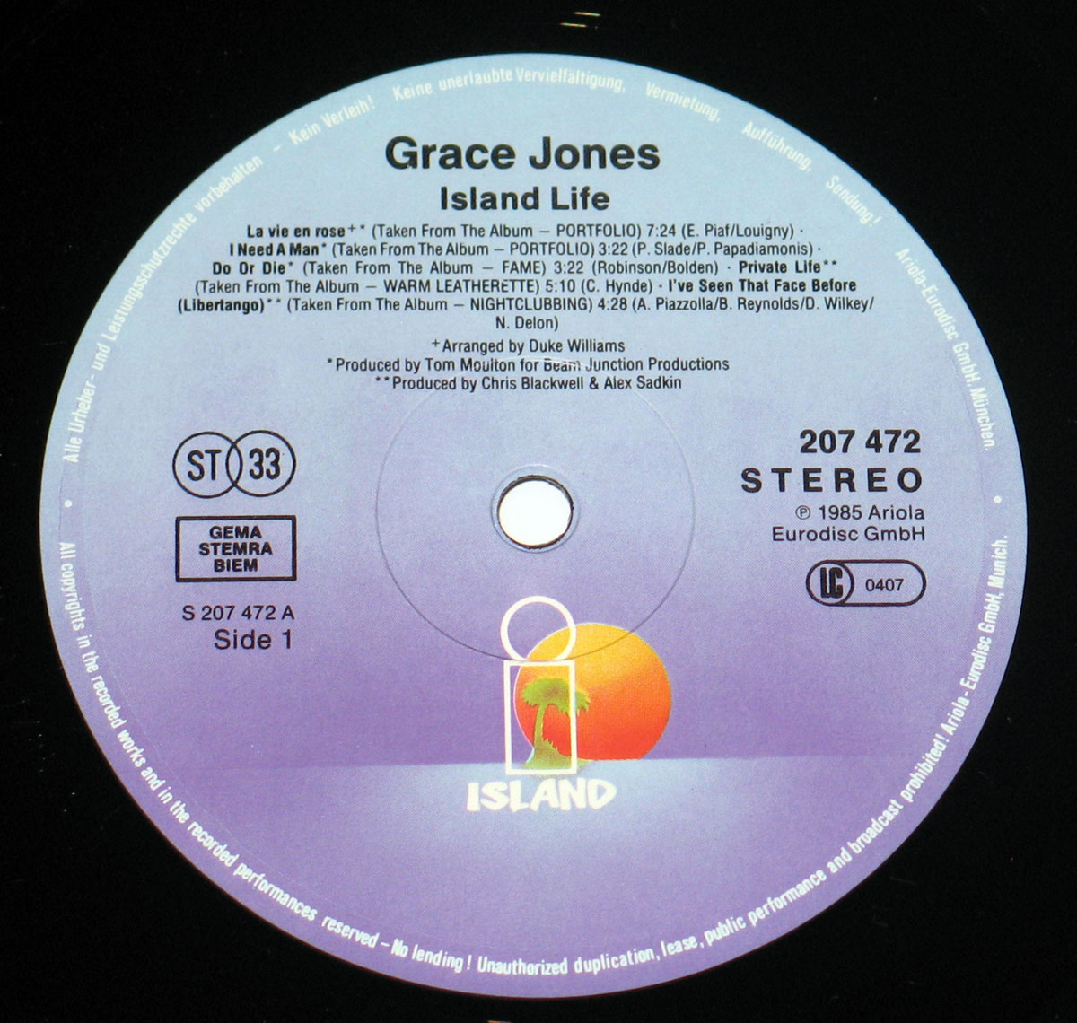
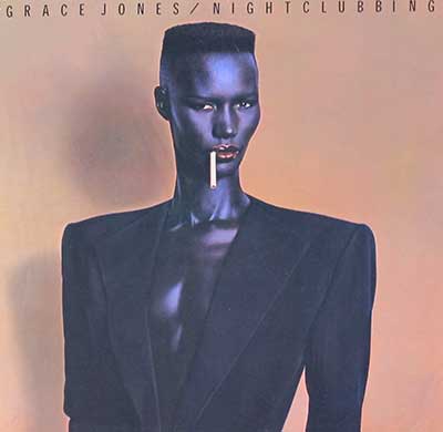
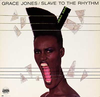
"Island Life" (1985) Album Description:

"Island Life" is the sort of compilation that looks neat on paper and slightly suspicious in the hand. By December 1985, Grace Jones had already torn through disco, cold-wave chic, reggae tension, nightclub funk, and that grand, expensive Trevor Horn machinery, so any single LP trying to sum her up was bound to leave a few bruises. Still, this one gets away with it more often than not. The running order moves like a hard stare across a decade: "La Vie En Rose" still slinks, "Private Life" still carries that dry, clipped menace, and "Slave to the Rhythm" lands at the end like the room lights just changed without asking permission.

The real hook is that this record lies a little, and not in a bad way. It pretends to be a tidy greatest-hits set, but once the needle drops it turns into something stranger: a document of reinvention by a singer who kept walking into other people's genres, rearranging the furniture, and leaving with the best lamp. Open the rest and the cracks start to matter—the songs left out, the sharp turn from Tom Moulton’s disco floor to Compass Point’s lean muscle, and the way 1985 was already trying to package Grace Jones while she was still too slippery to package properly.

Calling this a simple "best of" misses the grime under its nails. These tracks were cut across very different phases of Jones' career, and you can hear the shifts in production method like changes in weather. The early material still has that disco lift and sweep, elegant but a bit theatrical, while the Compass Point-era cuts hit with more bite and less lipstick: Sly & Robbie’s rhythm sense, Blackwell and Sadkin’s sense of space, guitars that slash instead of decorate, and basslines that move like they know the back door as well as the front.

That is where the album earns its keep. "Pull Up to the Bumper," "Walking in the Rain," and "My Jamaican Guy" don’t just sound good next to one another; they show how Jones stopped being treated like a stylish disco object and became the controlling presence in the room. Not warmer. Not softer. Just more dangerous. Plenty of 1985 pop was going glossy by default—Madonna going for mass seduction, Eurythmics sharpening synth-pop into a clean blade, Sade drifting on poise, Talking Heads turning neurosis into sleek rhythm science. Jones, meanwhile, still sounded like she might laugh at the whole industry and then walk off with its best tune.

The Jamaican angle matters, even if this record is no roots set and never pretends to be one. In 1985, Jamaican music at home was pushing deeper into digital dancehall, tougher and more stripped, while Jones remained an international creature shaped as much by Paris, New York, and Nassau as by Spanish Town. "My Jamaican Guy" is the clue. It is not a tourist postcard and not some dutiful heritage nod either; it sits inside the compilation like a sly reminder that her accent on record was always chosen, never handed over for easy sorting.

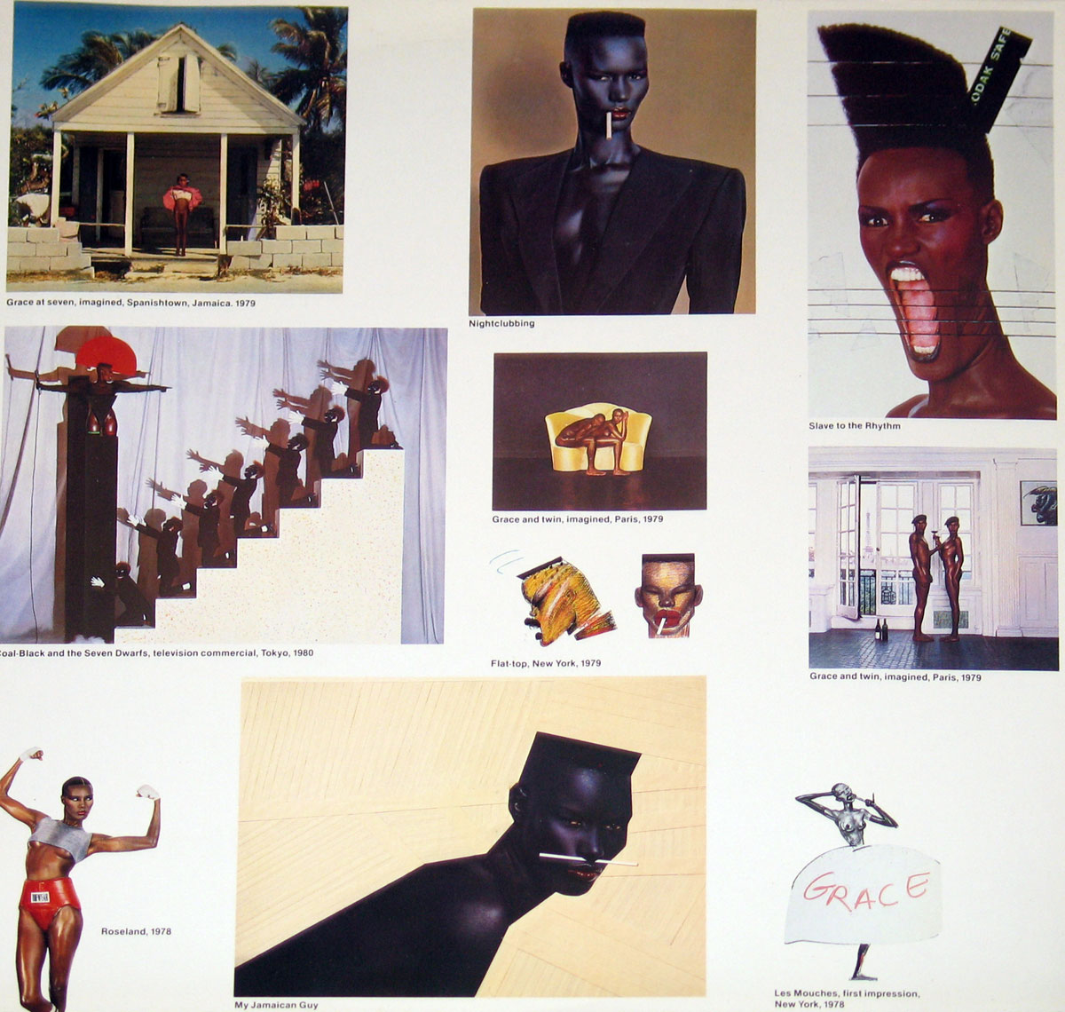
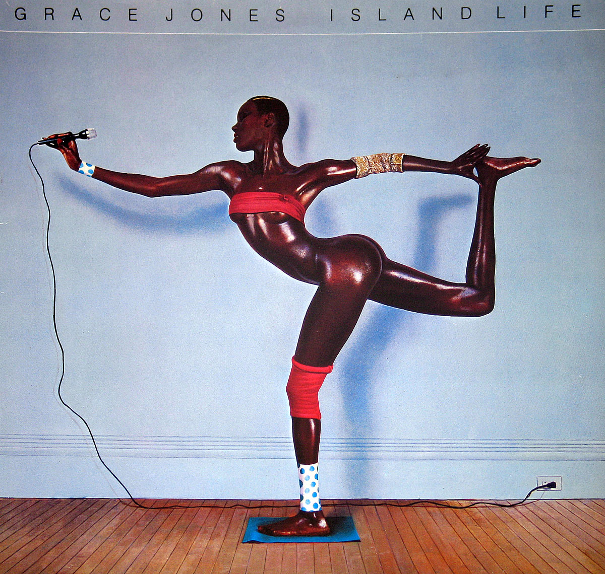
The sleeve adds its own argument. The front image is all impossible geometry and control, Jean-Paul Goude turning Grace into a design problem and then solving it with a razor blade and glue. Flip to the inner material and you get the other half of the story: stage images, masks, poses, cigarettes, the whole constructed mythology laid out like contact sheets from a campaign too smart to call itself a campaign. Handling the LP makes that tension clearer. The record wants to look immaculate, but the print grain, the slight fuzz in smaller text, the spindle wear around the center hole—those little facts keep dragging it back into the real world where records lived on shelves, not in theory.

There was no great public scandal attached to this release, and frankly that tells its own story. The common gripe has always been more collector-ish than dramatic: it smooths the catalog too neatly and skips material some listeners would fight for, especially if they prefer the awkward corners to the polished headline moments. Fair complaint. "Island Life" is not the whole woman. It is the version Island could sell in one sleeve after "Slave to the Rhythm" had kicked the door open.

Late at night this record makes more sense than it does in daylight. The best copies always seem to come from bins where the sleeve has just enough ring rub to prove somebody actually lived with it, and that feels right because Grace Jones was never background music for tidy people.

As a listening experience, Side One still feels a touch more curated than lived, almost like the label trying to clear its throat before the better material arrives. Side Two is where the blood circulation improves. "Love Is the Drug" has snap, "Pull Up to the Bumper" still struts like it owns the pavement, and "Slave to the Rhythm" closes the set with enough pomp to make the whole compilation seem grander than it really is. A bit of a cheat, yes. A smart one.

So no, this is not the last word on Grace Jones. It is too selective, too strategic, too keen to turn a restless career into a handsome object. But as a 1985 snapshot of what made her impossible to shelve beside the ordinary pop acts, it works. Not because it explains her. Because it doesn’t quite manage to.

References

Album Key Details: Genre, Label, Format & Release Info

Music Genre:

Pop, Dance

A polished blend of pop and dance that leans on rhythm, attitude, and studio precision rather than raw instrumentation. The grooves are tight, the vocals controlled and deliberate, and the production reflects the shift from disco into the sharper, more stylized sound of the 1980s club scene.

Label & Catalognr:

Island Records – Cat#: 204 472

Media Format:

Record Format: 12" LP Vinyl Gramophone Record

Release Details:

Release Date: 1985

Release Country: Germany

Complete Track-listing:

Tracklisting Side One:
  1. La Vie En Rose Cover
    Cover of Édith Piaf’s classic French chanson.
  2. I Need A Man Single
    Released as a single.
  3. Do Or Die Single
    Released as a single.
  4. Private Life Single
    Released as a single.
  5. I've Seen That Face Before (Libertango) Single Cover
    Released as a single. Based on Astor Piazzolla’s "Libertango".
Tracklisting Side Two:
  1. Love Is The Drug Cover
    Cover of Roxy Music’s classic song.
  2. Pull Up To The Bumper Single
    Released as a single.
  3. Walking in the Rain Cover
    Cover of The Flash and the Pan song.
  4. My Jamaican Guy Single
    Released as a single.
  5. Slave to the Rhythm Single
    Released as a single.

Disclaimer: Track durations shown are approximate and may vary slightly between different country editions or reissues. Variations can result from alternate masterings, pressing plant differences, or regional production adjustments.

You pick this one up and the sleeve already feels different, slightly thicker board, a bit of gloss that has dulled unevenly over time. The front image still hits, but look closer and you start noticing the print grain, especially in the darker areas where the ink settles heavier. Edges on most copies show that familiar soft wear, nothing dramatic, just the kind of rounding that comes from years of being slid in and out. Flip it over and the typography is typical Island mid-80s, clean but not overly refined, catalog number sitting there without fuss. The real interest starts once you move past the covers, the labels and pressing details tell the better story.

Album Front Cover Photo
Grace Jones Island Life front cover vinyl sleeve showing full-body composite pose with extended limbs holding microphone, pale blue background, wooden floor, minimal typography across top, visible gloss coating, slight corner wear, minor ink variation in dark skin tones and background, typical aging marks on edges of this pressing

First thing that hits isn’t the pose—it’s the surface. That slight gloss catches light unevenly, especially across the darker tones, and suddenly the whole thing looks less like a photograph and more like something assembled under pressure. Not badly done, just… deliberate in that early-80s studio trickery way. The pale blue background sits flat, almost too clean, like a wall that’s never seen furniture, and then you notice the faint inconsistencies in the print—tiny shifts in ink density that only show up when the sleeve tilts under a lamp.

The figure stretches across the sleeve in a way no human actually does, and that’s the point. It’s a composite, and it doesn’t try to hide it if you’ve handled enough sleeves to know the signs. The edges of the limbs feel just a touch too sharp in places, like they’ve been cut and reassembled with a steady but impatient hand. The microphone cable snakes down with a kind of lazy realism that almost ruins the illusion—too grounded, too ordinary. That contrast feels intentional, but it also nags.

Typography sits up top, spaced out like it’s afraid to get involved. “GRACE JONES ISLAND LIFE” runs thin and detached, leaving the image to do all the heavy lifting. Slight misalignment in spacing becomes visible once you stare too long—nothing dramatic, just enough to remind you this wasn’t laser-perfect production. The lower edge often picks up light scuffing, and this copy shows it, especially along the bottom where the wood floor meets the sleeve edge. Typical shelf wear, nothing heroic, just evidence this thing has been pulled in and out more than once.

What works is the attitude baked into the print itself. No softness, no apology. The body is treated like sculpture, polished almost to the point of looking synthetic, and that sheen isn’t just the photography—it’s how the ink sits on the paper. What doesn’t quite land is the background. Too clean, too safe, like they ran out of nerve after constructing the central image. Still, the sleeve holds up because it commits to the illusion just enough, and then lets the small imperfections—print quirks, edge wear, slight tonal drift—remind you this is still a physical object, not some untouchable concept piece.

Album Back Cover Photo
Grace Jones Island Life back cover vinyl sleeve collage layout with multiple performance and studio photos, white background, printed captions under each image, visible print softness in smaller images, slight edge wear and handling marks typical of used German pressings

Flip this thing over and the mood shifts immediately—from that controlled, almost clinical front into something that feels like a scrapbook someone tried to tidy up at the last minute. White background, plenty of breathing space, but it’s not calm—it’s just busy in a quieter way. The surface shows it too. That same semi-gloss catches light unevenly, especially across the white areas where faint scuffs and handling marks stand out more than they should. This is the side that ages faster, no question.

The collage of images is the real story here, and it’s not subtle. Different photo sizes, different tones, different moments—stage shots, stylized portraits, costume experiments—all dropped onto the page like evidence rather than design. Some of the smaller images lose sharpness, especially the darker ones, where the ink seems to sink a bit too much into the stock. That slight blur isn’t artistic—it’s print limitation, and once you see it, you can’t unsee it.

Captions sit underneath each image, typed out in a clean but slightly indifferent font. Alignment wobbles just enough to feel human rather than precise. Nothing dramatically off, just a millimeter here, a fraction there. The spacing between elements feels like it was measured once and then trusted a bit too much. German pressings often lean this way—functional first, aesthetics second—and this sleeve doesn’t fight that reputation.

What does work is the honesty of it. No attempt to unify everything into a single visual statement. Instead, it throws the whole persona onto the table—fashion, performance, theatre, attitude—and lets the viewer sort it out. What irritates slightly is the lack of hierarchy. The eye doesn’t know where to land first, so it wanders, which is either clever or lazy depending on your patience. Over time, the edges pick up that familiar dulling, especially along the right side where fingers tend to grip. Add a few faint pressure marks from stacked storage and you’ve got a sleeve that tells you exactly how often it’s been handled, even if the music inside stayed untouched for years.

Photo One of custom inner sleeve
Grace Jones Island Life custom inner sleeve collage with multiple performance and studio images, white background, captioned photo panels, visible print grain in darker tones, slight surface scuffs and edge wear typical of handled inner sleeves, varied image sharpness and ink density across panels

This one feels different the moment it comes out of the outer sleeve. Thinner stock, less forgiving, the kind that starts showing its history almost immediately. The white background looks clean from a distance, but up close it’s a battlefield of faint scuffs, tiny pressure marks, and those soft grey streaks that only appear after years of sliding in and out. Corners tend to soften first, and this copy doesn’t hide it—just enough rounding to tell you it’s been handled, not stored like a museum piece.

The collage layout tries to organize chaos, but it never quite succeeds—and that’s probably the point. Images jump in scale and tone without asking permission. A house in Jamaica sits next to a stylized studio portrait, then suddenly a theatrical staircase scene pulls the eye sideways. Some panels are crisp, others sink into the paper a bit too much, especially the darker ones where the ink feels heavy, almost clogged. That grain in the blacks isn’t subtle either. It gives texture, sure, but also hints at the limits of the print run.

Captions are scattered underneath, small, functional, slightly detached from the images they’re supposed to explain. Alignment drifts just enough to look accidental, though it probably isn’t. There’s a looseness here that works in places and frustrates in others. The larger central image with the cigarette—hard, glossy skin tones—holds the whole thing together, even as the surrounding panels fight for attention like unruly guests at the same table.

What comes through is a catalogue of personas rather than a single identity. Performance, fashion, provocation—it’s all laid out without much filtering. That honesty works. What doesn’t is the lack of hierarchy; the eye keeps searching for a starting point and never quite settles. Add the typical inner sleeve wear—light creasing near the opening edge, a few shallow pressure dents from stacked storage—and you’re left with something that feels used in the best and worst ways. Not precious, not polished, but undeniably handled.

Photo of enlarged record label
Grace Jones Island Life vinyl record label Side 1 Island Records Ariola Eurodisc pressing with gradient purple to blue background, palm tree logo, catalog number 207 472, GEMA STEMRA BIEM box, ST33 marking, visible spindle hole wear and light surface marks from playback

Pull the record out and the label immediately feels more grounded than the sleeve—less theatre, more factory. That soft purple-to-blue gradient looks smooth at a glance, but tilt it slightly and the ink reveals its limits. There’s a faint unevenness in the transition, especially near the lower half where the color deepens, like the press couldn’t quite keep the saturation consistent. Nothing dramatic, just enough to remind you this wasn’t printed yesterday.

The Island logo sits there with that sunset-and-palm motif, trying to inject a bit of warmth into an otherwise cool layout. It works, mostly, though the white lines around it aren’t perfectly crisp. Slight feathering at the edges, visible if you’ve spent too much time staring at labels like this. The center hole tells the real story. Light spindle wear, a few tiny radial marks where the record’s been dropped onto the turntable without ceremony. Not abused, but definitely used.

Typography is clean but not flawless. “Grace Jones” and “Island Life” are centered with confidence, yet the smaller track listing text feels packed in, almost as if someone ran out of room halfway through. Some lines print sharper than others, especially where the ink sits thinner. The GEMA STEMRA BIEM box and ST33 marking are solid, though slightly heavier in print density compared to the surrounding text, which creates a subtle imbalance once you notice it.

Around the outer rim, that ring of legal text circles like an afterthought, faint in places where the ink didn’t fully bite into the paper. This is where storage shows too—tiny scuffs along the edge, barely visible unless the light hits just right. What works here is the restraint. No clutter, no unnecessary decoration. What irritates slightly is the inconsistency in print sharpness. It’s minor, but once seen, it sticks. Still, it’s a working label—made to spin, not to impress—and the small imperfections give it just enough character to prove it has done exactly that.

All images on this site are photographed directly from the original vinyl LP covers and record labels in my collection. Earlier blank sleeves were not archived due to past storage limits, and Side Two labels are often omitted when they contain no collector-relevant details. Photo quality varies because the images were taken over several decades with different cameras. You may use these images for personal or non-commercial purposes if you include a link to this site; commercial use requires my permission. Text on covers and labels has been transcribed using a free online OCR service.

FEATURED GRACE JONES VINYL RECORDS & Album Cover Gallery

Thumbnail of GRACE JONES - Inside Story album front cover
GRACE JONES - Inside Story

"Inside Story" feels like Grace Jones stepping out of the shadows and straight into polished light—on her own terms. The edges are cleaner than before, maybe too clean in places, but that voice still cuts through everything. Horns snap, grooves glide, and the whole thing moves with a kind of controlled confidence. Not as dangerous as earlier records… but not exactly safe either.

Inside Story 12" Vinyl LP
Thumbnail of GRACE JONES - Island Life album front cover
GRACE JONES - Island Life

Released in 1982, Living My Life marked the final entry in Grace Jones’s Compass Point trilogy. Fusing reggae, funk, and new wave, the album includes standout tracks like “My Jamaican Guy” and “Nipple to the Bottle,” cementing Jones’s status as one of the boldest pop innovators of the era.

Island Life 12" Vinyl LP
Thumbnail of GRACE JONES - Living My Life album front cover
GRACE JONES - Living My Life

"Living My Life" is the sixth studio album by Grace Jones, released in 1982. It was the last of three albums she recorded at the Compass Point Studios in the Bahamas.

Living My Life 12" Vinyl LP
Thumbnail of GRACE JONES - Nightclubbing album front cover
GRACE JONES - Nightclubbing

Slink into the shadows, darling—*Nightclubbing* isn’t an album, it’s an ambush. Metallic heartbeat, velvet bassline, danger in heels. Grace doesn’t sing—she commands. Reggae seduction, synth chill, funk swagger. Gender bends, genres break. This is midnight with lipstick knives. You're not listening—you're surrendering.

Nightclubbing 12" Vinyl LP
Thumbnail of GRACE JONES - Slave To The Rhythm album front cover
GRACE JONES - Slave To The Rhythm

"Slave to the Rhythm" is the seventh studio album by Grace Jones, released on 28 October 1985 by Island Records. The concept album went on to become one of Jones' greatest album triumphs commercially and spawned her biggest hit, "Slave to the Rhythm".

Slave To The Rhythm 12" Vinyl LP
Thumbnail of GRACE JONES - Warm Leatherette album front cover
GRACE JONES - Warm Leatherette

"Warm Leatherette" is the fourth studio album by Grace Jones, released in 1980 by Island Records. The album features contributions from the reggae production duo Sly and Robbie and is a departure from Jones' earlier disco sound, moving towards a new wave-reggae direction.

Warm Leatherett 12" Vinyl LP