Pink Floyd - Animals (1977, Netherlands) 12" Vinyl LP Album

- The flying pig, the smokestacks, and the sleeve that made dread look majestic

Album Front cover showing Battersea Power Station rising like a brick fortress under a bruised sky, its four pale chimneys pushing through dark smoke while a small inflatable pig drifts between them like an absurd omen. The foreground rooftops and rail lines make the scene feel grounded and urban, but the strange floating animal turns it into something colder, stranger and unmistakably Pink Floyd.

Seen from a slightly elevated, almost watchful angle, the front cover frames Battersea Power Station as a vast industrial monument, all brown brick, pale chimneys and smoke-stained sky. The little pig hanging between the stacks looks ridiculous at first, then oddly threatening, which is exactly why the image works so well. The roofs and buildings in the foreground pull the eye inward, while the yellow-grey light gives the whole scene the feel of a city waiting for bad news.

Pink Floyd’s "Animals" landed in 1977 like a cold brick through the prog-rock window: darker, sharper, and far less interested in comforting anyone. It matters because it caught the band between stadium grandeur and social disgust, turning the late-70s mood into something bleak, spacious, and wonderfully unpleasant. The music growls rather than glows, with “Dogs” stretching out like a paranoid city walk, “Pigs (Three Different Ones)” sneering from the shadows, and “Sheep” charging forward with woolly menace. Roger Waters’ bite is everywhere, while the Battersea sleeve gives the whole thing that grim industrial aftertaste. This Dutch Harvest LP keeps the drama nicely physical, thank heavens.

"Animals" (1977) Album Description:

"Animals" arrived at the exact moment when progressive rock was being told to put on a tie, apologise for itself, and clear the room for punk. Pink Floyd did the opposite. Instead of chasing speed or fashion, they made a record that feels like wet concrete, bad temper and fluorescent light: long pieces, hard edges, very little comfort. In the acid-psych and progressive rock lane, it sits as the ugly-minded sibling between the dream-state sprawl of earlier Floyd and the outright wall-building to come. The Dutch Harvest copy suits it too, because this is not music that wants to look cheerful on a shelf.

What still catches me off guard is how lean the thing sounds once the mythology is stripped away. "Dogs" has real bite and drag, "Pigs (Three Different Ones)" sneers like a man who has stopped bothering with manners, and "Sheep" moves with that nervous, herded momentum that makes the room feel smaller. Open the rest of this up and the year 1977 starts closing in around the album: London industry, punk at the door, Waters tightening his grip, and a sleeve that tells the truth more bluntly than half the interviews ever did.

Britain in 1977 was in no mood for fantasy wallpaper. The country looked worn, the city mood was colder, and the local scene had split into camps: punk tearing at bloated old certainties, pub rock still keeping its boots on the floor, and the surviving progressive bands trying to decide whether to slim down, smarten up, or pretend not to notice. Pink Floyd were too large to panic, but not too large to feel the pressure. So rather than sounding grand for its own sake, "Animals" sounds cornered and irritated, which is a far better use of scale.

By then the internal balance of the band had shifted. The Syd Barrett rupture was long behind them, David Gilmour had already changed the group from inside, and the floating collective voice of the early years had hardened into something more directed. On this album Roger Waters is not merely writing songs; he is steering the emotional weather, the class contempt, the human taxonomy, the whole sour architecture of the thing. Gilmour answers with tensile guitar lines and a very particular kind of wounded cool, Richard Wright keeps the spaces open just enough to stop the album from choking on its own bitterness, and Nick Mason does what good drummers do when the room is tense: he holds the frame and lets the others misbehave inside it.

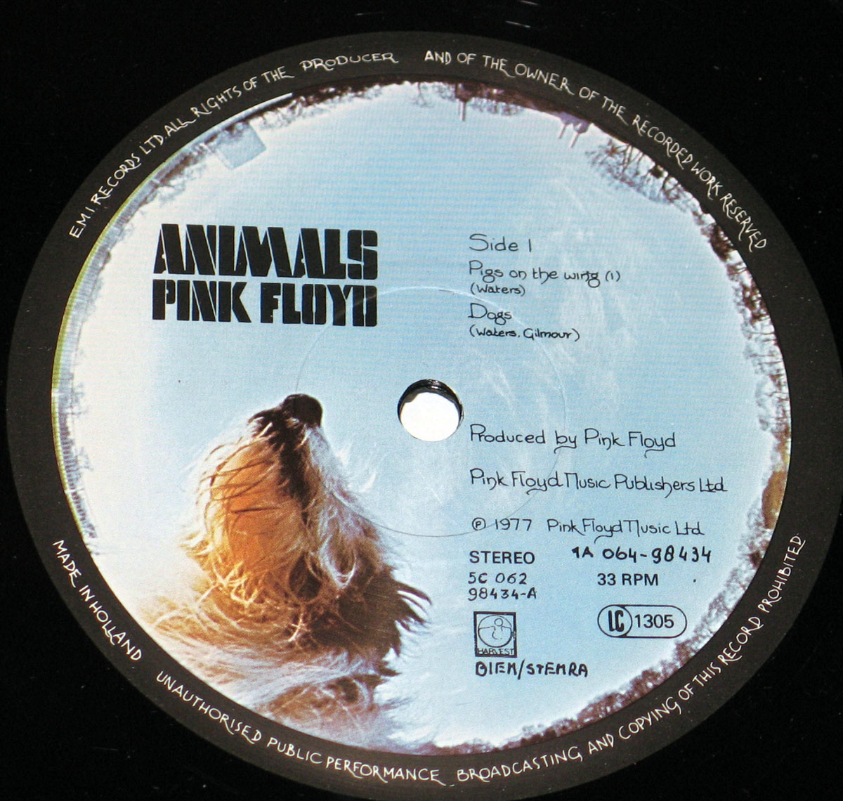
Produced by Pink Floyd, with Brian Humphries engineering at Britannia Row, the record has a dryness I prefer to some of the plusher prog records of the same year. It does not gush. It presses forward in slabs and long arcs, with enough air around the instruments to make every vocal jab and guitar bend feel exposed. The tempo feel is often slower than memory suggests, but that is part of the trick: the music lumbers, stalks, hangs back, then suddenly leans in. No decorative mist. Just pressure.

Set it next to other 1977 names and the differences jump out fast. Yes could still sound polished to the point of self-importance, Genesis were already learning how to compress their ideas into tighter shapes, Jethro Tull remained wilfully theatrical, Rush were turning virtuosity into forward motion, and Hawkwind kept their cosmic grime intact. Pink Floyd, on "Animals", sound less interested in fantasy, chops or pageantry than in moral abrasion. Even when the arrangements stretch out, the aim is not escape. It is accusation, with a decent amplifier attached.

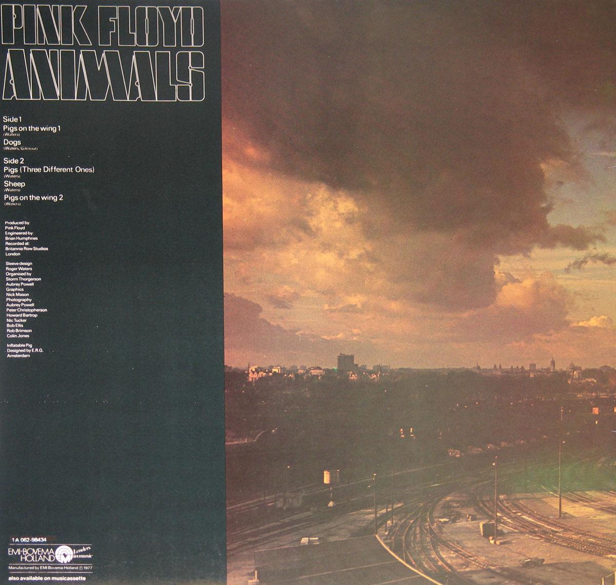
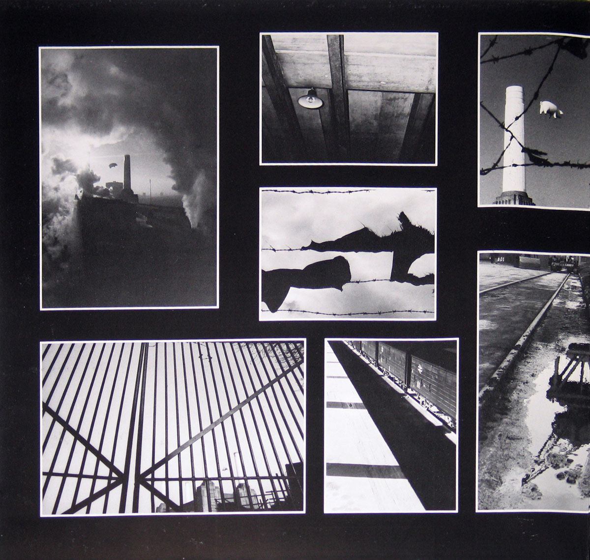
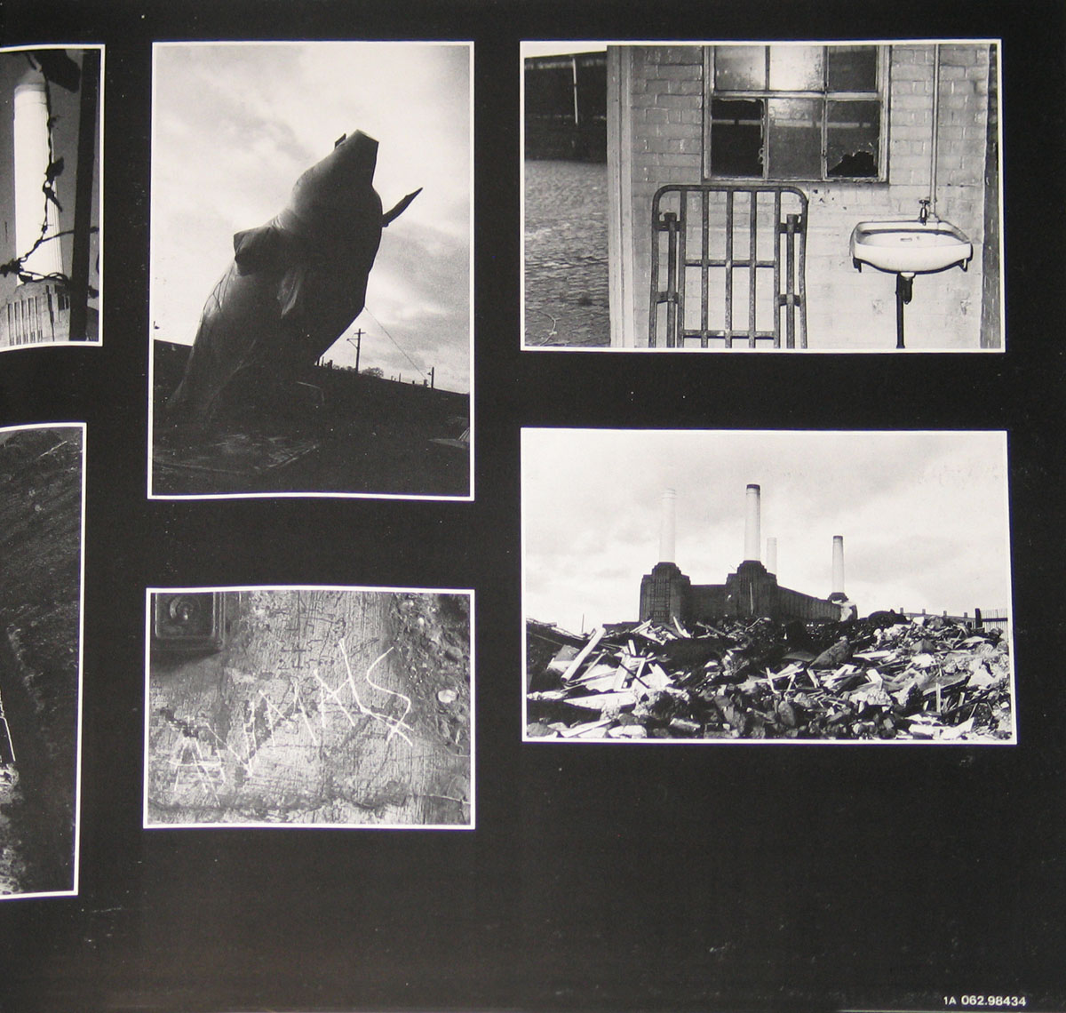
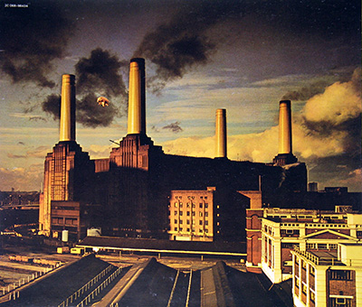
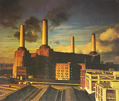
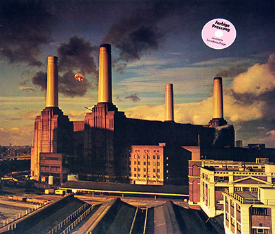
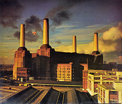
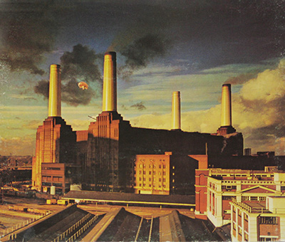
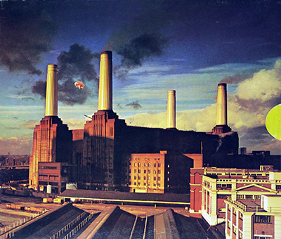
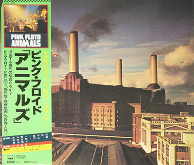
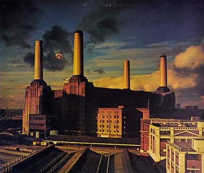
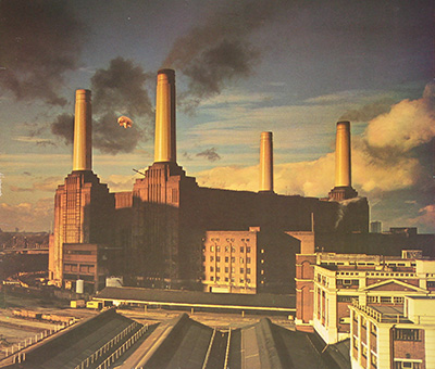
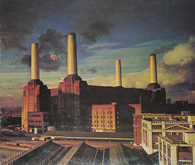
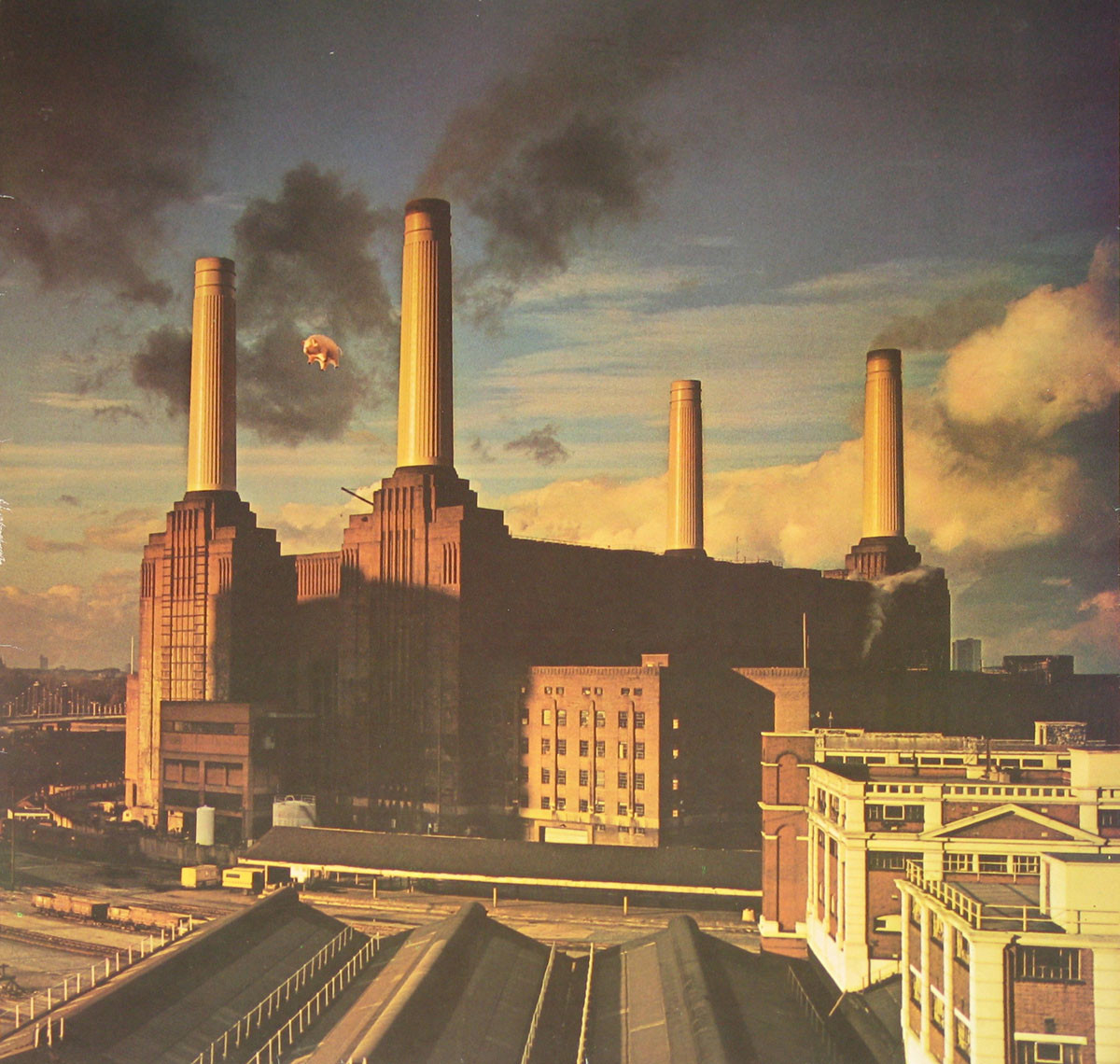
The sleeve helps because it does not flatter the music. Battersea Power Station, the pig, the industrial spread, the black-and-white gatefold fragments, the Dutch label with that pale blue field and sheep image: all of it feels like a world built from soot, pressure and bad company. Storm Thorgerson and Aubrey Powell organised the visual concept from Waters' idea, and for once the packaging is not some parallel art-school exercise pretending to improve the record. It belongs to the same emotional weather. That is rarer than record buyers like to admit.

A late-night listen does the job best. One lamp on, sleeve half open on a cluttered desk, side one already turning while the room starts feeling slightly less friendly than it did twenty minutes earlier. That is when "Animals" makes sense: not as a monument, but as a record that quietly dirties the air.

There was no tidy scandal attached to the release itself, no moral panic worth romanticising. The argument around it was more cultural than tabloid: old-guard stadium intellect versus the new short-sharp British impatience. Some people still misremember the album as indulgent prog bulk because the tracks are long and the cover is famous. Nonsense. Underneath the length, this is one of Pink Floyd's meanest and most economical records, and probably the one least interested in being loved.

That is also why collectors keep coming back to it. Not because it is impossibly rare; it is not, and nobody needs to swoon theatrically into the record bin. The pull is that "Animals" preserves a particular late-70s frost without sanding it down for comfort. The Dutch Harvest pressing carries that mood well: gatefold, lyric inner sleeve, solid visual identity, useful label details, none of the unnecessary carnival barking. Some albums ask to be admired. This one still prefers to judge the room first.

References

Album Key Details: Genre, Label, Format & Release Info

Music Genre:

Acid Psychedelic Progressive Rock Music

Label & Catalognr:

Harvest – Cat#: 1A 064-98434

Album Packaging

Gatefold/FOC (Fold Open Cover) Album Cover Design.

This album includes the original thick custom inner sleeve with album details, complete lyrics of all songs by Pink Floyd.

Media Format:

Record Format: 12" Vinyl LP Gramophone

Release Details:

Release Date: 1977

Release Country: Holland

Collector’s Note: Dutch Harvest Pressing Perspective

My Dutch Harvest pressing of Pink Floyd's "Animals" is not some mythical lost artefact dragged from a locked EMI cupboard, but it absolutely earns its shelf space. The gatefold sleeve still does the heavy lifting: Battersea, the pig, the grey industrial gloom, all that late-70s British discomfort pressed into cardboard.

Add the thick custom inner sleeve with lyrics, the Harvest label, and the 1977 Holland connection, and you have a proper collector copy of a major Floyd album. Not ultra-rare, no need to faint theatrically, but visually strong, historically loaded, and far too important to bury in the archive dust.

Production & Recording Information:

Producers:
  • Roger Waters – Producer

    Waters was steering far more than the lyrics here; the whole mood carries his fingerprints.

    Roger Waters, founding bassist, lyricist and chief concept driver of Pink Floyd, shaped "Animals" more heavily than almost anyone else involved. Across the writing, sequencing and general emotional weather, his hand is everywhere, so this production line never feels misplaced to me. The album moves with his logic: cold, controlled, bitter and built to leave a bruise rather than a glow.

    Pink Floyd Music Publishers Ltd 1977
Sound & Recording Engineers:
  • Brian Humphries – Sound engineer

    I know Brian Humphries as one of those essential studio men whose work helped shape the dark weight of Black Sabbath and the wide-screen atmosphere of Pink Floyd.

    Brian Humphries was the sort of engineer I never ignore, because his name turns up exactly where the sound gets deeper, heavier and more cinematic. In 1970 he co-engineered Black Sabbath's "Paranoid", helping trap that blunt, iron-lunged force without polishing away its menace. With Pink Floyd, he entered the frame in 1969 on "Animals" and "Ummagumma", also working on music connected to "Zabriskie Point". He returned in the mid-1970s as front-of-house mixer during 1974, 1975 and 1977, then engineered "Wish You Were Here" in 1975 and "Animals" in 1977. By the late 1970s he was also tied to Britannia Row, right at the point where Floyd's sound became vast, cold and beautifully unsettling.

Recording Location:
  • Britannia Row Studios – Recording studio

    Pink Floyd built this place to work on their own terms, and that freedom bleeds through the grooves.

    Britannia Row Studios, was Pink Floyd's own London base, built so the band could stop feeding studio clocks and start working at full scale on its own turf. "Animals" was recorded there through 1976, and that matters to me: the album sounds roomy, severe and tightly controlled, with enough space for the long pieces to breathe while still feeling penned in by tension, paranoia and cold city air.

Album Cover Design & Artwork:
  • Roger Waters – Sleeve design

    That flying pig was not just a stunt; it was the album's whole sneer made visible.

    Roger Waters, founding bassist, lyricist and resident provocateur of Pink Floyd, had long since learned that a sleeve could carry the same sting as a lyric. On "Animals" he supplied the cover concept that placed the pig over Battersea Power Station, turning the album's class-war cynicism into an image that feels ridiculous and menacing at the same time. From a collector's chair, that is sleeve thinking with real teeth.

  • Storm Thorgerson – Organized cover concept

    Thorgerson knew how to turn a clever idea into an image that stayed lodged in the head for decades.

    Storm Thorgerson, the great visual surrealist in Pink Floyd's orbit and co-founder of Hipgnosis, had a gift for making record sleeves feel larger than the music industry deserved. On "Animals" he organised the cover design and helped turn Waters' Battersea-and-pig idea into a coherent visual statement: huge scale, hard weather, industrial gloom and just enough unreality to make the whole thing unsettling rather than decorative.

  • Aubrey Powell – Organized cover concept

    Powell helped give the sleeve its cold London grandeur without polishing away the soot.

    Aubrey Powell, graphic designer, photographer and Hipgnosis co-founder, always seemed to know when a sleeve needed spectacle and when it needed restraint. On "Animals" he helped organise the cover concept and the Battersea shoot, giving the album its grim architectural weight without draining away the absurdity of that airborne pig. That balance is exactly why the sleeve still feels dangerous instead of merely clever.

  • Nick Mason – Graphics

    Mason's graphics work is one of those details collectors feel before they consciously notice it.

    Nick Mason, founding drummer of Pink Floyd and the one constant presence across the band's whole studio run, always had a sharp eye for presentation as well as rhythm. On "Animals" he handled the graphics, including the handwriting-based visual touches that stop the package from feeling overcooked. Small details, yes, but they give the sleeve that unmistakable Floyd identity: deliberate, worn-in and slightly uneasy.

  • E.R.G Amsterdam – Inflatable Pig design

    The pig looked absurd, threatening and unforgettable, which is exactly why it worked.

    E.R.G Amsterdam, the experimental design team credited with the inflatable pig, supplied the one object this sleeve could not live without. For "Animals" that contribution was not some playful extra bolted on at the end; it gave physical shape to the whole visual argument. Once that pig was up against Battersea, the cover stopped being an idea and became a proper myth, complete with weather, chaos and near-disaster.

    Eventstructure Research Group Amsterdam.
Photography:
  • Aubrey Powell – Photography

    Powell's camera helped keep this sleeve grimy, physical and stubbornly real.

    Aubrey Powell, besides being one half of Hipgnosis, was a working photographer with a real feel for weather, scale and the drama of ordinary structures. On "Animals" his photography helped anchor the Battersea imagery in something tangible and bleak, so the sleeve never slips into fantasy. That mix of documentary grime and staged absurdity is precisely what gives the cover its long aftertaste.

  • Peter Christopherson – Photography

    Christopherson's name in the credits always makes me stop and look a little closer.

    Peter Christopherson, who came through Hipgnosis before later helping shape the worlds of Throbbing Gristle and Coil, was never the sort of name that sits quietly in small print. On "Animals" he contributed photography to the Battersea sessions and the sleeve material around them. Even in a supporting role the fit feels perfect, because the imagery ends up mechanical, eerie and just slightly wrong in the best possible way.

  • Howard Bartrop – Photography

    Bartrop's photograph gave the famous cover its hard industrial backbone.

    Howard Bartrop, one of the photographers tied to the Hipgnosis orbit around this project, matters here more than casual listeners usually realise. The final sleeve image used the pig superimposed onto one of Bartrop's Battersea photographs, which means his shot became the visual bedrock of "Animals". Without that exact angle, those looming chimneys and that bruised winter sky, the cover would not hit nearly as hard.

  • Nic Tucker – Photography

    Tucker's contribution sits in the small print, but the atmosphere would be poorer without it.

    Nic Tucker, credited here for photography, was part of the crew gathering the raw visual material around Battersea and the infamous pig shoot. That kind of work rarely gets the glamorous write-up, but it feeds the sleeve's atmosphere in a very practical way. On "Animals" that means soot, scale, winter light and industrial emptiness, all the things that keep the package grounded in something harsher than fantasy.

  • Bob Ellis – Photography

    Ellis helped feed the sleeve with real photographic weight instead of art-school wallpaper.

    Bob Ellis, a rock photographer whose name turns up on serious sleeve work from the period, added another set of eyes to the visual build of "Animals". Here he is credited for photography, contributing to the body of images surrounding the Battersea sessions and the package as a whole. Supporting work on a cover this famous is easy to overlook, but it helps give the album its bleak realism instead of some tidy art-school gloss.

  • Rob Brimson – Photography

    Brimson was there in the Hipgnosis trenches when this mad cover story was being built.

    Rob Brimson worked around Storm Thorgerson's Hipgnosis circle and later recalled his own part in the Battersea saga, which tells me he was no random name buried in the credits. On "Animals" he is credited for photography connected to one of rock's most notorious cover shoots. Proper behind-the-scenes graft sits in that line, with all the usual 1970s practicalities plus the minor inconvenience of a giant pig escaping into the sky.

  • Colin Jones – Photography

    Jones brought a documentary eye to a sleeve that could easily have drifted into gimmick.

    Colin Jones, first a ballet dancer and then a formidable British photographer and photojournalist, took a far less predictable road into record-sleeve history than most. On "Animals" he contributed photography to the package, bringing a seasoned documentary eye into a project built on industrial decay and staged absurdity. That bit of real-world gravity helps keep the whole visual concept from floating off into pure gimmick.

Band Members / Musicians:

Band Line-up:
  • Roger Waters – Vocals, bass, acoustic guitar, rhythm guitar, vocoder, tape effects, sleeve design
  • Roger Waters – Bass, vocals, songwriter

    Roger Waters is the guy I blame (politely) when a Pink Floyd song stops being “spacey vibes” and starts staring straight through you with lyrics that feel like a courtroom cross-examination.

    Roger Waters is, to my ears, Pink Floyd’s razor-edged storyteller: bassist, singer, and the main lyric engine who pushed the band from psychedelic drift into big, human-scale themes. His key band period is Pink Floyd (1965–1985), where he became the dominant writer through the 1970s and early 1980s, before leaving and launching a long solo career (1984–present). After years of public tension, he briefly reunited with Pink Floyd for a one-off performance at Live 8 in London on 2 July 2005—basically the musical equivalent of spotting a comet: rare, bright, and gone again. Since the late 1990s he’s toured extensively under his own name, staging huge concept-driven shows that revisit Floyd classics like "The Dark Side of the Moon" (notably on the 2006–2008 tour) and "The Wall" (2010–2013), because apparently subtlety is not the point when you’ve got something to say.

  • David Gilmour – Guitars, bass, vocals, talkbox, synthesizer
  • David Gilmour – Guitar, vocals

    David Gilmour is the voice-and-fingers combo I hear whenever Pink Floyd turns from “spacey” into straight-up cinematic: he joined in 1967 and basically helped define what “guitar tone with emotions” even means.

    David Gilmour is, for me, the calm center of Pink Floyd’s storm: an English guitarist, singer, and songwriter whose playing can feel gentle and devastating in the same bar. His earliest band period worth name-dropping is Jokers Wild (1964–1967), before he stepped into Pink Floyd in 1967 as Syd Barrett’s situation unraveled. From there his main performing era is Pink Floyd (1967–1995), including the post-Roger Waters years where the band continued under his leadership and released "A Momentary Lapse of Reason" (1987) and "The Division Bell" (1994), with a later studio coda in "The Endless River" (2014). Outside Floyd, he’s had a long solo run (1978–present) with albums ranging from "David Gilmour" (1978) to "Luck and Strange" (2024), and he even did a sharp side-quest in 1985 with Pete Townshend’s short-lived supergroup Deep End. And for one historic night, the classic lineup reunited at Live 8 in Hyde Park, London on 2 July 2005—one of those “you had to be there (or at least press play)” moments.

 
  • Richard Wright – Hammond organ, Fender Rhodes piano, Yamaha piano, ARP synthesizer, backing vocals
  • Richard Wright – Keyboards, vocals

    Richard Wright is the secret atmosphere machine in Pink Floyd: the guy who can make one chord feel like a whole weather system, and then casually add a vocal harmony that makes it hit even harder.

    Richard Wright (born Richard William Wright) is, for me, the understated genius of Pink Floyd: co-founder, keyboardist, and occasional lead vocalist whose textures are basically baked into the band’s DNA. His main performing period with Pink Floyd runs from 1965 to 1981 (including the early albums through the massive arena years), then he returned as a full member again from 1987 to 1994 for the later era tours and albums. In between those chapters, he didn’t just vanish into a fog machine: he released a solo album, "Wet Dream" (1978), and later "Broken China" (1996), and he also had a proper side-project moment with Zee (1983–1984), which produced the album "Identity" (1984). He passed away in 2008, but his playing still feels like the part of Pink Floyd that makes the air shimmer.

  • Nick Mason – Drums, percussion, tape effects, sleeve graphics
  • Nick Mason – Drums, percussion

    Nick Mason is the steady heartbeat I always come back to in Pink Floyd: the only constant member since the band formed in 1965, quietly holding the whole weird universe together while the rest of the planet argues about everything else.

    Nick Mason is Pink Floyd’s drummer, co-founder, and the one guy who never clocked out: his main performing period with Pink Floyd runs from 1965 to the present, and he’s the only member to appear across every Pink Floyd album. Outside the mothership, he’s had a very “I’m not done yet” second act: in 2018 he formed Nick Mason’s Saucerful of Secrets (2018–present) to bring the band’s early psychedelic years back to the stage. He’s also stepped out under his own name with projects like the solo album "Nick Mason’s Fictitious Sports" (released 1981), which is basically him taking a left turn into jazz-rock just to prove he can. And yes, he was part of that blink-and-you-miss-it full-band moment at Live 8 in London in 2005, when the classic lineup briefly reunited and reminded everyone why this band still haunts people.

Complete Track-listing:

Tracklisting Side One:
  1. Pigs on the Wing 1
  2. Dogs
Tracklisting Side Two:
  1. Pigs (Three different ones)
  2. Sheep
  3. Pigs on the Wing 2

Disclaimer: Track durations shown are approximate and may vary slightly between different country editions or reissues. Variations can result from alternate masterings, pressing plant differences, or regional production adjustments.

This Dutch "Animals" gallery is exactly the sort of thing I like to inspect slowly, not just glance at like some streaming thumbnail nonsense. The front cover has that grey industrial mood, with the Battersea power station sitting there like it pays rent in your memory. The back cover keeps the same cold, printed restraint, while the inside gatefold shots let the packaging breathe a bit more. The custom sleeve and label photo matter here too: Harvest typography, catalogue number, label ink, and those tiny production details that usually tell more truth than any glossy sales blurb. Open the full gallery and the real collector bits start showing up.

Album Front Cover Photo
Front cover of Pink Floyd's "Animals" showing Battersea Power Station filling most of the frame, with two tall chimneys on the left, two on the right, dark smoke across the upper sky, and a small pale pig floating between the left chimneys. Rooftops, rail tracks, and low industrial buildings run across the foreground, while the print has a warm brown cast, slight edge wear, and visible scuffing along the left border.

First thing that grabs me is not the pig. It is the sheer brick bulk of Battersea, shoved right up against the front of the sleeve like it wants to crowd everything else off the table. That matters, because the design concept is not subtle at all: industry first, humanity somewhere under the rubble, and then this daft little airborne pig dropped into the middle as if absurdity will somehow make the whole business easier to swallow. It does not. The station sits there like a threat, all vertical stacks and soot-heavy sky, and the pig looks small enough to miss if the light catches the sleeve badly. That is one of the sleeve’s little irritations, actually. On a worn copy, or under yellow room light, the pig can almost disappear into the murk, which is either clever visual tension or an overconfident printing decision. Depends how generous one feels that day.

Handled up close, the colour has that slightly browned, nicotine-era printed warmth that these late-70s covers often drift into, whether they meant to or not. The sky is not blue in any cheerful sense. It is a dirty grey-blue with heavy black cloud forms dragged across the top half, and the smoke pouring from the chimneys does a lot of the emotional labour. The lower part of the image is cluttered with roofs, tracks, sheds and squat blocks, none of it romantic, which is exactly why it works. A cleaner foreground would have lied. Here it feels like London industry seen by somebody who had stopped pretending factories were noble. Along the left edge there is visible whitening and scuff wear, the kind that comes from sleeves being pulled too often from shelves that were already overstuffed. A few tiny surface flecks and rubbed spots break the image as well, not enough to ruin it, just enough to remind me this is cardboard, not myth.

The chimneys do most of the compositional bullying. Two on the left, two on the right, with the building stretched between them like some rectangular brick carcass. They are pale against the darker body of the station, so the eye climbs them immediately, then gets snagged by the pig hanging between the left pair. Smart placement. Slightly theatrical too, but at least it earns its theatrics. What annoys me less than it should is how small the pig is. On plenty of rock sleeves, the big idea gets over-explained until it dies in your hands. Not here. This one makes you look for the thing. Meanwhile the print itself shows the usual age tells: the corners have softened a touch, the black areas lose detail in the darkest sections, and there is that faint pressure-flattened look you get when a sleeve has spent years pressed between heavier gatefolds and forgotten live doubles. Nothing glamorous. All useful.

What feels deliberate is the refusal to pretty the place up. No dramatic angle trying to turn the station into modernist sculpture, no decorative sky worth framing on its own, no fake grandeur beyond the scale already sitting there in the architecture. The image is selling bleakness, class tension, machinery, and a kind of urban contempt, and for once the cover is not lying about the record inside. That earns respect. The brown-black printing can look a bit muddy on some copies, yes, and the left border wear on this one is the sort of thing collectors clock in half a second, but the sleeve still lands its punch. Set it on a cluttered desk among brighter albums and it sulks its way to the front anyway, which is more than can be said for a lot of supposedly smarter cover art from the same period.

Album Back Cover Photo
Back cover of Pink Floyd's "Animals" showing a dark vertical black panel on the left with album title, tracklisting, and credits in white text, while the right side displays a wide cityscape under heavy brown-grey clouds. Railway tracks curve through the foreground with scattered industrial structures, distant low-rise buildings, and a muted skyline under a dim, stormy sky.

The back cover does not bother pretending to compete with the front. Instead, it shifts sideways into something quieter, almost grudging, as if the sleeve has already said its piece and now just hands over the paperwork. That tall black strip on the left feels more like a filing cabinet than design flair, crammed with track titles and credits in that stark white type that looks sharp until you notice how easily it scuffs. On this copy, there is faint rubbing along the edges of that panel, tiny breaks in the black where the cardboard has taken a few too many trips in and out of tight shelves. Nothing dramatic, but enough to tell you it has been handled, not archived in some sterile collector fantasy.

The right side is where things stretch out, but not in any comforting way. A wide, low city sits under a sky that looks like it has already decided the day is a write-off. The clouds are heavy and uneven, darker at the top, thinning out into a dull yellow-grey closer to the horizon. There is a slight colour shift here, almost sepia but not quite, the kind of printing tone that can feel accidental until you realise it matches the album’s mood a bit too well to be coincidence. Down in the foreground, the rail tracks curve and split, lines crossing over each other with that familiar industrial logic that makes sense on paper and feels slightly oppressive in real life. A few small structures sit scattered along the tracks, none of them worth romanticising, which is exactly the point.

What catches me off guard is how empty it feels. No pig this time, no obvious focal point to latch onto, just distance and infrastructure doing their quiet work. It almost risks being dull, and on a bad print it probably is. The lower half can sink into murk, especially where the tracks and ground start blending into each other, and there are a few faint surface marks here that flatten the darker tones even more. But the emptiness is deliberate, or at least it feels that way. After the front cover’s blunt statement, this side just lets the atmosphere hang there, unresolved and slightly uncomfortable. It is not trying to impress. It is making you sit with it, which is a far more stubborn move than another clever visual trick.

The typography up top, “Pink Floyd Animals,” sits in that oversized outlined style that looks almost too neat for the rest of the image. That mismatch bothers me a little. The clean lettering against this muddy skyline feels like two ideas refusing to fully shake hands. Maybe that tension is the point, maybe it is just a design compromise that stuck. Either way, it gives the back cover a slightly off-balance character that fits the record better than a polished layout ever would. Set next to the front, this side does not shout. It just sits there, quietly bleak, which in this case is exactly the right kind of honesty.

Photo One of Inside Page Gatefold Cover
Inside gatefold of Pink Floyd's "Animals" showing a black background with several black and white photographs bordered in white. Images include a smokestack with heavy steam, a ceiling with a hanging light, barbed wire with torn fabric, a chimney with a small pig in the sky, railway tracks, a puddle reflection, and metal fencing lines, arranged in a collage layout across the sleeve.

Open the gatefold and the mood drops another few degrees. No grand centrepiece here, just a scatter of black-and-white photos pinned against a heavy black field, each one looking like it was pulled from a contact sheet and never quite cleaned up for polite company. The concept is obvious enough: fragments of the same industrial world as the front cover, but broken down into details that feel less theatrical and more nosy. Pipes, fences, puddles, bits of infrastructure that normally sit in the corner of your eye while you are on your way somewhere else. Here they get promoted, whether they deserve it or not.

Some of the images work better than others, and that imbalance is part of the charm, or the irritation, depending on patience levels. The shot of the smokestack wrapped in steam has weight to it, the kind of damp, choking atmosphere you can almost smell. Next to it, that ceiling beam with a hanging light feels almost too ordinary, like someone forgot to edit it out. Then again, maybe that is the point: no hierarchy, no glamour, just a flat presentation of industrial leftovers. The barbed wire with torn fabric catches the eye properly, though. That one feels deliberate, sharp, like it actually has something to say rather than just filling space.

Handling the sleeve up close, the black background shows its age quickly. Fine hairline scuffs cut across it if the light hits at the wrong angle, and there are a few faint pressure marks where something heavier must have sat on top for years. The white borders around the photos are slightly uneven in tone, not perfectly crisp, which gives the whole layout a faintly photocopied feel. Not sloppy exactly, but certainly not precious. Corners of the inner panel have softened a bit, and there is that familiar slight sheen loss where fingers have repeatedly opened and closed the gatefold without much ceremony.

The layout itself feels deliberately unsentimental. No captions, no guidance, no attempt to explain why these particular images matter. You are left to make sense of it or not bother at all. That can come across as lazy, but here it leans more toward stubborn. It refuses to entertain, which fits the record better than a clever visual narrative ever would. Some collectors might wish for a cleaner, more unified design. Personally, the unevenness makes it feel closer to the band’s actual headspace at the time: fragmented, slightly cold, and not especially interested in being liked.

Photo Two of Inside Page Gatefold Cover
Inside gatefold of Pink Floyd's "Animals" showing a black background with several black and white photos bordered in white, including a deflated pig structure on the ground, a broken window with a metal gate and sink, a scratched wall surface, and Battersea Power Station behind a pile of rubble, arranged as a collage across the sleeve.

This second gatefold spread feels less like a continuation and more like someone tipping over the contents of a drawer and deciding that will do. The layout is similar—white-bordered photos dropped onto a black field—but the tone shifts slightly from observation to aftermath. The deflated pig dominates the left side, slumped and awkward, no longer floating or symbolic, just a sagging object on the ground. That is a clever bit of honesty, actually. The myth collapses into rubber and seams, and suddenly the whole grand concept looks a bit more temporary than the front cover pretends.

Across from it, the small details start piling up. A broken window with a bent metal frame sits next to a wall-mounted sink that looks like it has not seen clean hands in years. The brickwork around it is rough and tired, and the glass has that uneven, slightly cloudy texture that prints poorly but feels right in the hand. Below that, there is a scratched surface with crude markings—nothing artistic, just gouges and lines that look like boredom or frustration worked into wood or metal. It is the kind of image that does not impress anyone, which is probably why it belongs here.

The larger photo on the right brings Battersea back into view, but now it is pushed behind a mess of rubble and debris. Broken boards, scattered fragments, nothing arranged, everything dumped. The station still stands, of course, but it has lost its dominance. It is just another structure behind the mess, which says more about the album’s mood than any neat visual metaphor could. The print here is a little uneven, blacks swallowing some of the finer detail in the rubble, and there are faint pressure lines running diagonally if you catch the light just right. Not damage exactly, more the quiet wear of being opened and closed too many times without ceremony.

Handling the sleeve, the black background again shows every minor flaw. Fine scuffs, a couple of dull patches where the surface sheen has worn down, and a slight softening at the fold where the gatefold has flexed over the years. The white borders around the photos are not perfectly sharp either, a bit of bleed here and there, giving the whole spread a slightly rough, almost work-in-progress feel. That might irritate someone looking for precision. Personally, it suits the material. This is not a sleeve that wants to look finished. It wants to look like something still settling into its own discomfort, which is far more interesting than polished certainty.

Close up of Side One record’s label
Close-up of vinyl record label for Pink Floyd's "Animals" Side 1 showing a light blue label with a sheep illustration in the lower left, black text listing tracks Pigs on the Wing (1) and Dogs, and catalog number 1A 064-98434 on the right. The outer ring is dark with small white text, and the center spindle hole is visible with slight wear around it.

The label is where things stop pretending to be grand and start telling the truth. No skyline, no pig in the clouds, just that pale blue field sitting there with a slightly faded, almost washed look that already hints at how these copies age. The sheep image in the lower left corner feels oddly soft compared to the rest of the sleeve’s harshness, like it wandered in from a different conversation. That mismatch works better than it should, though it still feels a bit too polite for a record this sour.

The typography is where the real business happens. “Animals Pink Floyd” sits bold and blocky at the top, while the track listing is handwritten-style and slightly uneven, which always looks charming until you realise how easy it is to misread under poor light. “Pigs on the Wing (1)” and “Dogs” are laid out without fuss, no decoration, just information. Around the spindle hole, there is visible wear, a faint whitening where the record has been handled and played often enough to leave its mark. That small circle tells you more about the life of this copy than any sleeve note ever could.

The outer ring is darker, framing the label with that standard EMI text running along the edge. On this pressing, the contrast between the inner label and the darker rim is a bit uneven, with slight ink variation that becomes obvious when the light hits it at an angle. The “Made in Holland” text is tucked along the side, not shouting, just doing its job. The catalogue number 1A 064-98434 sits to the right, clear enough, though the print is not razor sharp. There is a faint dullness to the ink, as if it never quite settled properly into the paper.

Handling the record itself, the surface around the label shows the usual hairline marks, nothing dramatic, just the fine scratches that come from decades of being taken out, put back, maybe played on a less-than-perfect turntable once or twice too often. The label has a slight sheen loss in spots, especially near the center, where fingers tend to land without thinking. None of it glamorous, none of it rare, but all of it useful. This is the part of the record that collectors trust, because it does not try to impress. It just sits there, quietly confirming what you are holding.

All images on this site are photographed directly from the original vinyl LP covers and record labels in my collection. Earlier blank sleeves were not archived due to past storage limits, and Side Two labels are often omitted when they contain no collector-relevant details. Photo quality varies because the images were taken over several decades with different cameras. You may use these images for personal or non-commercial purposes if you include a link to this site; commercial use requires my permission. Text on covers and labels has been transcribed using a free online OCR service.

Index of PINK FLOYD Animals Vinyl Album Discography and Album Cover Gallery

PINK FLOYD - Animals (France)
PINK FLOYD - Animals (France) album front cover

EMI Harvest 2C 068-98434 , 1977 , France

Pink Floyd's 1977 "Animals" French release, adorned with a distinctive catalog number, showcases Roger Waters' production brilliance. Engineered by Brian Humphries at Britannia Row Studios, London, the album boasts Waters' artistic sleeve design and an inflatable pig by E.R.G Amsterdam. Amidst the progressive 1970s music scene, "Animals" stands as a timeless blend of musical innovation and conceptual storytelling, solidifying Pink Floyd's enduring influence. The French version adds a collector's touch to this iconic piece of rock history.

Animals (France) 12" Vinyl LP
PINK FLOYD - Animals (Germany 1st Pressing)
PINK FLOYD - Animals (Germany 1st Pressing) album front cover

Harvest 1C 064-98 434 , 1977 , Germany

Pink Floyd's 1977 "Animals" German release, a 12" Vinyl LP, is a collector's gem with a gatefold cover and original inner sleeve. Harvest label 1C 064-98 434 showcases Roger Waters' sleeve design and an inflatable pig by E.R.G Amsterdam. Recorded at Britannia Row Studios, London, engineered by Brian Humphries, the album encapsulates Pink Floyd's innovative spirit, making it a timeless piece in the vibrant 1977 music landscape.

Animals (Germany 1st Pressing) 12" Vinyl LP
PINK FLOYD - Animals (Pink Vinyl)
PINK FLOYD - Animals (Germany) album front cover

Harvest 1C 064.98 434 / LC 1305 , 1977 , Germany

Pink Floyd's 1977 "Animals" shines as a musical and visual marvel, with a distinctive German release on pink vinyl. Roger Waters' meticulous craftsmanship at Britannia Row Studios is evident in the sonic brilliance. The gatefold cover, designed by Waters and executed by the Hipgnosis Design Group, complements the iconic inflatable pig. This limited edition's farbige pressung status adds a collector's touch, encapsulating Pink Floyd's innovative spirit in a timeless gem.

Animals (Germany Pink Vinyl) 12" Vinyl LP
PINK FLOYD - Animals (Germany 4th Edition)
 album front cover

 Harvest – 064-74 6128 1 , 1977 , Germany & Netherlands

This is the hard to find (rare) release of Pink Floyd's Animal album which has an uncovered catalognr on the bottom right half of the label. Later releases of this album have this catalognr blacked-out and printed in the upper right half of the record label.

Animals (Germany 4th Edition) 12" Vinyl LP
PINK FLOYD - Animals (Gt. Britain 1st Pressing)
PINK FLOYD - Animals (Gt. Britain 1st Pressing) album front cover

Harvest SHVL 815 , Barking Dog Blue Picture Label , 1977 , Gt. Britain

Pink Floyd's "Animals" 12" Vinyl LP, Britain's 1st pressing, captivates collectors with stamper codes, no scan codes, and unique inner sleeve. Released in 1977 on Harvest Records, its production showcases Roger Waters' influence, Britannia Row Studios' engineering, and collaborative visual design by Hipgnosis. The iconic Inflatable Pig adds a distinct touch. Labeled "1977 Made in Gt Britain," the album's enduring legacy lies in its musical brilliance and meticulous craftsmanship.

Animals (Gt. Britain 1st Pressing) 12" Vinyl LP
PINK FLOYD - Animals (Gt. Britain)
PINK FLOYD - Animals Gt. Britain) album front cover

SHVL 815  , 1977 , Gt. Britain

Pink Floyd's 1977 "Animals" LP, produced by Roger Waters, is a landmark in progressive rock. Recorded at Britannia Row Studios in London, engineered by Brian Humphries, the album features Waters' thematic brilliance and iconic sleeve design. Its socio-political commentary, inspired by Orwell's "Animal Farm," makes it a timeless masterpiece. The album's experimental nature and sonic richness define Pink Floyd's artistic evolution during a pivotal period in music history.

Animals (Gt. Britain) 12" Vinyl LP
PINK FLOYD - Animals (Japan + OBI)
PINK FLOYD - Animals (Japan + OBI) album front cover

CBS / Sony Japan 25Ap 340 , 1977 , Japan

Pink Floyd's 1977 "Animals" Japanese 12" Vinyl LP is a musical relic, adorned with an OBI strip, gatefold design, and a four-page leaflet in Japanese. The production includes an original thick paper inner sleeve with complete lyrics. Cataloged as CBS/Sony Japan 25Ap 340, this edition, "Made in Japan," signifies a unique blend of artistry, cultural richness, and craftsmanship, encapsulating the essence of the late '70s music scene.

Animals (Japan + OBI) 12" Vinyl LP
PINK FLOYD - Animals (Netherlands I)
PINK FLOYD - Animals (Netherlands I) album front cover

Harvest – 5C 062-98434 , 1977 , Netherlands

Pink Floyd's "Animals," released in January 1977 in the Netherlands, is a groundbreaking concept album critiquing 1970s Britain's social-political landscape. Its three tracks serve as allegories for societal classes. The Dutch vinyl, cataloged as Harvest – 5C 062-98434, features a Gatefold cover revealing artwork, lyrics, and production details. This release, marked by its European imprint, contributed to the album's enduring legacy, resonating beyond its temporal origins and shaping the progressive rock genre.

Animals (Netherlands I) 12" Vinyl LP
PINK FLOYD - Animals (Netherlands II)
PINK FLOYD - Animals (Netherlands II) album front cover

  Harvest 1A 064-98434 , 1977 , Netherlands

Pink Floyd's "Animals" 12" Vinyl LP, released in the Netherlands in 1977 under Harvest 1A 064-98434, is a sonic masterpiece and collector's gem. With a distinctive gatefold cover and thick custom inner sleeve featuring complete lyrics, it embodies the 1970s vinyl era. Meticulously produced in Holland, it reflects the progressive rock ethos, offering a timeless connection to the band's exploration of societal issues.

Animals (Netherlands II) 12" Vinyl LP
PINK FLOYD - Animals (Yugoslavia)
PINK FLOYD - Animals (Yugoslavia) album front cover

Jugoton LSHV 78003 , 1977 , Yugoslavia

Pink Floyd's "Animals" 12" Vinyl LP, released by Jugoton in Yugoslavia, stands as a sonic masterpiece and visual marvel. Produced by Roger Waters and Pink Floyd Music Publishers Ltd in 1977, its Britannia Row Studios recording reflects meticulous craftsmanship. The gatefold cover, designed by Roger Waters and curated by Hipgnosis, adds a visual dimension. Addressing societal issues, this album remains an enduring symbol of musical and artistic brilliance from the late 1970s.

Animals (Yugoslavia) 12" Vinyl LP

PINK FLOYD Main Index