Mayhem - Bloodrush (1985, UK) 12" EP VINYL

- The Underground 12" That Pushed UK Punk Into Crossover Fury

Album Front cover Photo of Mayhem - Bloodrush (1985, UK) 12" EP VINYL https://vinyl-records.nl/

A stark red backdrop frames a black-and-white illustration of a towering woman balancing scales: on one side, a muscular man rising from flames; on the other, two nude women seated in a dish. The Mayhem logo looms above in sharp, aggressive lettering, giving the whole scene a confrontational, underground comic-book edge.

My vinyl LP collection isn’t a “hobby,” it’s a long-running rescue mission for records that refuse to die quietly. These albums mattered because they were the soundtracks to real scenes: the ones that didn’t ask permission, didn’t polish the edges, and somehow still became fan favorites—whether it was a breakthrough debut, a scene-defining pivot, or the record everyone swore “you had to hear” at 1 a.m. The common thread is the feel: guitars that rasp like sandpaper, drums that punch like a pissed-off heartbeat, and vocals that sound like somebody grabbing the mic with dirty hands. Think of standout moments like “the obvious single,” the track that turns a room feral, and the deep cut that sticks around longer than it should. Pressing quirks? Sure—one subtle nod: some copies just hit harder. That’s why the shelf keeps growing, and why I keep pretending it won’t.

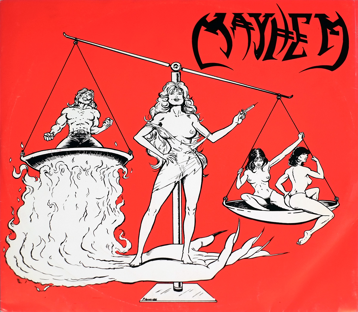
"MAYHEM - Bloodrush" (1985) Album Description:

"Bloodrush" is a three-track 12" EP that doesn’t knock. It barges in—wet coat smell, cheap amp heat, that UK mid-80s tension you could taste on a sticky floor. Southport grit aimed through Manchester tape, and the whole thing moves like it’s late for the last bus. No manifesto. No mercy.

Britain, 1985: clenched jaws and loud rooms

Britain in 1985 felt tight in the shoulders. Post-miners’ strike atmosphere, money worries, the kind of background stress that makes crowds impatient and bands play faster. The punk circuit didn’t behave like a “scene,” it behaved like weather—changing nightly, drifting from clubs to back rooms to anywhere a promoter could borrow a PA and pretend it would survive the set.

Records like this didn’t arrive with polite introductions. They arrived like proof. Someone out there was still making noise on purpose.

Where it sits: UK82 roots, metal weight creeping in

Mayhem came out of Southport as a UK82 band , street-punk first—boots on, elbows out—and by the time "Bloodrush" lands in 1985, the music leans heavier without putting on a costume. That’s the trick: the punk posture stays, but the guitar tone starts swinging with more weight. Motörhead is the obvious permission slip here, the one everybody “accidentally” borrowed.

The band’s history is tangled up with the local ecosystem too: members overlapping with Blitzkrieg and The Insane isn’t trivia, it’s geography. Same towns, same practice spaces, same handful of people who actually showed up.

Peers in the air that year (not a family tree, just the vibe)

The record makes more sense when it’s rubbed against the other rough edges floating around 1985. Not “influences,” more like neighboring rooms where the shouting leaks through the walls:

  • English Dogs (already dragging punk into heavier mud)
  • Broken Bones (hardcore speed, zero softness)
  • Discharge (still the blueprint for ugliness with discipline)
  • GBH / The Exploited (street-punk hooks, bigger fists)
  • Onslaught (British thrash arriving blunt and hungry)
  • D.R.I. (showing how fast punk could pivot into metal attack)

Mayhem don’t sound like they’re chasing any of them. "Bloodrush" sounds like a local answer—short, sharp, and stubborn.

The sound: three tracks, no hiding places

Three tracks forces honesty. Weak riffs don’t get rescued by track four. Lazy drumming doesn’t get forgiven because “the album grows on you.” This EP doesn’t grow on you. It grabs you by the collar and checks your pockets for spare change.

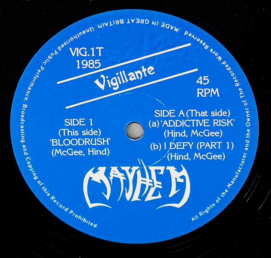
"Bloodrush" fires first: clipped phrasing, forward shove, the band daring the tape to keep up. "Addictive Risk" keeps the same nervous pulse but shifts its weight—less straight-line sprint, more skidding corner. "I Defy (Part 1)" is the one that leaves the door open, like the band is halfway through a sentence and refuses to finish it politely.

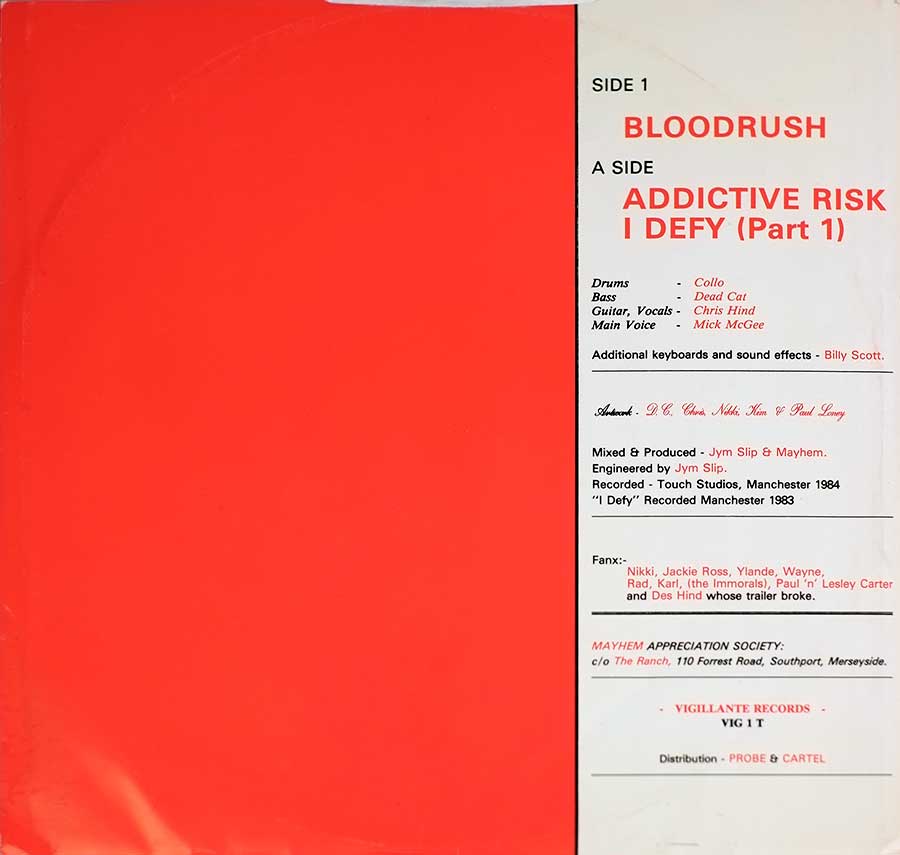
People who mattered here (because work leaves marks)

Jym Slip gets credited as producer and sound/recording engineer, and that usually translates to one practical thing: somebody made sure the chaos stayed in focus while the clock kept biting. The band also takes a producer credit, which reads like control, pride, and maybe a little paranoia—useful qualities when you’re trying to capture something this tense without smoothing the teeth off it.

Touch Studios in Manchester is where it went down, recorded across 1983 and 1984. That span matters. It suggests a band returning, tightening, trying again—songs living in rehearsal rooms and then getting nailed to tape when the moment finally cooperated.

Misconceptions, because the name causes trouble

No famous scandal hangs off this EP. The main confusion is lazier: people see “Mayhem” and drift toward the Norwegian black metal band out of habit. Wrong country. Wrong era. Wrong set of problems. This is a UK street-punk outfit, and "Bloodrush" is their 1985 12" statement on Vigillante Records, not a corpse-painted mythology exercise.

Another myth is that punk-to-metal crossover had to announce itself with shiny production or technical flexing. Not here. This one wins by being direct and by staying angry without getting theatrical about it.

One quiet personal anchor

Late-night radio, half-dead cassette deck, finger hovering near “record” because the DJ might actually play something risky at this hour. Next day, the same EP sits in the rack like it’s waiting to be picked for a fight.

References

Best part is how little it asks permission. Turn it up, and it still sounds like it wants a hallway—not a pedestal.

Album Key Details: Genre, Label, Format & Release Info

Music Genre:

Obscure Punk Crossover

Obscure Punk Crossover blends the raw urgency of early punk with the heavier, more aggressive edge of crossover experimentation. Expect short, fast, and confrontational tracks driven by distorted guitars, pounding rhythms, and a DIY attitude rooted in underground scenes of the mid-1980s.

Label & Catalognr:

Vigillante – Cat#: VIG.1T

Media Format:

Record Format: 45RPM 12" Vinyl Stereo Gramophone Record
Total Weight: 230g

Release Details:

Release Date: 1985

Release Country: Great Britain

Production & Recording Information:

Producers:
  • Jym Slip – Producer

    Studio lifer with a practical ear and zero patience for flab.

    Jym Slip, a hands-on Manchester producer type who favors momentum over polish, keeps "Bloodrush" lean and mean: guitars bite without turning to mush, the rhythm section lands like a boot, and the whole thing feels recorded by people who actually meant it. No fancy perfume—just pressure, punch, and speed.

  • Mayhem – Producer

    Band-as-producer: when control freakery actually helps the music.

    Mayhem, a UK underground crossover crew with DIY instincts, steer the production like it’s their van, their amps, and their last ten quid. On "Bloodrush" the choices sound deliberate: vocals up front, riffs kept sharp, tempos allowed to sprint, and zero smoothing of the rough edges that make this thing feel alive.

Sound & Recording Engineers:
  • Jym Slip – Sound & Recording Engineer

    The person behind the desk when the red light turns nerves into takes.

    Jym Slip, the engineer with the job of catching chaos without letting it smear, nails the recording side of "Bloodrush": drums stay tight at 45RPM attack speed, bass doesn’t vanish behind the guitars, and the stereo spread is simple but effective. Plenty of room for aggression, not much room for excuses.

Recording Location:
  • Touch Studios – Manchester, United Kingdom

    A working Manchester room where bands come to sweat, not to pose.

    Touch Studios, Manchester, United Kingdom, is the kind of place that rewards bands who can play the parts and punishes anyone hoping studio magic will do the heavy lifting. Recorded across 1983 and 1984, "Bloodrush" comes off direct and uncluttered—close-miked bite, minimal gloss, and a live-room feel that keeps the grit believable.

Band Members / Musicians:

Band Line-up:
  • Mick McGee – Main Voice

    Frontman energy with that no-nonsense punk bite, built for short, loud, and memorable.

    Mick McGee, a shout-first lead vocalist in the UK underground tradition, drives "Bloodrush" like he’s trying to outrun the drummer. The delivery stays sharp and urgent, cutting through the guitars without getting swallowed, and the phrasing keeps the songs feeling dangerous rather than merely fast. Attitude, diction, and bruises—job done. McGee later transitioned into a career as a sound engineer at the Roundhouse in London

  • Chris Hind – Guitar, Vocals

    Riff worker and backup throat—two jobs, zero vanity, all forward motion.

    Chris Hind, guitarist-vocalist type from the punk-to-crossover trenches, gives "Bloodrush" its teeth. The guitar sound is lean and wired, riffs clipped and aggressive, with just enough grime to feel real. Vocal support adds that gang-snarl texture where it counts, keeping the choruses rowdy and the momentum pinned to the wall. He was a founding member of Blitzkrieg and a frequent collaborator with Jym Slip at Touch Studios.

 
  • Dead Cat – Bass

    Low-end enforcer: the glue between punk speed and crossover shove.

    Dead Cat, a bassist with the classic job of making chaos feel like a song, keeps "Bloodrush" from turning into a blur. The lines sit right under the riffs—tight, audible, and stubborn—adding weight without slowing the pace. That steady thump gives the 12" punch and stops the guitars from hogging all the oxygen. Most likely his real-name was Paul Lobley. He was previously in the band The Set Up.

  • Collo – Drums

    A drummer built for 45RPM trouble—fast hands, hard stops, and no mercy.

    Collo, a straight-ahead punk drummer with crossover stamina, is the engine room on "Bloodrush". The playing stays tight at speed—snare cracks, kicks lock in, and the transitions land clean instead of wobbling. That discipline is what makes the record hit like a short fight: quick, direct, and already moving to the next punch. His real name is Mick Collinson. He was previously a member of the Southport band The Dumb Blondes.

Complete Track-listing:

Tracklisting Side One:
  1. Bloodrush
Video: Mayhem - Bloodrush Crossover at its Best
Tracklisting Side Two:
  1. Addictive Risk
  2. I Defy (Part 1)

Disclaimer: Track durations shown are approximate and may vary slightly between different country editions or reissues. Variations can result from alternate masterings, pressing plant differences, or regional production adjustments.

Album Front Cover Photo
MAYHEM – Bloodrush (1985, UK) 12-inch 45RPM EP front cover on Vigillante Records VIG.1T. Bright red matte sleeve with black-and-white line illustration of a nude woman balancing scales: muscular man rising from flames on one side, two seated nude women on the other. Large black Mayhem logo top right. Non-laminated stock shows corner whitening, light ring impression, faint edge rub and minor pressure creases typical of mid-80s UK indie pressing.

First thing that hits is the red. Not polite crimson. Cheap, unapologetic, mid-80s UK red that soaks into the matte stock and dares the shelf to fade it. In the hand, the ink feels dense but not glossy—no lamination here—so every fingerprint shows if you catch it in the wrong light. Corners already whispering white, top right slightly blunted, the kind of honest shelf wear that tells you it wasn’t bought to be framed.

The illustration is pure underground bravado: a towering nude woman balancing scales, one pan holding a muscle-bound man clawing up through flames, the other carrying two seated nude women posed like they’re bored of the whole argument. It’s provocative in that early-80s punk way—half satire, half adolescent grin—and not remotely interested in subtlety. The black line work bites hard against the red field; no gradients, no softness, just thick comic-book strokes that feel deliberate rather than refined.

The Mayhem logo sprawls across the upper right in jagged black lettering, slightly top-heavy, like it was pushed up there late in the layout process. Alignment isn’t perfect and that’s exactly why it works. Too neat and it would feel calculated. Here it feels like someone cared more about impact than grid systems. The scale beam stretches nearly the full width, giving the eye a line to follow, though the empty red space on the left feels almost confrontational. Some would call it imbalance. It feels intentional, maybe even stubborn.

Handling this copy reveals a faint ring impression beginning to ghost through the red, especially under angled light—evidence of the 12-inch pressing sitting snug inside for decades. There’s a slight pressure ripple near the lower spine edge, likely from being packed too tight between heavier sleeves. No price sticker residue on this one, thankfully, but the paper has that faint, dry drag you get from UK indie stock of the era. Not luxurious. Honest.

Conceptually, the sleeve doesn’t hide what the band is about. It’s confrontation staged as a crude moral scale—strength versus temptation, maybe, or just provocation for its own sake. Either way, it’s loud before the needle ever drops. And that’s the point.

Album Back Cover Photo
MAYHEM – Bloodrush (1985, UK) 12-inch EP back cover on Vigillante Records VIG 1 T. Split red and white layout with left red panel and right white credits panel listing tracks, band members, Billy Scott keyboards, Jym Slip production, Touch Studios Manchester 1983–84, distribution by Probe & Cartel. Matte stock shows ring wear, edge rub and light corner wear.

Flip the sleeve over and the design drops the theatrics. Left half is that same blunt red field, uninterrupted, already showing a faint circular ring starting to ghost through if you tilt it under light. Right half turns clinical white, almost like the printer ran out of patience. The split is hard and vertical, no fade, no decoration—just red versus information.

Track titles shout in red caps—BLOODRUSH, ADDICTIVE RISK, I DEFY (Part 1)—and they sit slightly higher than you expect, giving the layout a top-heavy feel. It isn’t elegant. It’s efficient. Credits line up underneath in tidy black type, roles on the left, names in red on the right. That red-on-white pairing bleeds ever so slightly at the edges on this copy, typical of mid-80s indie runs where registration wasn’t a religion.

Production notes confirm what the front implied: mixed and produced by Jym Slip & Mayhem, engineered by Jym Slip, recorded at Touch Studios, Manchester 1984, with “I Defy” tagged 1983. That staggered recording date tells its own story—songs carried forward, not dashed off in a weekend. Additional keyboards and sound effects credited to Billy Scott, tucked in without fanfare.

Look closer and the paper stock gives it away. Matte, slightly dry to the touch, with a light ripple near the lower spine edge from being stored tight between thicker sleeves. Bottom right corner shows the first signs of whitening; top edge has a whisper of rub where it’s slid in and out of racks for decades. No barcode cluttering things up—distribution noted as Probe & Cartel, Vigillante Records VIG 1 T centered with just enough pride.

There’s even a fan club address—Mayhem Appreciation Society, Southport—printed like an invitation to write a letter instead of clicking a link. That’s the part that feels honest. No gloss. No hype copy. Just names, places, and the sense that this record came from a room, not a marketing plan.

Close up of Side One record’s label
MAYHEM – Bloodrush (1985, UK) 12-inch EP Side One record label on Vigillante Records. Blue label with white geometric star and circular line design, handwritten-style lyric text around the rim reading 'And the beast that I saw was like a leopard, it looked like a lion.' Center spindle hole shows light wear and faint scuffing consistent with play.

Pull the record from the sleeve and the blue label jumps out harder than the cover art ever did. Not glossy, not fashionable—just that saturated, almost electric blue that indie labels seemed to favor when budgets were tight but conviction wasn’t. White ink sits on top in a sharp geometric design: overlapping star points and tight concentric rings that feel slightly over-ambitious for a small operation. It’s bold. A little theatrical. And unapologetically so.

Circle the outer rim and the text reads like a cryptic aside rather than a standard label credit. No catalog clutter screaming for attention here. Instead, a lyric fragment wraps around the edge in a loose, handwritten style: “And the beast that I saw was like a leopard, it looked like a lion.” That choice feels deliberate, almost defiant. Religious imagery? Apocalyptic hint? Or just something that sounded suitably ominous at the time. Either way, it’s not neutral decoration.

Look closely near the spindle hole and the truth of the copy shows up. Light whitening where the vinyl has met metal dozens of times. A faint crescent scratch near the inner ring that won’t affect playback but tells you this wasn’t sealed away in some collector’s fantasy. There’s a shallow press ripple visible under angled light—typical of mid-80s UK runs—nothing catastrophic, just manufacturing reality.

The white ink has held up surprisingly well; no bleeding into the blue, no obvious misregistration. That alone suggests care at the pressing stage. Still, the slight scuff halo around the center gives away its working life. This wasn’t a display piece. It was played. Probably loud.

Side Two Close up of record’s label
Close up of Side Two record’s label
Close up of Side Two label for MAYHEM - Bloodrush (1985) on Vigillante Records VIG.1T, blue label with white print, 45 RPM marking, full track listing and UK rim text

This is the blue Side Two label of MAYHEM – Bloodrush, a 1985 UK 12-inch 45RPM EP on Vigillante Records. The colour is a strong mid-blue, slightly uneven where the paper has absorbed ink differently around the spindle hole. White print sits sharply on top, with no drop shadows or decoration—just functional contrast meant to be read in low light.

At the top: “VIG.1T” and “1985” in block capitals. Beneath that, the label name “Vigillante” appears in a curved, slightly playful serif script, framed by two thin horizontal white lines. On the right side, “45 RPM” is printed clearly, confirming the single-format identity of this pressing. The track layout divides the disc into “SIDE 1 (This side)” and “SIDE A (That side)”—a slightly cheeky piece of wording that fits the band’s no-frills attitude.

The lower half carries the MAYHEM band logo in white: jagged, sharp-edged lettering with elongated strokes that resemble blades or torn metal. It functions purely as brand identity—no symbolism beyond aggression and underground intent—but its placement at the bottom balances the label visually and reinforces the band’s presence against the otherwise orderly typography.

Around the outer rim runs fine-print copyright text in English, stating that unauthorized public performance, broadcasting and copying of the record is prohibited, and that it was made in Great Britain. The rim text forms a complete circular boundary. Light spindle wear is visible at the center hole, with faint whitening and minor scuff arcs radiating outward—evidence that this copy has actually been played. The glossy vinyl surface surrounding the label shows subtle hairline marks consistent with normal handling of a 12-inch EP from the mid-1980s UK pressing plants.

Vigillante Records, United Kingdom Label

Vigillante Records was a small independent UK label active during the mid-1980s punk and crossover underground scene. This particular blue-and-white label design was used by Vigillante Records between approximately 1984 and 1986 for 12-inch EP releases.

Colours
Mid-blue background with solid white typography and logo elements.
Design & Layout
Clean radial layout, catalogue and year at top, label name centered, 45 RPM marking on right, track listings divided left and right of spindle hole, band logo at bottom.
Record company logo
“Vigillante” printed in curved serif script between two horizontal white rules; serves as brand identifier for the independent UK label.
Band/Performer logo
Stylized MAYHEM logo in jagged, blade-like lettering positioned at the bottom half of the label.
Unique features
Unconventional side wording “This side” and “That side”; independent-label minimalism; strong colour contrast for club lighting visibility.
Side designation
Marked as “SIDE 1 (This side)” and “SIDE A (That side)” rather than traditional A/B formatting.
Rights society
No explicit rights society code visible on label face; standard UK copyright warning printed in rim text.
Catalogue number
VIG.1T
Rim text language
English – includes manufacturing and unauthorized copying prohibition notice.
Track list layout
Left and right column arrangement around spindle hole with songwriter credits in parentheses.
Rights info placement
Printed in fine circular rim text along outer edge of label.
Pressing info
“Made in Great Britain” included in rim text; distributed by Probe & Cartel (noted on sleeve).
Background image
Solid colour field; no imagery or illustration beyond typographic and logo elements.

All images on this site are photographed directly from the original vinyl LP covers and record labels in my collection. Earlier blank sleeves were not archived due to past storage limits, and Side Two labels are often omitted when they contain no collector-relevant details. Photo quality varies because the images were taken over several decades with different cameras. You may use these images for personal or non-commercial purposes if you include a link to this site; commercial use requires my permission. Text on covers and labels has been transcribed using a free online OCR service.