Iron Maiden - Sanctuary (1980, Netherlands, EP) 12" EP ALBUM VINYL

- the cover that turned shock into identity overnight

Iron Maiden Sanctuary EP Netherlands front cover with Eddie crouching over Margaret Thatcher on pavement, knife in right hand, torn political poster across her body, yellow-black color scheme, brick wall and posters on left, streetlights and cloudy sky in background, slight print softness and warmer tones visible across sleeve

Stark yellow-black palette frames Eddie crouched mid-strike over a fallen Margaret Thatcher on a deserted street. Harsh shadows, crude urban textures, and smeared sky tones give it a tabloid violence feel. Top corner banner screams “4 Tracks Inc / 2 Live Tracks,” almost pasted on.

Iron Maiden – Sanctuary didn’t arrive politely knocking—it kicked the door in and left it swinging. Right in the thick of the NWOBHM surge, this 1980 EP caught the band before the edges were filed down, when the sound still had grit under its fingernails. “Sanctuary” itself snaps like a street fight, “Prowler” stalks with that early predatory swagger, and the live “Drifter” drags you straight into the sweat and noise of a packed Marquee Club. Produced by Will Malone, it keeps just enough control to hold together without sanding off the danger. Not their first move, but the one where things started to feel inevitable.

"Sanctuary" (1980) Album Description:

By the time "Sanctuary" landed in this Dutch 12-inch form, Iron Maiden were already past being a rumour traded between tape hounds and readers of the weekly music papers. Britain in 1980 was all hard edges, stale politics, cheap pints, and young metal bands forcing their way out of club basements while punk’s aftershock still rattled the walls. This EP catches Maiden right in that ugly useful gap between hunger and control. It does not sound settled. It sounds like a band that still had grit under its nails and no real interest in washing it off.

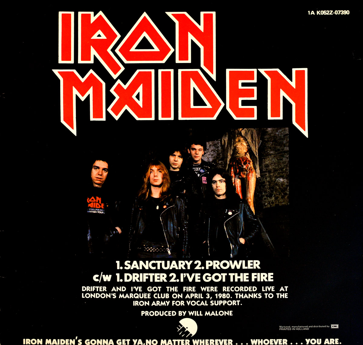
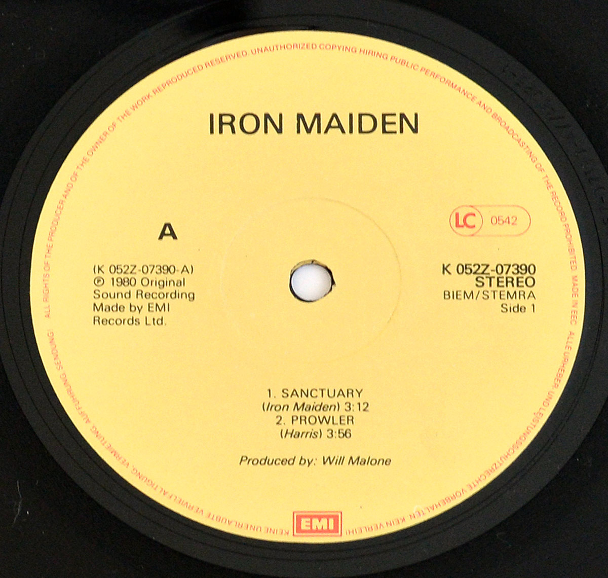
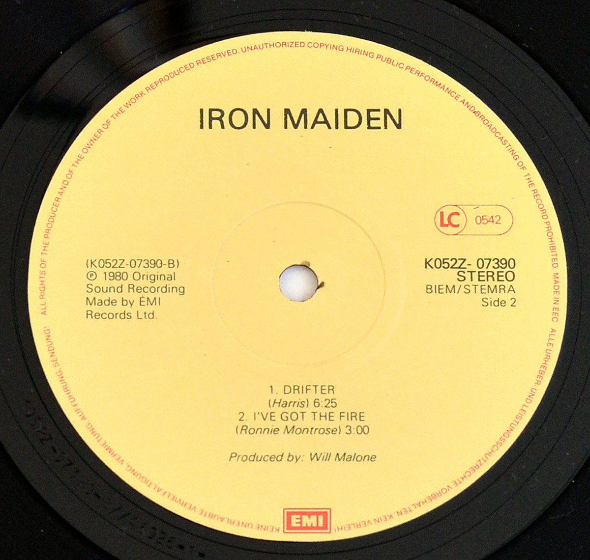
That is why this Netherlands pressing is more interesting than the usual early-Maiden mist around it. One side throws two sharp studio cuts at you, the other side jumps into the Marquee with two live recordings, and the sleeve keeps leaking clues if you bother to look past the obvious scandal bait: warmer inks, softer blacks, that barking corner flash about the live tracks, pale yellow EMI labels, and matrix text that says more than half the collector chatter ever does. Open the hidden part and the record stops being a slogan and starts behaving like evidence.

The lazy version of the story says this was the birth of the beast. Not quite. By spring 1980 Maiden had already dragged themselves through "The Soundhouse Tapes", the "Metal for Muthas" appearance, "Running Free", and the debut LP. What "Sanctuary" really catches is the moment after the door had been kicked open but before anyone had tidied the room. In the same stretch, Saxon were going for heavier road-burn weight, Angel Witch were freezing the air with occult chill, Def Leppard were already sniffing out cleaner hooks, Samson still had pub-floor bruises on them, and Diamond Head were stretching riffs into bigger shapes. Maiden went more direct than most of them. Faster in the wrist. Dirtier in attitude.

The line-up was still twitchy, and that matters. Steve Harris had built the thing through stubbornness more than comfort, Clive Burr had given the rhythm a sharper lift than the earlier set-up, Dennis Stratton was still in the picture before the chemistry shifted later that year, and Paul Di’Anno still sounded like the bloke out front rather than a future monument in a band shirt. That instability gives the record its charge. The playing is tight enough to hold, but there is still a sense that somebody might shove the tempo, lean too hard into the chorus, or start grinning at the wrong moment. Good. Early NWOBHM should feel like that.

"Sanctuary" itself moves with clipped attack and no wasted pleasantries. The riff gets in first, the vocal snaps back, and the whole thing has that compact street-level shove that later Maiden, for all their scale and craft, sometimes left behind. "Prowler" still carries the sly grime of the first album, less heroic than the band would soon become and better for it. There is bite in these studio sides, but not the polished bite of a band already thinking about arenas. More like a switchblade pulled in bad light.

Then Side Two changes the air. "Drifter" and "I've Got the Fire" were recorded live at the Marquee Club on 3 April 1980, and they sound like it: crowded, vocal, a little ragged around the edges, absolutely alive. The so-called Iron Army vocal support is not some neat backing-choir touch either. It feels like the room leaning in. Plenty of live tracks from the era sound dutiful, inserted because somebody wanted extra value for money. These do not. They drag sweat, shove, and a bit of club-room chaos onto the record, which is exactly what this release needed.

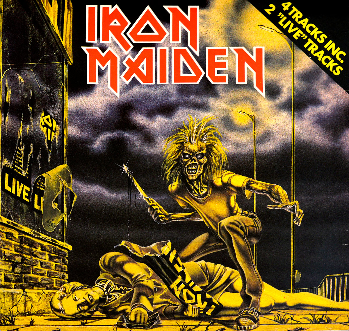
Will Malone tends to get treated like a suspicious character in early Maiden talk, mostly by people who think every origin story ought to arrive bleeding onto the tape. That gets old. His job here was practical: keep the thing from turning to mush, stop the guitars from blurring, leave the rhythm section enough space to move, and make sure the band’s aggression translated onto vinyl without collapsing into thin noise. He did not tame them into respectability. He just made sure the punch landed. Derek Riggs, meanwhile, handled the visual end with all the tact of a brick through a shop window.

The sleeve did what it was built to do. Britain had Thatcher. Maiden had Eddie. Somewhere between tabloid instinct and smart provocation, the band and their camp realised that putting the future Iron Lady on the pavement under Eddie’s knife was cheaper than buying an advertising campaign and a lot harder to ignore. It is not subtle. It was never supposed to be. The common myth is that this was some grand forbidden object; in truth, it was rude, opportunistic, and memorable, which in 1980 heavy metal was often the more useful combination anyway.

On a cluttered desk late at night, this Dutch copy always looks a shade less glamorous than the legend around it. Then the yellow EMI labels catch the lamp, the run-out codes come into focus, and the whole thing stops looking ordinary.

What makes this Netherlands 12-inch worth holding onto is not fake rarity theatre. It is shape, timing, and nerve. Four tracks. Two of them live. A sleeve that still smirks. Pressing details that separate this copy from the prettier stories people tell after the fact. And a band not yet trapped inside its own mythology. That is Iron Maiden’s NWOBHM at the interesting stage, before the banners got bigger, before the epics stretched out, and before anyone had learned to iron the shirt.

References
Collectors information

Side Two of this EP contains the songs: "Drifter" and "I've Got Fire". This EP is the first release album with these two live tracks.

"Drifter" and "I've Got The Fire" were recorded live at London's Marquee Club on 3 April 1980 with vocal support by the "Iron Army".

Album front cover

The album front cover shows the British Prime Minister Margaret Thatcher slaughtered by Eddie.

Top right corner:

4 Tracks Inc
2 "Live" Tracks

Album back cover

Top right corner:
1A K052Z-07390

Bottom center:
Black & White EMI logo in a circle

Bottom right corner:
Marketed, manufactured and distributed by EMI-logo
PRINTED IN HOLLAND

Labels - Side One

Copyrights text in the rim of the label in both English and German

At 3 o'clock:
in Red print: LC 0542
K 052Z-07390
STEREO
BIEM/STEMRA
Side 1

At 6 o'clock:
EMI-Logo inside a red box

At 9 o'clock:
(K 052Z-07390-A)
1980 Original
Sound Recording
Made by EMI
Records Ltd

Labels - Side Two

Copyrights text in the rim of the label in both English and German

At 3 o'clock:
in Red print: LC 0542
K 052Z-07390
STEREO
BIEM/STEMRA
Side 2

At 6 o'clock:
EMI-Logo inside a red box

At 9 o'clock:
(K 052Z-07390-B)
1980 Original
Sound Recording
Made by EMI
Records Ltd

Matrix code / run-out grooves - Side One

K025Z-07390-A//46025-1Y C1

Matrix code / run-out grooves - Side Two

K052Z-07390-B//46026-1-Y C1

Album Key Details: Genre, Label, Format & Release Info

Music Genre:

NWOBHM  British Heavy Metal

Label & Catalognr:

EMI – Cat#: K 052Z-07390

Media Format:

Record Format: 12" Vinyl Stereo Gramophone Record
Total Weight: 210g

Release Details:

Release Date: 16 May 1980

Release Country: Netherlands

Production & Recording Information:

Producers:
  • Will Malone – Producer, Sound Engineer

    Best known as a British producer, arranger and conductor who drifted through rock, pop and orchestral sessions without ever sounding house-trained.

    Will Malone, came out of the British studio world as one of those adaptable behind-the-desk names who could handle arrangement, production and bigger sonic framing without making a fuss about it. On "IRON MAIDEN - Sanctuary (EP)" he produced the session with a surprisingly firm hand, helping shape those early recordings into something sharper and more presentable than the band’s club-room chaos, while still leaving enough grime on the boots to keep the thing alive.

Album Cover Design & Artwork:
  • Derek Riggs – Illustrator, Cover Artist

    I have always liked the way Riggs made heavy metal look dangerous, not decorative.

    Derek Riggs is the British illustrator who gave Iron Maiden its face, its menace, and half its mythology. I still see him as one of the few cover artists who didn’t just package a band, he enlarged it. His run with Iron Maiden began in 1980 with the debut and stretched through the classic 1980s into the early 1990s, before later returns for Brave New World in 2000 and Somewhere Back in Time in 2008. Outside Maiden, he turned up on Budgie’s Nightflight in 1981, Bruce Dickinson’s Accident of Birth in 1997, Gamma Ray’s Power Plant in 1999, and Stratovarius’ Infinite in 2000. That is a proper career, not a side note.

Production Notes:

The album "IRON MAIDEN - Sanctuary (EP)" was produced by Will Malone, who also handled sound and recording engineering duties.

Collector’s Note: The Dutch four-track "Sanctuary" that casual fans keep underestimating

This Dutch 12" of "Sanctuary" is not Iron Maiden's first step onto vinyl, and that is exactly why it matters. By May 1980 the band had already kicked a few doors off the hinges: "The Soundhouse Tapes", the "Metal for Muthas" appearance, "Running Free", the debut LP. So this record should not be sold as some misty-eyed origin myth. It is better than that. It catches Maiden at the moment when the rough edges were still hanging out in public and nobody had started polishing the danger away.

What makes this Netherlands pressing worth a collector's second look is the shape of it. Four tracks, not the usual quick in-and-out single treatment. "Sanctuary" and "Prowler" on one side, then "Drifter" and "I've Got the Fire" live from the Marquee Club on 3 April 1980 on the other. That is the kind of configuration that makes you stop flipping and actually read the sleeve. Add the Dutch EMI number 1A K052Z-07390, the label variations, the "4 Tracks Inc 2 Live Tracks" flash on the cover, and suddenly this is not just another early Maiden record. It starts to feel like a proper shelf piece.

Then there is the sleeve, and yes, that is still half the fun. Eddie looming over Margaret Thatcher was never designed to sit quietly in the background like wallpaper for polite people. On this uncensored cover it still has that cheap-shot tabloid nastiness that early Maiden used so well. Derek Riggs had not yet become an institution. He was still making things look slightly feral, slightly grubby, slightly out of order. Much better. Heavy metal sleeves should occasionally look like they might get you side-eyed by your aunt.

For me, this is the sort of record that wakes up an early Maiden run that is starting to look a little too respectable. Not some impossible grail, not some bargain-bin shrug either. It lives in that far more interesting space where the music is hungry, the sleeve still bites, and the pressing details give collectors something real to chase. Miss this Dutch 12" and the story still works, sure. It just loses a bit of blood.

Collector’s note: Musicians are not credited on the original album cover.

Complete Track-listing:

Tracklisting Side One:
  1. Sanctuary
  2. Prowler
Video: Iron Maiden - Sanctuary (Live After Death 1985)
Tracklisting Side Two:
  1. Drifter
  2. I've Got the Fire
Video: Iron Maiden - I've Got The Fire
Collector’s note: Side Two features two live recordings from the Marquee Club, London (3 April 1980), capturing Iron Maiden in their raw early form with audience participation from the so-called "Iron Army".

Disclaimer: Track durations shown are approximate and may vary slightly between different country editions or reissues. Variations can result from alternate masterings, pressing plant differences, or regional production adjustments.

First glance, the sleeve already tells you this isn’t a polite record. The print leans slightly warm, reds pushed a notch too far, while the blacks just sit there—no real depth, more like they’ve given up halfway. Compared to the UK copies, this Dutch one feels a touch softer, almost like the plates were a generation down. Eddie’s little encounter with Thatcher still lands though—no censorship, no apology. Top corner text—“4 Tracks Inc / 2 Live Tracks”—looks slapped on late, slightly misaligned if you stare long enough. Flip it over and it turns functional: catalogue numbers, logos, placement over personality. You can feel the factory thinking. But the real clues? They’re hiding deeper—labels, matrix etchings, and the kind of small print most people never bother to read.

Album Front Cover Photo
Iron Maiden Sanctuary EP Netherlands front cover with Eddie crouching over Margaret Thatcher on pavement, knife in right hand, torn political poster across her body, yellow-black color scheme, brick wall and posters on left, streetlights and cloudy sky in background, slight print softness and warmer tones visible across sleeve

Pulled this one out and the first thing that hits isn’t Eddie—it’s the colour. That heavy yellow wash over everything, like the printer decided subtlety was for someone else’s budget. Blacks don’t bite, they sort of hover, especially in the clouds. Looks almost smoky instead of solid. Under a desk lamp you can see the grain in the darker areas, a faint speckling where the ink didn’t quite settle. Edges of the sleeve show the usual light rub, especially along the bottom where it’s been dragged in and out of shelves too many times. Left side brickwork is softer than it should be, like the plate lost a bit of sharpness somewhere along the line.

Eddie himself—mid-lunge, all elbows and bad intent—comes off slightly flatter than on the UK copy. The hair still explodes outward, but the highlights bleed a little into the background. That knife catches the light though, a sharp little white streak that somehow survives the printing compromises. The torn poster across Thatcher’s body is where things get messy in a good way. You can see the jagged edges, the typography breaking apart, but also a slight misregistration where yellow and black don’t quite line up. That kind of thing drives designers mad, collectors quietly smile.

Top right corner—“4 Tracks Inc / 2 Live Tracks”—feels like it was slapped on five minutes before deadline. Angle’s slightly aggressive, almost shouting over the artwork. Ink there is denser, oddly enough, as if that layer got more attention than the rest of the sleeve. Always found that mildly irritating. Either commit to the chaos or don’t. This sits somewhere in between.

And then there’s Thatcher. The Iron Lady herself, reduced here to pavement decoration, handbag still clutched like it’s going to save her. There’s a certain blunt honesty to it—no metaphor, no cleverness, just straight-up shock value. Subtle as a brick, which fits the band at this stage. Can almost hear some EMI executive sighing while signing off on it. Or pretending not to notice.

Funny thing is, the caricature doesn’t even try to be accurate. Face is softened, almost generic, like the artist wasn’t too concerned with likeness as long as the message landed. And it does. Even now it still feels a bit cheeky, slightly uncomfortable in that early ’80s way where nobody quite knew where the line was—so they stepped over it just to check.

What keeps pulling attention back, though, are the small things—the uneven blacks in the sky, the faint wear along the spine edge, the way the yellow ink pools just a fraction heavier around Eddie’s arms. That’s where this sleeve starts telling the truth. The real story isn’t the scene—it’s how it was printed, handled, and slowly worn into something a bit more honest than it started out.

Album Back Cover Photo
Iron Maiden Sanctuary EP Netherlands back cover with large red band logo at top, five band members in leather jackets centered below, track listing text in white beneath, small EMI logo and printed in Holland credit at lower right, catalogue number 1A K052Z-07390 top right, black background with slight surface wear visible

Turn the sleeve over and everything tightens up. Front was chaos, this is paperwork pretending to be design. Big red logo dominates the top, clean and sharp, almost too clean compared to the rest of the print. Under it, the band stands there like they’ve been told to behave for five minutes. Leather jackets, blank expressions, slightly awkward spacing—classic early promo shot. You can see the grain creeping in around their faces, especially in the darker areas, where the black background starts swallowing detail instead of holding it.

That track listing sits dead centre, all caps, no personality whatsoever. Functional, almost stubbornly so. “1. SANCTUARY 2. PROWLER…” just lined up like inventory. There’s a faint softness to the white ink, not quite crisp, like the edges are breathing a little. Look close and you’ll spot tiny inconsistencies where letters don’t fully lock into the black—nothing dramatic, but enough to remind you this wasn’t printed yesterday.

The band photo itself always feels slightly off to me. Lighting’s uneven—faces catch a bit of shine while jackets disappear into the background. And then there’s that odd detail behind them, the hanging figure half hidden in shadow. Easy to miss at first, then impossible to ignore. Feels like someone slipped it in just to keep things from getting too straightforward. Not subtle, just lurking.

Top right corner carries the catalogue number, small but sharp—“1A K052Z-07390”—printed with more confidence than half the rest of the sleeve. Down at the bottom right, the EMI credit and “Printed in Holland” line sit quietly, almost apologetic. You’ll often see slight rubbing around that area, and this copy’s no exception. A bit of dulling where fingers have held it over the years, pulling it out, flipping it, putting it back without thinking.

And then that final line across the bottom—“IRON MAIDEN’S GONNA GET YA…”—spaced out like it’s trying too hard to sound threatening. It’s blunt, maybe even a bit corny, but it sticks. Ink there is heavier, more solid than the track listing above, almost like they wanted to make sure you didn’t miss it. Still, between the soft blacks, the slightly fuzzy whites, and the odd little details hiding in the shadows, this back cover tells you more about the pressing than the music ever could.

Close up of Side One record’s label
Close-up of Iron Maiden Sanctuary EP Netherlands Side One vinyl label, pale yellow EMI label with black text, red LC 0542 marking on right, spindle hole centered with slight wear, track listing Sanctuary and Prowler below, BIEM STEMRA rights text and K 052Z-07390 catalogue number visible, black vinyl grooves surrounding label

Drop the needle area into view and suddenly the sleeve stops pretending and the record starts telling the truth. That pale yellow EMI label isn’t as clean as it first looks. Under light, it leans slightly uneven—subtle shifts in tone where the ink sat differently during pressing. Not dramatic, just enough to break the illusion of uniformity. Around the spindle hole there’s the usual wear, faint grey scuffing where it’s been played more than a few times. Nothing abusive, just honest handling.

Text layout is pure early ’80s EMI Europe—functional, almost stubbornly dull. “IRON MAIDEN” sits up top, spaced wide, not quite centered if you really line it up with the hole. That kind of thing shouldn’t matter, but it does once you’ve seen enough of these. The catalogue number “K 052Z-07390” is printed with more authority than the band name, slightly heavier ink, sharper edges. And then there’s that red LC 0542 box off to the right—always looks like it was added later, like a bureaucratic stamp rather than part of the design.

Look closer at the track listing—“Sanctuary” and “Prowler”—and the type starts to wobble just a touch. Not crooked, just not perfectly locked. Tiny inconsistencies in the black ink, especially where letters meet the yellow background. It gives the whole thing a faint softness, like the plate had seen one press too many. Same story with “BIEM/STEMRA,” tucked in politely, doing its legal job without adding anything visually.

Outer rim text, printed in red, circles the label like a warning nobody reads. On this copy it’s slightly faded in places, especially near the lower edge, where fingers have brushed it over time. You can even catch a slight sheen difference between the label and the vinyl itself—the grooves reflecting light sharply while the label just absorbs it. That contrast always gives these EMI pressings a certain no-nonsense feel.

And then the little things creep in. A faint pressing ripple near the edge of the label, barely visible unless you tilt it. A tiny nick near the spindle hole where someone missed the center once. None of it hurts playback, but it all adds up. This is where the record stops being a product and starts being an object that’s actually lived a bit.

Side Two Close up of record’s label
Close-up of Iron Maiden Sanctuary EP Netherlands Side Two vinyl label, pale yellow EMI label with black text, red LC 0542 marking on right, spindle hole centered with visible wear, track listing Drifter and I've Got The Fire below, BIEM STEMRA text and catalogue number K 052Z-07390 present, surrounded by black vinyl grooves with light reflections

Flip it over and Side Two doesn’t even try to pretend it’s different. Same pale yellow EMI label, same layout, same slightly tired look to the ink. But this is where you start noticing the differences that actually matter. The colour isn’t perfectly even—there’s a faint shift toward a slightly duller tone on the lower half, like the ink settled unevenly during pressing. Nothing dramatic, just enough to make it feel less machine-perfect than it probably wanted to be.

The spindle hole tells its own story. Slight wear again, but this time there’s a tiny chip on the edge—someone missed the center once, maybe twice. Happens more often than people admit. Around it, you can catch faint circular marks where the label has been pressed and re-pressed against a turntable mat over the years. It’s subtle, but once you see it, you can’t unsee it.

Track listing—“Drifter” and “I’ve Got The Fire”—sits lower on the label, and the type looks just a fraction softer than Side One. Could be the lighting, could be the print run starting to drift. Either way, the letters don’t quite snap into focus the way you’d expect. The writing credit for Ronnie Montrose is there, quietly doing its job, though you have to lean in a bit to really catch it.

That red LC 0542 mark shows up again on the right, still looking like it belongs to a different conversation altogether. Ink there is sharper, cleaner, almost smug compared to the rest of the label. Catalogue number “K 052Z-07390” sits nearby, but again, not perfectly aligned if you start measuring things against the center hole. And yes, once you notice that, it becomes mildly irritating every single time.

Outer rim text circles the edge in red, slightly more faded on this side, especially near the lower quadrant where fingers naturally land when lifting the record. You can even see tiny interruptions in the print where the text loses consistency—ink thinning out just enough to break the circle’s rhythm. Add in the way the vinyl grooves catch light—sharp, reflective, almost too clean compared to the label—and you get that familiar contrast: the music surface pristine, the label quietly aging.

Nothing here is flashy, and that’s exactly the point. Side Two feels like the part of the record that’s been used, handled, played without ceremony. And if you’re paying attention, it gives away far more about the life of this pressing than the front cover ever will.

All images on this site are photographed directly from the original vinyl LP covers and record labels in my collection. Earlier blank sleeves were not archived due to past storage limits, and Side Two labels are often omitted when they contain no collector-relevant details. Photo quality varies because the images were taken over several decades with different cameras. You may use these images for personal or non-commercial purposes if you include a link to this site; commercial use requires my permission. Text on covers and labels has been transcribed using a free online OCR service.

IRON MAIDEN - Vinyl Records Discography Home Page