Metal for Muthas (Various Artists Incl Iron Maiden) NWOBHM 12" Vinyl LP Album

- steel rider, sharp edges, and a scene kicking the door in

Illustrated album cover showing a metallic knight riding a robotic horse in the foreground, both angular and steel-colored, facing left; the knight holds a black electric guitar emitting yellow beam-like streaks; background is a gradient sky shifting from deep orange at top to pale yellow near horizon; the title 'METAL FOR MUTHAS' appears centered along the top edge in stylized sharp lettering; surface shows slight print grain and minor edge wear.

A metallic knight rides a robotic beast, both rendered in sharp, angular steel tones against a glowing orange sky. A guitar doubles as weapon and prop, firing light beams. The illustration leans futuristic yet rough, with hard edges and muted shading that echo early 80s print limitations.

Metal for Muthas mattered because it caught NWOBHM mid-eruption and shoved it into wider view: not a tidy "best of," but a scene report with the amps still warm. The sound is all grit and spark—thin air, hot valves, cymbals like broken glass, riffs that smell faintly of beer and bus fumes. Jump to Sanctuary and Wrathchild (early Iron Maiden), then let Baphomet pull the curtain back on the darker corners. It even hides a track only found on this LP, because the movement was sprinting. Subtle collector wink: UK sleeve, no barcode.

Metal for Muthas: a 1980 snapshot of the NWOBHM swarm

"Metal for Muthas" isn’t a “best of.” It’s a freeze-frame. UK, 1980, a bunch of hungry bands circling the same streets, the same pubs, the same loud dream. One compilation, one moment, and a very specific kind of electricity that doesn’t politely ask for permission.

This copy leans into that time-capsule vibe even harder because the page includes a full transcript of the original liner notes. It’s the sort of thing that makes a compilation feel less like a playlist and more like a scene report.

Why this compilation matters

Compilations can be messy. That’s the point. You get the movement, not the museum label. 
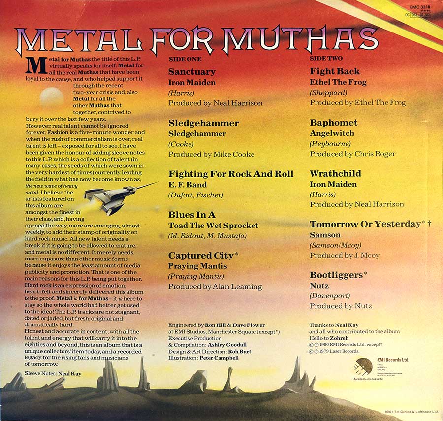
The sleeve notes (credited to Neal Kay) basically plant a flag: metal is here, it’s real, and it’s not going away.

Read that with a grin, because the confidence is loud. Then drop the needle and realize the swagger actually has teeth.

The Iron Maiden headline moment

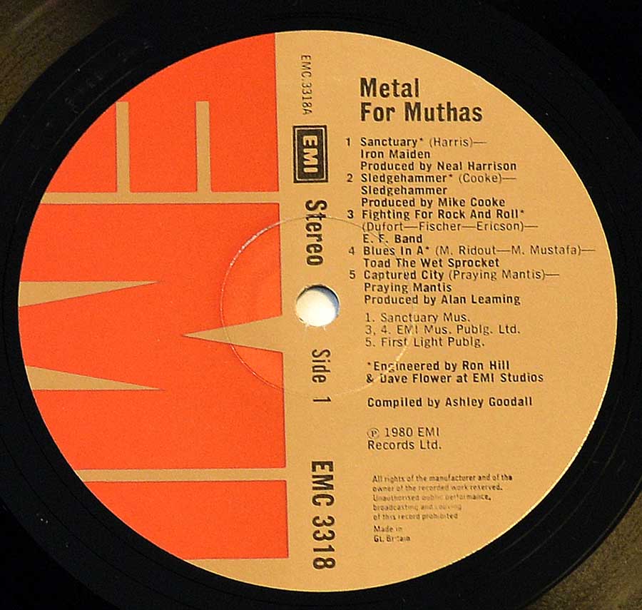
The big hook here is Iron Maiden, and the album puts it bluntly: it contains their first two recorded tracks ever, "Sanctuary" and "Wrathchild." "Sanctuary" is noted as the original mix, recorded in November 1979, and first appearing on this compilation. It was meant as a single-only track, and later got added to the US version of the self-titled "Iron Maiden" album.

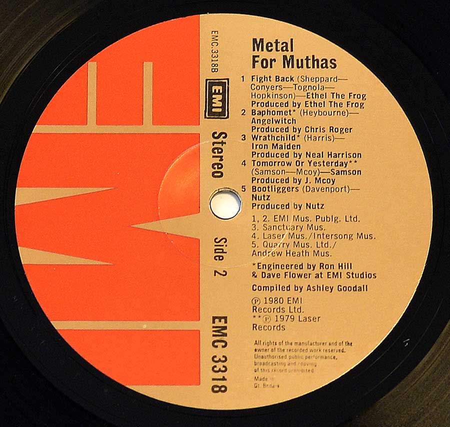
"Wrathchild" shows up as an early version recorded in 1979. Both tracks are credited here with producer Neal Harrison, and they sound like a band already leaning into the fast, sharp edge of what came next.

The rest of the litter: different bands, same hunger

After Maiden, the record turns into a proper scene sampler. You get names that feel like they should be on the back of a denim jacket, because of course you do. Some tracks come with little breadcrumb notes that make the compilation feel curated rather than random.

"Sledgehammer" by Sledge Hammer is tagged as coming from a 7" single recorded in 1979, produced by Mike Cooke. E.F. Band’s "Fighting For Rock And Roll" is called out as only being available on this compilation LP. Praying Mantis bring "Captured City" with producer Alan Leaming, and Ethel the Frog punch in with "Fight Back" as part of the Neal Kay Metal for Muthas universe.

Angel Witch’s "Baphomet" is framed here as their first song to hit mainstream popularity via this compilation, produced by Chris Roger. Samson show up with "Tomorrow Or Yesterday," described as coming from their first album "Survivors," plus a neat little footnote: Bruce Dickinson is mentioned on the cover, but joined after that album was completed. Nutz close out this chunk with "Bootliggers," summed up here as “very obscure,” which is honestly a whole aesthetic.

The oddball moment that makes compilations fun

Every good scene document has at least one curveball. Here it’s "Blues In A" by Toad The Wet Sprocket, described as probably the only non-metal track on the album. That kind of left-turn is either a vibe killer or a palate cleanser, depending on your mood and how much coffee you’ve had.

Quick highlights
Collector notes, but keep it human

The label and sleeve details are part of the charm, but they’re also practical. This UK release is shown with no barcode, and the label text calls out (p) 1980 EMI Records Ltd and “Made in Gt Britain.” The record label and catalog info on this version is listed as EMC 3318 / 0C 062 - 07 202.

Production credits on the page name Executive Production: Ashley Goodall. Sound/Recording Engineer(s) are listed as Ron Hill and Dave Flower. 
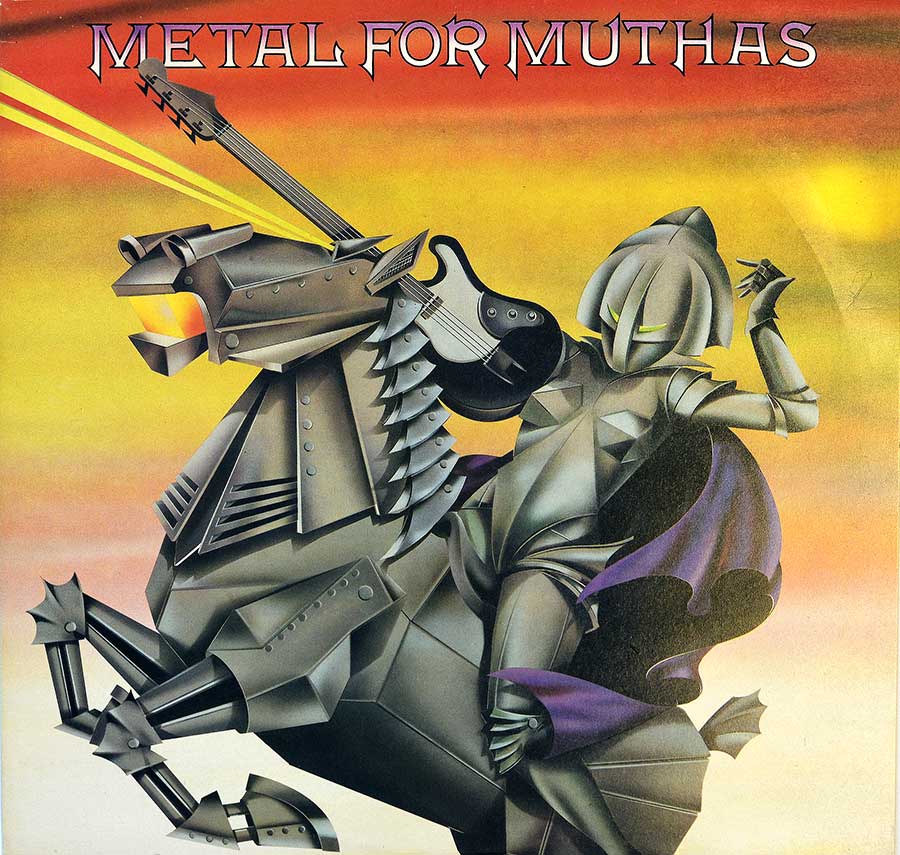
Design & Art Direction is credited to Rob Burt, with illustration by Peter Campbell. It’s the kind of credit block that reminds you: scenes don’t just happen, they get built.

The liner notes energy: pure scene evangelism

The liner notes read like a mission statement. They talk about talent surviving fashion, new bands emerging weekly, and heavy music needing exposure because it gets the least media love. Then they land the punchline: “Metal is for Muthas” and the world should get used to the idea.

Slightly dramatic? Yes. Also: exactly the attitude that makes early NWOBHM feel alive on vinyl.

Collector’s Note: Metal for Muthas - when the NWOBHM still smelled of pubs and photocopiers

"Metal for Muthas" matters because it caught the NWOBHM before anyone had the bright idea to tidy it up for visitors. This was not a polished victory lap. It was a scene document assembled while the thing was still kicking at the door, all warm valves, cheap lager, bus fumes and that particular British optimism that usually turns up five minutes after common sense has left the room.

The Iron Maiden pull is obvious, and fair enough. Their versions of "Sanctuary" and "Wrathchild" give the record its bite, but not because some later historian told us they should. You hear it straight away. "Sanctuary" was recorded in November 1979 and first turned up here before later being added to the US edition of the debut "Iron Maiden" album. "Wrathchild" arrives as an early version too, less monument, more warning shot. Not the first thing Maiden ever recorded, no matter how often people flatten the story, but early enough to still have the scrape and impatience on it.

And that is why this LP still earns shelf space. It does not behave like a careful "best of". It lurches. It argues with itself. One minute you get Angel Witch dragging the room into darker corners with "Baphomet", the next you trip over oddities, obscurities and that left-turn from Toad The Wet Sprocket that still feels like somebody wandered into the wrong rehearsal room and decided to stay. Good. Compilations like this should have a bit of mud on their shoes.

The collector appeal is not just in the music either. This UK pressing has the right sort of plain, practical charm: no barcode, EMI catalogue number EMC 3318, "Made in Gt Britain" on the labels, Garrod & Lofthouse credit on the back, and sleeve notes by Neal Kay that charge in with all the restraint of a man kicking open a saloon door. A cleaner, more sensible package would probably be easier to file. It would also be far less fun.

References

Collector’s Note: Identifying this UK pressing of "Metal for Muthas"

This section contains the practical details needed to identify this particular UK version of "Metal for Muthas" by Various Artists, including Iron Maiden.

Album back cover

Top right corner:
EMC 3318
stereo
0C 062 - 07 202

Bottom right corner:
8001 TM Garrod & Lofthouse Ltd

Barcode

There is no barcode on the album cover.

Record labels

Side One:
EMC 3318A EMI STEREO o Side 1 EMC 3318
(p) 1980 EMI Records Ltd
Made in Gt Britain

Side Two:
EMC 3318B EMI STEREO o Side 2 EMC 3318
(p) 1980 EMI Records Ltd
Made in Gt Britain

Album Key Details: Genre, Label, Format & Release Info

Music Genre:

NWOBHM

NWOBHM (New Wave of British Heavy Metal) captures the raw, early 1980s surge of British metal bands blending punk energy with classic heavy riffs, characterized by fast tempos, sharp guitar work, and a DIY underground spirit.

Label & Catalognr:

EMC 3318 / 0C 062 - 07 202

Media Format:

Record Format: 12" Vinyl Stereo Gramophone Record
Total Weight: 230g

Release Details:

Release Date: 1980

Release Country: UK (United Kingdom)

Production & Recording Information:

Producers:
  • Ashley Goodall – Executive Producer

    The man behind the desk, but very much not an innocent bystander.

    Ashley Goodall, was an EMI A&R man and producer active right as the first NWOBHM wave was forcing its way through the door. On this album he is credited as executive producer, and that role matters more than it sounds: this compilation does not feel politely assembled, it feels gathered in a hurry while the scene was still hot, with enough instinct to put Iron Maiden beside obscurities and let the whole thing crackle rather than behave.

Sound & Recording Engineers:
  • Ron Hill – Sound & Recording Engineer

    One of the engineers who kept the bite in the tape instead of tidying it away.

    Ron Hill, was a British engineer and producer working for EMI and at Abbey Road, one of those names that turns up in the credits when proper studio work was needed without any theatrical fuss. On "Metal for Muthas" he shares engineering credit on material coordinated through EMI House in Manchester Square—the label’s London HQ, not a recording studio—and that steady hand shows: the guitars still snarl, the cymbals still spit, but the whole record hangs together instead of collapsing into pub-floor sludge.

  • Dave Flower – Sound & Recording Engineer

    Another small-print name, and one that quietly earned its keep here.

    Dave Flower, was a British recording engineer associated with EMI and Abbey Road, the sort of studio craftsman whose career sits in the margins while the records do the shouting. On this album he shares the engineering duties across tracks sourced from different sessions, keeping the sound dry, tight and unpolished—no studio gloss, just enough control to stop the whole thing from turning into rehearsal-room mush.

Album Cover Design & Artwork:
  • Rob Burt – Design & Art Direction

    Sleeve discipline matters, especially when the music arrives with its elbows out.

    Rob Burt, was a designer and liner-notes writer, which is a useful combination when a record needs both shape and attitude rather than just decoration. Here he handled the design and art direction, and the sleeve benefits from that restraint: Peter Campbell's illustration gets room to do its job, the package looks direct rather than cluttered, and the whole thing lands like a proper scene document instead of label-office wallpaper.

  • Peter Campbell – Illustration

    The cover had to bark before the needle dropped, and it manages that nicely.

    Peter Campbell, was the credited illustrator on the sleeve, the person handed the job of giving this scrappy compilation a face memorable enough to survive forty-odd years of record bins and collector shelves. His contribution does not soften the album or make it respectable; it gives the package its visual shove, catching the unruly, slightly dangerous feel of the music without sanding off the roughness that makes it worth owning.

Complete Track-listing:

Tracklisting Side One:
  1. IRON MAIDEN – Sanctuary
    Original mix recorded November 1979, first released on this compilation; later added to the US version of the "Iron Maiden" album. Producer – Neal Harrison.
  2. IRON MAIDEN – Wrathchild
    Early version recorded in 1979. Producer – Neal Harrison.
  3. SLEDGE HAMMER – Sledgehammer
    Taken from a 7" single recorded in 1979. Producer – Mike Cooke.
  4. E.F. BAND – Fighting For Rock And Roll
    Track only available on this "Metal for Muthas" compilation LP.
  5. TOAD THE WET SPROCKET – Blues In A
    The probable non-metal outlier on this compilation.
Tracklisting Side Two:
  1. PRAYING MANTIS – Captured City
    Producer – Alan Leaming.
  2. ETHEL THE FROG – Fight Back
    Part of the Neal Kay Metal for Muthas project.
  3. ANGEL WITCH – Baphomet
    Early track gaining attention through this compilation. Producer – Chris Roger.
  4. SAMSON – Tomorrow Or Yesterday
    From the album "Survivors"; Bruce Dickinson mentioned on sleeve but joined after its recording. Producer – J. McCoy.
  5. NUTZ – Bootliggers
    A notably obscure closing track.
Additional Notes:

This compilation captures early recordings and rare tracks from emerging NWOBHM bands, including exclusive material and early versions that differ from later studio releases.

Disclaimer: Track durations shown are approximate and may vary slightly between different country editions or reissues. Variations can result from alternate masterings, pressing plant differences, or regional production adjustments.

First thing you notice is the sleeve stock—thin, slightly flexible, the kind that never quite sits flat after forty-odd years. UK pressings from this period have that feel. Not cheap, just… practical. The front cover print leans a touch soft, blacks not quite biting, more grey than menace if you look closely under decent light. Flip it over and the typography tightens up—catalog numbers neatly tucked in the corner, Garrod & Lofthouse credit sitting there like a quiet signature most people ignore.

The labels tell a different story. Classic EMI layout, no nonsense, but look closer and you’ll spot the slight ink spread around the lettering, especially on “EMC 3318”. That’s where it gets interesting. Groove wear is light here, still a bit of sheen left in the vinyl, which is always a small victory. Nothing flashy. Just honest wear, honest printing, and a record that’s clearly been played but not abused. If you’re the type who checks matrix etchings before the music starts, you’ll want to dig deeper into the labels below.

Album Front Cover Photo
Illustrated album cover showing a metallic knight riding a robotic horse in the foreground, both angular and steel-colored, facing left; the knight holds a black electric guitar emitting yellow beam-like streaks; background is a gradient sky shifting from deep orange at top to pale yellow near horizon; the title 'METAL FOR MUTHAS' appears centered along the top edge in stylized sharp lettering; surface shows slight print grain and minor edge wear.

First thing that hits is the colour—loud, almost aggressively warm, like someone turned the saturation knob too far and decided it looked better that way. That orange-to-yellow gradient isn’t subtle, it’s shouting, and against it sits this angular steel knight on a mechanical horse that looks more welded together than designed. The whole thing feels slightly off-balance, which, frankly, suits the music better than any polished fantasy nonsense would have.

Up close, the illustration gives itself away a bit. The shading on the armour is careful but not perfect—tiny transitions where the grey jumps instead of fades, especially around the shoulder plates and the horse’s neck. That’s not a flaw, it’s the print. Early runs of these sleeves tend to show that grain, especially in the darker metallic tones. Seen enough copies where that area goes muddy with age, but here it still holds together, just about.

The guitar doubling as a weapon—yes, that’s deliberate, and yes, it’s a bit on the nose. The yellow beams shooting out feel like someone insisted on making sure nobody missed the point. Still, there’s something honest about that lack of restraint. No clever symbolism, just a guitar blasting energy like it’s the most natural thing in the world. Hard to argue with that, even if it borders on comic-book territory.

Lettering at the top sits clean enough, though on a few pressings the black outline tends to soften slightly into the background, especially where the orange is strongest. That’s one of those small tells collectors clock immediately. Edges of the sleeve here show light wear—nothing dramatic, just the usual softening at the corners where the laminate has taken a few knocks over the decades.

What works is the attitude. What doesn’t quite land is the precision. It feels rushed in places, like the scene it represents. And that’s probably the point, whether anyone admitted it at the time or not. The real clues, as always, sit lower down—ink behaviour, label consistency, and the way the print holds under light—worth a closer look if you care about what you’re actually holding.

Album Back Cover Photo
Back cover of Metal for Muthas showing orange to yellow gradient sky with track listing in two columns, liner notes text block on the left, small spaceship illustration near center, catalog number EMC 3318 and 0C 062-07 202 in top right corner, desert landscape silhouettes along the bottom edge, slight surface wear and print grain visible.

Flip it over and things suddenly get a bit more practical. That loud front-cover fantasy gives way to a layout that feels like it was assembled under mild time pressure, but with just enough care to keep it readable. The orange-to-yellow gradient carries through, though it’s flatter here, less dramatic, like the ink ran a little tired by the time they got to the back. Seen copies where this side fades unevenly—this one still holds its colour, but only just.

The left column is dominated by Neal Kay’s liner notes, and they’re packed tight. No breathing room. Letters sit close, almost impatient, like someone insisted on squeezing every last word onto the sleeve. There’s a slight softness to the print, especially in the smaller text, the kind that makes you tilt the sleeve under a lamp just to get it sharp enough to read without squinting. That’s not bad printing—it’s typical EMI of the period, just not generous.

Track listings are split cleanly down the middle, side one and side two behaving themselves more than the music probably does. Names, credits, producers—all lined up neatly, though the spacing feels a bit uneven if you stare at it too long. That little spaceship graphic tucked near the center-left? Feels like an afterthought. Either that or someone really liked it and refused to let it go.

Top right corner carries the important stuff—EMC 3318 and 0C 062 - 07 202—printed clean but not razor-sharp. On worn copies, that’s usually the first place where the ink starts to blur into the background. Bottom edge shows that familiar Garrod & Lofthouse credit, and along the horizon line you get those odd, jagged rock formations, almost like a leftover idea from the front cover that didn’t quite earn its keep.

What sticks is the density of it all. No empty gestures, no wasted space, just information pressed into cardboard. Slightly cramped, slightly uneven, but honest. And if anything’s going to give away the pressing or the print run, it’s here—in the small type, the ink weight, the way those catalog numbers sit against the fading sky.

Close up of Side 1 record’s label
Close up of vinyl record Side 1 label showing EMI logo in bold red block pattern on left half, cream background on right half with black text listing tracks including Iron Maiden Sanctuary and Wrathchild, catalog number EMC 3318 printed vertically, central spindle hole with light wear marks, black vinyl grooves surrounding the label

First glance lands on that oversized red EMI block, taking up nearly half the label like it owns the place. Not subtle, not decorative—more like a stamp than a logo. The rest of the label sits in a pale cream tone that has aged slightly uneven, especially toward the spindle hole where handling always leaves its trace. That centre hole shows the usual light spidering—fine lines radiating outward from repeated plays, not abuse, just use.

The typography is dense but disciplined. Track titles, writers, and production credits are stacked tightly, no wasted space, but still readable if you tilt it just right under light. “Sanctuary” sits at the top, Iron Maiden getting first billing, followed by the rest of the lineup in a steady, almost bureaucratic list. The ink has a faint softness at the edges—typical EMI pressings—where the black text just begins to feather into the paper.

That vertical strip running through the centre—“Stereo”, “Side 1”, and EMC 3318—feels almost like a spine dividing the label into two personalities: bold branding on the left, strict information on the right. It works, but only just. Seen copies where that central text shifts slightly off alignment, and once you notice it, it’s hard to unsee.

What gives it away as a proper UK pressing is the combination of layout and restraint. No flashy colour experiments, no clutter. Just function. And yet, under close inspection, the small tells start showing—ink density variation, slight wear at the spindle, the way the red field holds its colour better than the cream. That’s where the real story sits, not in the music, but in the paper and print.

EMI, United Kingdom Label

This EMI label design is instantly recognisable for its bold red block logo occupying the left half of the label, paired with a cream information field on the right. It reflects EMI’s late-1970s to early-1980s UK house style—functional, high-contrast, and built for clarity rather than flair. The label prioritises readability and manufacturing efficiency, with a structured layout that separates branding from track data. This particular label design was used by EMI between approximately 1978 and 1982.

Colours
Deep red (logo field) and cream/off-white (text field) with black print
Design & Layout
Split design: left half dominated by large EMI block logo, right half contains track listings and credits; vertical centre strip with format and side information
Record company logo
The EMI logo is rendered as a bold geometric block pattern forming the letters “EMI”, acting as both branding and visual anchor; its purpose is immediate label identification during handling and stacking
Band/Performer logo
No dedicated band logo; artists are listed in plain text as part of compilation format
Unique features
Vertical catalogue strip, dense text layout, and clear separation between branding and data; visible spindle wear patterns typical of played copies
Side designation
Clearly printed “Side 1” within central vertical band alongside “Stereo” marking
Rights society
Publishing credits listed per track (e.g., EMI Music Publishing, First Light Publishing)
Catalogue number
EMC 3318 (also printed vertically along the centre strip)
Rim text language
English
Track list layout
Numbered vertical list with artist names, songwriters in brackets, and production credits beneath each track
Rights info placement
Lower right quadrant beneath track listing, including ℗ 1980 EMI Records Ltd
Pressing info
“Made in Gt Britain” typically present near lower edge (partially visible depending on crop)
Background image
Solid colour fields only; no photographic or illustrative background, reinforcing functional design
Close up of Side 2 record’s label
Close up of vinyl record Side 2 label showing EMI red block logo on left half, cream background with black text listing tracks including Angel Witch Baphomet and Iron Maiden Wrathchild on right half, vertical EMC 3318 catalogue number and Side 2 marking, central spindle hole with light wear, black vinyl grooves surrounding the label

Side two looks familiar at first glance, but give it a second and small differences start creeping in. That same oversized red EMI block dominates the left side again, holding its colour a bit more evenly than the cream half, which has just a hint of uneven tone if you tilt it under light. Not damage, just how these things age—paper and ink never quite agree on how to grow old.

The track list shifts, obviously, but the layout stays stubbornly consistent. “Fight Back” at the top, then Angel Witch, then Maiden again with “Wrathchild.” It reads like a continuation rather than a second act. The text feels slightly tighter here, almost like the typesetting was nudged a fraction inward. Could be the pressing, could be the print run—seen enough EMI labels where side one and two don’t quite mirror each other as cleanly as you’d expect.

Spindle wear is there, but lighter than you’d expect for a record of this age. A few faint circular marks, nothing aggressive, suggesting it’s been played but not abused. Around the hole, the cream background shows the usual dulling where fingers have landed over the years. That’s the honest part—no collector fantasy, just actual use.

The vertical strip again carries “Stereo,” “Side 2,” and EMC 3318, cutting the label in two like a divider. On some copies this alignment drifts slightly; here it sits reasonably straight, though not perfectly centred if you’re the type who checks that sort of thing. And if you are, you’ve already noticed the slight softness in the black print—just enough to blur at the edges without losing legibility.

What stands out isn’t what’s different, but how little they bothered to change. Same template, same logic, just new data dropped in. Efficient, maybe a bit lazy, but it works. And again, the real story sits in the small things—the ink weight, the wear patterns, the way the red holds while the cream slowly gives in.

EMI, United Kingdom Label

This EMI Side 2 label continues the late-1970s UK house design with its bold red block logo and cream data field, maintaining strict visual consistency across both sides of the record. The layout prioritises clarity and production efficiency, with only the track data changing between sides. This particular label design was used by EMI between approximately 1978 and 1982.

Colours
Deep red logo field with cream/off-white background and black printed text
Design & Layout
Split label with dominant EMI logo on left and track information on right; vertical centre strip containing format, side and catalogue number
Record company logo
Large geometric EMI block logo forming the letters through negative space; designed for instant recognition during handling and stacking
Band/Performer logo
No band logo; compilation artists listed in standardised text format
Unique features
Consistent dual-side design with minor print variations; visible spindle wear; subtle ink density differences between red and cream areas
Side designation
Clearly marked “Side 2” within the vertical centre strip alongside “Stereo”
Rights society
Publishing credits listed per track (e.g., EMI Music Publishing, Laser Music, Intersong Music)
Catalogue number
EMC 3318 (printed both horizontally and vertically)
Rim text language
English
Track list layout
Numbered vertical list including artist names, songwriters in brackets, and production credits under each entry
Rights info placement
Lower right quadrant including ℗ 1980 EMI Records Ltd and additional licensing credits
Pressing info
“Made in Gt Britain” indicated near lower edge of label
Background image
No background illustration; flat colour fields emphasize functionality and clarity

All images on this site are photographed directly from the original vinyl LP covers and record labels in my collection. Earlier blank sleeves were not archived due to past storage limits, and Side Two labels are often omitted when they contain no collector-relevant details. Photo quality varies because the images were taken over several decades with different cameras. You may use these images for personal or non-commercial purposes if you include a link to this site; commercial use requires my permission. Text on covers and labels has been transcribed using a free online OCR service.