Destruction - Live Without Sense - 12" Vinyl LP Album

- The deranged puppet-master that defined Teutonic live thrash

Album Front cover Photo of Destruction - Live Without Sense - 12" Vinyl LP Album https://vinyl-records.nl/

A grotesque, bald puppet-master looms from a red-black void, grinning with cracked teeth and manic eyes while yanking strings tied to dangling bombs. The Destruction logo slashes in red, the neon-green title cuts diagonally—pure late-80s menace rendered in sharp, theatrical detail.

Destruction's "Live Without Sense" 12" Vinyl LP, released in the late '80s, is a thrash metal gem. The gatefold cover, with captivating artwork and photography of the 1987-1988 tour dates, visually enhances the album. Meticulously crafted, it reflects the band's energy and historical journey. This iconic release intertwines music and visuals, creating a collector's delight for fans of Destruction and thrash metal vinyl enthusiasts.

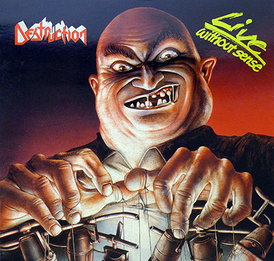
"Live Without Sense" (1989) Album Description:

Destruction put "Live Without Sense" on vinyl the way a band puts bootprints on a club stage: quick, heavy, and leaving marks. No perfume, no “hello city,” no fake cinematic crowd swell. This is Teutonic thrash caught mid-swing, the kind that makes the room feel smaller and your speakers feel guilty.

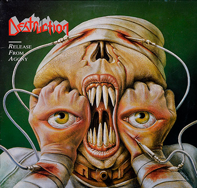
Two little detours give the game away: the "Pink Panther" wink and the sudden "In the Mood" drop, both tossed into the set like a dare. Laugh at the wrong moment and the next riff will correct you. The sleeve notes also refuse to pretend it’s one sacred evening; it’s recorded across gigs on the "Release From Agony" tour, and that detail starts to matter once you stop listening like a tourist.

West Germany, 1989: the air still tasted wired

West Germany in ’89 wasn’t calm, it was tense in that everyday way—news noise, hard borders, hard opinions, and kids who trusted amps more than speeches. The thrash scene behaved accordingly. Flyers, tape trades, cheap gear, long drives, and labels like Steamhammer/SPV moving records with the blunt efficiency of people who didn’t have time to romanticize anything.

That’s the climate this album breathes in. Not “historic,” not “important.” Just urgent. The kind of urgency that makes a band tighten up because the next town is tomorrow and the PA is already humming.

Where they sat in the pack, and who they sounded like they hated

German thrash in ’89 was crowded and competitive. Kreator were sharpening their edge into something more exact, Sodom were still dragging war and rust through the riffs, and Tankard kept the grin alive while the music stayed rough enough to bruise. Across the border of influence, Exodus were still swinging for the pit, Testament were getting cleaner without losing bite, and Slayer’s shadow kept stretching whether anyone asked for it or not.

Destruction on this record don’t chase polish. They chase impact. Guitars grind instead of shimmering, and the momentum never waits for you to catch up.

The sound on tape: stage bleed, crowd heat, and a mix that doesn’t flinch

Live albums usually fall apart in the same places: cymbals turning to spray, bass disappearing, the crowd sitting on top of the band like wet cement. "Live Without Sense" dodges most of that by being practical. Herwig Ursin’s engineering and mixing keep the band forward, and the crowd stays around the edges where it belongs—present, loud, but not driving the bus.

Mixing at Power Sound Factory in Vienna shows up as restraint, not cleanliness. Space gets carved just enough for the riffs to bite. Schmier’s bass actually lives in the mix, not just in the liner notes, and that changes everything because Teutonic thrash without bass weight is just frantic guitar practice.

The set: Side A hits first, Side B starts talking back

Side A is the straight punch. "Curse the Gods" doesn’t warm up; it lunges. "Unconscious Ruins" keeps the blade moving, and by the time "Invincible Force" and "Dissatisfied Existence" roll through, the record has already decided you’re either in or you’re out.

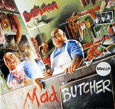
Side B has more personality and less patience. "Mad Butcher" lands like a familiar weapon, and then the set throws in that "Pink Panther" bit—one of those split-second jokes that only works because the band is still playing like they mean it. "Life Without Sense" and "In the Mood" do the same trick from another angle: a recognizable shape shoved into thrash tempo until it stops being cute and starts being confrontational.

  • Best kind of live moment: riffs staying readable even when the room sounds like it’s shaking.
  • Most revealing moment: the quick quote-songs, tossed in like a grin with a broken tooth.
  • Most physical moment: kick and bass locking together and dragging the guitars forward by the collar.
Who did what, and why it matters on a live record

Production is credited to Harry, Mike, Olly, Schmier, and Rainer Hänsel, which reads like a band refusing to hand the steering wheel to a stranger. That decision shows in the feel: the record keeps the aggression and doesn’t sand off the ugly corners just to sound “professional.” Rainer Hänsel also carries the cover concept credit, which fits the era—one person doing two jobs because everyone is tired and the deadline doesn’t care.

Two guitars matter here. Mike Sifringer’s right-hand attack stays sharp, and Harry Wilkens thickens the wall so the riffs hit like a block instead of a line. Oliver “Olly” Kaiser keeps the tempo controlled enough to be dangerous. Fast is easy. Fast and tight is the part that costs you sleep.

Band events as cause and effect, not a timeline

This lineup sounds like a band that already learned the lesson: one guitar leaves holes live, and a drummer who rushes makes everything collapse. Add the second guitar, tighten the drumming, and suddenly the old songs hit harder because there’s less air leaking out of the arrangement.

The timing is the cruel part. The record catches Destruction sounding locked-in and functional, right before internal pressure starts rearranging the future. That’s not gossip. That’s what bands do when the road turns into a room you can’t leave.

Controversy, or the argument fans actually have

No public scandal trails this release. The real fight is smaller and more familiar: some listeners swear it’s “one show,” others hear the seams. The sleeve notes make it plain—recorded across gigs—and once that’s in your head you start noticing tiny shifts in atmosphere and balance. A tour stitched into a record, not a single-night monument. Anyone insisting otherwise is either romantic or stubborn.

One quiet personal anchor

A late-night radio slot made this kind of live thrash feel even louder, because the DJ sounded half-asleep and the guitars sounded wide awake. The next morning, the record-shop bin smelled like cardboard and cigarette smoke, and the sleeve looked like it had already been grabbed by three people before you got there.

That’s the point of "Live Without Sense." It doesn’t ask to be admired. It keeps moving, it keeps swinging, and it leaves you deciding whether the little jokes were humor or a warning.

References

Album Key Details: Genre, Label, Format & Release Info

Music Genre:

German Thrash Metal

German Thrash Metal from the late 1980s is defined by razor-sharp riffing, relentless double-time drumming, and socially charged or war-themed lyrics. Rooted in the Teutonic scene, it delivers a harsher, more aggressive edge than its American counterparts, combining speed, precision, and raw intensity into a tight, high-energy sonic assault.

Label & Catalognr:

Steamhammer – Cat#: SPV 08-7578

Album Packaging

Standard sleeve.

Includes the original custom inner sleeve with album details.

Media Format:

Record Format: 12" Vinyl Full-Length Stereo LP Gramophone Record
Total Weight: 270g

Release Details:

Release Date: 1989

Release Country: West Germany

Production & Recording Information:

Producers:
  • Harry – Producer
  • Mike – Producer
  • Olly – Producer
  • Schmier – Producer

    The frontman’s perspective: the set has to hit like a gig, not like a polite “live product.”

    Schmier, Destruction’s vocalist and bassist with the instincts of a bandleader, brings the performance-first viewpoint into production decisions. On "Live Without Sense" that means protecting the bite in the vocals and bass, keeping the pacing brutal, and making sure the album feels like being pinned to the front barrier—sweaty, loud, and unforgiving.

  • Rainer Hänsel – Producer, Album Cover Concept

    A classic metal-world multi-tasker: production decisions in one hand, visual concept in the other.

    Rainer Hänsel, a producer with a sharp sense for presentation, is credited not only for guiding the album sonically but also for shaping the cover concept. On "Live Without Sense" the contribution lands in two places: keeping the live recording focused and cohesive, and framing the album’s visual identity so it matches the raw, confrontational mood on the grooves.

Sound & Recording Engineers:
  • Herwig Ursin – Sound Engineer

    Ursin doing battle with stage volume, crowd noise, and physics — and somehow winning.

    Herwig Ursin, a live-sound engineer with the thankless job of capturing reality at extreme volume, helps translate the gig into something a turntable can handle. On "Live Without Sense" the work shows in the clarity under chaos: drums stay punchy, guitars stay sharp, and the crowd energy sits around the band instead of smothering it.

  • Martin Knauerhase – Sound Engineer

    The technical anchor: keeping the recording clean enough to hit hard, not just loud.

    Martin Knauerhase, credited as sound engineer and responsible for the mix, brings the control-room discipline that a live thrash album absolutely needs. On "Live Without Sense" the contribution is the mix that keeps everything moving: guitars don’t blur, bass stays present, and the kick drum drives the whole thing like a boot to the chest.

Mixing Studio & Location:

Power Sound Factory – Vienna, Austria

  • Power Sound Factory – Mixing studio

    Where the wild night gets trimmed into a record without sanding off the danger.

    Power Sound Factory in Vienna is the kind of working studio built for getting results, not for vibes and scented candles. On "Live Without Sense" it’s the place where the live recording is shaped into a coherent listening experience: crowd, stage bleed, and instrument balance get dialed so the album stays violent, fast, and readable on vinyl.

Album Cover Design & Artwork:
  • Joachim Luetke – Album cover artwork

    I love cover artists who make a 12-inch square feel like a whole horror film.

    Joachim Luetke is a German cross-media artist (born 1957) who makes album art feel like a miniature movie poster. I like that he actually trained in the late 1970s - graphic design in Switzerland, then Vienna's Academy of Fine Arts under Rudolf Hausner - so the craft is real, not just screen-glow. His work is often compared to H. R. Giger . In metal, his longest run is with Dimmu Borgir (2003-2010: "Death Cult Armageddon", "In Sorte Diaboli", "Abrahadabra"); he also rebooted Kreator's look (2005-2009: "Enemy of God", "Hordes of Chaos"), and stamped Arch Enemy's "Doomsday Machine" (2005) and Meshuggah's "obZen" (2008). He even published "Posthuman" (2000), which tells you he thinks beyond the sleeve.

  • Martin Knauerhase – Cover design for profil arts

    The layout muscle: taking the concept and making it look like a real, printed object from 1989.

    Martin Knauerhase, working on cover design for profil arts, handles the practical graphic side where metal concepts either land or fall flat. On "Live Without Sense" the contribution is the finished sleeve presentation: type, spacing, and visual balance that make the album feel official and era-correct—built to be grabbed in a record shop rack, not admired from a distance.

Band Members / Musicians:

Band Line-up:
  • Marcel "Schmier" Schirmer – Vocals, Bass

    That rasp and that pick attack: the sound of a club PA begging for mercy.

    Marcel "Schmier" Schirmer is the rasp-throated bassist-frontman who turned Destruction into a blunt instrument you can actually hum. I hear his barked vocal phrasing like a siren riding on top of that pick-driven low end—pure Teutonic grit, no perfume. He drove the classic Destruction era through the 1980s, then stepped out in 1989 to form Headhunter (1989–1999), returning to Destruction in 1999 and staying the constant voice and bass punch ever since. On a live document like "Live Without Sense" he’s the ringmaster: counting off mayhem, punching the choruses, and keeping it locked to the kick drum. Side quests like Bassinvaders (late 2000s) and Pänzer (mid-2010s) show the same attitude: tight, loud, and allergic to nonsense.

  • Mike Sifringer – Guitars

    The riff-engine that keeps Destruction’s live chaos sharp enough to cut.

    Mike Sifringer is Destruction’s founding guitarist, the riff-engine who helped turn Weil am Rhein’s “Knight of Demon” into full-on Teutonic thrash. To my ears, the tight, biting downstrokes and wiry leads are the glue on "Live Without Sense"—guitars that stay sharp even when the crowd and stage volume try to eat them alive. Destruction ran with him from 1982 until the split in 2021, including the long “Neo-Destruction” 1990s stretch and the 1999 Schmier return under his strings. Early stops include Morrigan (to 1983) and Knight of Demon (1982–1983), plus later guest solos (Emerald 2010; Fear My Thoughts 2007; Godslave 2011; Manic Depression 2012/2016).

 
  • Harry Wilkens – Guitars

    Second guitar, first line of defense when the tempo goes feral.

    Harry Wilkens is the late-80s second guitar in Destruction, stepping into the blast zone just when the band’s live set turned from fast to ferocious. To me his role on "Live Without Sense" is the extra blade in the two-guitar attack: tightening the rhythm wall, doubling the hooky figures, and giving Sifringer room to throw leads without the bottom dropping out. Credited with Destruction from 1987–1990, he’s part of that era’s snap-and-snarl sound—less studio polish, more stage sweat—where every chord change has to land on the drummer’s boot. Hear it in the locked chugs and the quick harmony stabs: practical, muscular playing that keeps the songs upright while the crowd tries to knock them over.

  • Tommy Sandmann – Drums

    The original drum hammer who taught Destruction how to sprint without tripping over its own boots.

    Tommy Sandmann is Destruction’s founding drum hammer, the early engine-room that turned the band from rehearsal noise into a real Teutonic threat. Across Knight of Demon (1982–1984) and Destruction (1983–1986), his playing powered the formative releases—"Bestial Invasion of Hell" (demo, 1984), "Sentence of Death" (EP, 1984), "Infernal Overkill" (1985), and "Eternal Devastation" (1986). On "Live Without Sense" his sticks aren’t on the tape, but the attitude is: the older riffs still breathe on his clipped fills, hard stops, and that street-tight double-time feel. To my ears, he helped define the band’s early pacing—fast, ugly, and perfectly allergic to polish.

Complete Track-listing:

Tracklisting Side One:
  1. Curse the Gods
  2. Unconscious Ruins
  3. Invincible Force
  4. Dissatisfied Existence
  5. Reject Emotions
Video: Destruction – Curse The Gods (Live at Heavy Sound 1988) HD Remastered 60FPS
Tracklisting Side Two:
  1. Eternal Ban
  2. Mad Butcher
  3. Pink Panther
  4. Life Without Sense
  5. In the Mood
  6. Release from Agony
  7. Bestial Invasion
Video: Destruction - Mad Butcher (Live)

Disclaimer: Track durations shown are approximate and may vary slightly between different country editions or reissues. Variations can result from alternate masterings, pressing plant differences, or regional production adjustments.

This gallery walks straight into the raw nerve of late-80s Teutonic thrash. The front cover sets the tone with its stark, high-contrast brutality, while the back cover freezes the band in full live confrontation mode. The inner sleeve reveals the printed details and atmosphere that often get ignored in streaming-era minimalism. Close-ups of the Steamhammer label and custom inner sleeve expose catalog numbers, typography, and pressing details that serious collectors quietly obsess over. Look closely at the textures, the wear, the ink density — every image tells a small story about how this West German pressing was made, handled, played, and survived.

Album Front Cover Photo
Destruction Live Without Sense 1989 front cover West German Steamhammer SPV 08-7578 pressing, grotesque bald puppet-master controlling bombs on strings, red to black gradient background, red Destruction logo top left, neon green Live Without Sense script top right, sharp ink density and late-80s thrash illustration style typical of original vinyl sleeve.

Pull the sleeve out of the stack and the first thing that hits is that glare. The bald puppet-master fills the square like he’s leaning over your desk, teeth cracked and uneven, gums painted in a sickly off-white that always looks slightly yellow under room light. The red-to-black gradient bleeds from right to left, not perfectly smooth either—there’s a faint banding in the darker area that gives away late-80s print limitations. The Destruction logo sits sharp in the upper left, clean white with red outline, while the “Live Without Sense” title slashes diagonally in toxic green like it was added five minutes before print deadline. It works, but it’s not subtle, and that’s the point.

Run a thumb along the top edge and you’ll usually find the first signs of age right there. Corners soften fast on these Steamhammer sleeves, especially the West German copies that weren’t laminated. Tiny white freckles appear where the black ink has taken the brunt of shelf friction. This one shows a faint pressure crease near the top right corner, barely visible unless the light catches it sideways. Someone slid it in and out of a tight rack for years. There’s often a faint ring beginning to ghost through the darker background, not a full circle yet, just the early warning that vinyl has been sitting inside since 1989 without apology.

The illustration itself is blunt-force thrash theater. Thick fingers tugging on strings tied to cartoonish bombs, each fuse dangling like a nervous afterthought. The shading on the knuckles is exaggerated, almost greasy, and the whites of the eyes are overpainted to a degree that feels intentionally uncomfortable. No polite symbolism here. The design concept is obvious: control, chaos, manipulation, the band pulling the crowd like explosives on strings. It’s heavy-handed, sure, but that directness fits a live album. No pretense, no art-school ambiguity. A part of me always smirks at how exaggerated the grin is—almost comic-book villain territory—but it’s honest about its excess.

Flip it slightly under a lamp and the ink density in the red field reveals subtle unevenness. Not a flaw exactly, more a reminder this wasn’t printed yesterday. There’s no lamination gloss to hide imperfections, just straightforward coated board stock that shows every scuff. When copies age, the black areas pick up micro-scratches that look like hairline cracks in the night sky. That kind of wear tells a story. Someone played this loud. Probably more than once.

The typography behaves itself, mostly. The band logo is centered enough but feels like it’s hovering a millimeter too high, leaving more breathing room at the bottom than the top. That imbalance bothers me in a way it shouldn’t, but it gives the face more dominance, which might have been deliberate. The diagonal green title cuts across the upper right like graffiti on a finished painting. It shouldn’t work. It absolutely does.

After decades, the spine on these copies often shows the first real fatigue. Tiny stress lines where the board flexed every time the record was pulled. If the catalog number isn’t printed boldly enough, it fades into that black background and you have to squint to confirm you’re holding the SPV 08-7578 issue. That small annoyance is part of the ritual. Collectors learn to read shadows.

Nothing about this sleeve pretends to be refined. It’s aggressive, a little cartoonish, and proud of it. The puppet-master leans forward forever, frozen mid-grin, while the bombs hang ready to drop. In a rack full of late-80s thrash releases, this one doesn’t whisper. It shoves.

Album Back Cover Photo
Destruction Live Without Sense 1989 back cover West German Steamhammer SPV 08-7578 pressing, band depicted as marionette puppets with oversized hair and instruments on strings, drum kit and Marshall amplifiers in background, Steamhammer logo, barcode and SPV catalog numbers visible bottom right.

Turn the sleeve over and the joke becomes clearer, and sharper. The band themselves are now the puppets, dangling from thin yellow strings, frozen mid-riff on a wooden stage that looks more like a tabletop than a concert floor. The drummer hangs slightly higher in the frame, cymbals tilted at improbable angles, while the three front figures sit with stiff, carved expressions and guitars clutched like props. The Marshall stacks hover behind them in a foggy gray haze, more suggestion than realism. The paint has that late-80s airbrush thickness—skin tones slightly too warm, hair exaggerated into frizzed halos that almost glow against the cooler background.

Along the bottom edge, the practical stuff creeps in. The Steamhammer logo sits left, bold and proud, with “A product of Steamhammer” stamped above it. Distributor text runs in a fine white line that only becomes legible when you lean close and tilt the sleeve toward the light. That tiny type is always the first to fade on well-handled copies. On this one, the lower edge shows the usual shelf scuffing, a thin whitening where the dark brown stage floor ink has rubbed away from years of sliding in and out of tight racks. There’s often a faint compression mark near the barcode box on the right, the result of being stored too tightly against another LP with a harder spine.

The barcode block and SPV catalog numbers in the bottom right corner anchor the chaos with cold retail logic. “CD 85-7579” and “LP 08-7578” sit in that neat little grid, reminding you this wasn’t just art—it was product. The Luetke ’88 signature tucked near the lower right is small but deliberate, almost easy to miss unless you’re scanning for it. That detail matters. It ties the front’s theatrical villain to this scene of wooden-band obedience, closing the visual loop without explaining it.

What works here is the self-awareness. Thrash bands pretending to be manipulated while still blasting through Marshall stacks—heavy-handed, sure, but at least it commits. The strings are painted bright enough to be obvious, almost annoyingly so, as if subtlety was banned from the room. That lack of restraint fits the era. Nothing about this layout feels elegant. It feels loud, slightly cramped, and unapologetic. Even the stage floor planks are drawn with thicker lines than necessary, as if someone wanted to make absolutely certain you understood this is a performance.

Age shows differently on the back. Ring wear ghosts up through the lighter gray background more visibly than on the darker front. The brown floor area tends to develop fine surface scratches that catch light like hairline cracks. Spines on these copies often show stress where the heavy inner sleeve pressed outward over decades. Those little flaws don’t diminish the image. They prove it lived in a record shelf, not a display case.

The whole concept—puppet-master on the front, band as puppets on the back—could have been corny. Instead it lands with a certain blunt honesty. No mystery, no art-school riddles. Just a live thrash band admitting the show is controlled chaos, packaged neatly with a barcode and shipped worldwide. That contradiction is half the charm.

First Photo of Custom Inner Sleeve
Destruction Live Without Sense 1989 custom inner sleeve West German Steamhammer SPV 08-7578 pressing, production credits and tracklisting printed over puppet-master artwork, white text columns on dark gradient background, Side A and Side B listings visible, original vinyl inner with handling wear and light edge creasing.

Slide the record out and this inner sleeve hits you with more information than glamour. The same bald puppet-master dominates the right half, but now he shares space with dense white text columns that run down the left like a tour van manifest. “The Band:” sits at the top in plain, functional type, listing Schmier, Harry, Mike, Olly without ceremony. No oversized fonts, no dramatic spacing. Just facts. The Side A and Side B tracklists sit opposite, aligned flush right, stacked in tight capital letters that feel almost cramped against the red gradient.

Up close, the ink tells its own story. The white lettering isn’t perfectly opaque; in certain light you can see the faint grain of the paper stock ghosting through, especially in the smaller distributor and management credits. That’s typical for late-80s European inners—serviceable board, not luxurious. Along the bottom edge there’s usually the first sign of fatigue: slight crinkling where fingers pinched the sleeve to pull the vinyl out. This copy shows a shallow crease near the lower left corner, subtle but permanent, the kind of mark that only appears after a few dozen removals.

The design concept shifts here from theatrical to practical. Front and back sleeves deliver the puppet allegory; the inner gets down to logistics. Production credits—Harry, Mike, Olly, Schmier, Rainer—engineered by Herwig Ursin at Power Sound Factory Vienna, cover idea by Rainer Haensel, illustration by Joachim Luetke, cover design by Martin Knauerhase. It’s all laid out with almost bureaucratic bluntness. No decorative frames. No breathing room. A part of me appreciates the honesty. Another part wishes the type had just a hair more spacing. It feels like someone wanted every name squeezed in before the printer started charging by the line.

The gradient behind the text is darker than the front cover, which means ring wear tends to show more clearly over time. Tilt it under a lamp and you’ll catch the faint circular impression where the record has pressed outward for decades. On well-played copies, that pressure mark becomes a pale halo cutting through the puppet-master’s jacket. There’s no lamination to protect it. Just raw printed board taking the punishment.

What stands out most is the contrast between the exaggerated face and the sober typography. The manic grin hovers over lists of tour management, lighting crews, trucking companies. Chaos above, logistics below. It’s almost funny. Thrash mythology wrapped around paperwork. That tension feels real. No romantic haze. Just a live band documented honestly, credit by credit, pressed onto paper that was never meant to survive pristine for thirty-five years.

Second photo of custom inner sleeve
Destruction Live Without Sense custom inner sleeve tour panel, Release From Agony Tour 87/88 photo collage with live stage shots and crowd scenes, bold white title line, dense tour date list in three columns across bottom on dark background, original 1989 Steamhammer SPV 08-7578 West German sleeve print with handling wear.

This inner sleeve side is the one that smells like a road case. The top half is a loose collage of live photos, each framed in thick white borders like someone slapped glossy prints onto black card and called it a layout. Hair flying, elbows out, guitars at odd angles, a drummer caught mid-swing, and a crowd shot where bodies blur into a sweaty mess. The images aren’t sharp in a modern sense; they’re warm, slightly smeared, and lit by stage reds and ambers that make everything look louder than it probably was. That’s fine. Live was never meant to be clean.

Down below, the sleeve turns into a tour ledger: “DESTRUCTION – RELEASE FROM AGONY TOUR 87/88” printed in blunt white capitals, then three dense columns of dates and venues. The type is small enough to make you lean in, and the spacing is tight like they were fighting for millimeters. That little struggle is visible. The bottom edge on these inners often picks up finger grime first because this is the side you end up holding while squinting at the dates, and the black background loves to show it. A slight sheen shift appears where hands have rubbed the ink—no lamination, no mercy.

The design concept is simple: prove it happened. These aren’t dreamy band portraits; they’re receipts. The photo borders are so thick they almost annoy me, like the designer didn’t trust the pictures to hold your attention without a white frame shouting at you. Still, it does what it’s supposed to do. The collage feels like a cheap backstage wall, and the tour list reads like bragging rights printed in ink. Seeing places like “London – Brixton academy” and “New York – Irving Plaza” tucked into that sea of dates turns the whole page into a map of late-80s grind.

Look closer and the printing tells you it’s an era piece. The whites of the borders aren’t pure white; they’re slightly off, and the edges of the photos aren’t razor crisp, suggesting a reproduction of photos rather than direct high-resolution originals. That mild softness is exactly what these sleeves age into. Add a few decades of sliding in and out, and you get faint creases running horizontally across the lower half, usually from being folded slightly when shoved back into the jacket in a hurry. This copy shows the early signs: a shallow pressure line across the tour dates that catches light at a certain angle.

What sells it is the mix of chaos and bureaucracy. The top says “we were there,” the bottom says “and here’s the paperwork.” It’s not elegant. It’s not subtle. It’s a live thrash band documenting the damage and then listing every stop like a badge wall. That’s honest enough for me.

Photo of original insert
Destruction Live Without Sense 1989 original insert West German Steamhammer SPV 08-7578 pressing, black and red layout with puppet-master illustration above large red Destruction logo, thank-you credits and fan club address printed in white text, matte paper stock showing light handling wear.

This insert feels thinner the moment you lift it. Not flimsy, but clearly separate from the sturdier inner sleeve. The top half reprises the puppet-master in stark black and white, cropped tighter this time, hovering above that oversized red Destruction logo that bleeds confidently across the center. The red side borders frame the composition like stage curtains, slightly uneven in tone if you look closely, the kind of red that shifts depending on room light. It’s a bold move, but not a refined one. Subtlety was never invited.

The paper stock is matte and unforgiving. Run your fingers across the lower section and you’ll feel faint ripple lines where the sheet absorbed humidity over the years. This copy shows a slight corner ding at the bottom right, barely creased but enough to catch a shadow when angled. The black background at the top tends to pick up tiny hairline scratches, especially where the insert has rubbed against the inner sleeve. Those micro-abrasions aren’t visible from across the room. Up close, they map out its storage history.

Text placement is blunt and direct. “Hello and special thanks to:” sits centered in plain white type, followed by a dense paragraph of names that reads like a backstage roll call. Lemmy, King Diamond, Girlschool, Megadeth, and a string of road crew acknowledgments tumble across the page without decorative breaks. It’s functional, almost cramped. The spacing between lines feels slightly tighter than comfortable, as if they were determined to fit every name before the layout overflowed. That urgency makes it feel real.

Lower down, “DESTRUCTION Fan Club” and the West German address anchor the bottom like a time capsule. A physical address. A request for a self-stamped envelope. No glossy marketing gloss, just instructions for writing a letter. That alone places this square firmly in the pre-digital era. The ink density in the red logo is solid but not glassy; it absorbs into the paper rather than sitting on top. After decades, the red holds surprisingly well, while the black field above is the first to reveal subtle ring pressure if the insert was stored too tightly.

What works here is the honesty. No grand artwork reinterpretation, no extra theatrics. Just a thank-you page framed by the album’s visual villain, as if he’s supervising the gratitude. It’s slightly over-the-top, maybe even a touch heavy-handed, but it doesn’t pretend to be anything else. It reads like a band still close enough to the van life to mean every name printed.

Enlarged photo of the record’s label
Destruction Live Without Sense 1989 Steamhammer Side One vinyl label SPV 08-7578 West German pressing, white center label with gold Steamhammer logo, GEMA LC 9002 box, 33 rpm stereo marking, production credits and Made in West Germany text, light spindle wear around center hole.

Lower the needle and this is what you’re staring at while the room fills with feedback. A white Steamhammer label, slightly warm in tone rather than bright white, crowned by that gold-and-blue winged hammer logo that always looks more ornate than the music it represents. “Side One” sits plainly on the left with “Stereo 33 upm” and SPV 08-7578 printed without drama. No decorative nonsense. Just information delivered in the calmest typeface imaginable, which somehow makes the thrash feel even more aggressive by contrast.

The center hole tells the real story. There’s visible spindle wear—fine gray arcs around the opening where a slightly impatient hand missed the mark more than once. Not gouged, not abused, but used. That’s what you want to see on a live album. A pristine label always makes me suspicious. Slight paper compression radiates outwards from the hole, a subtle ripple in the coating that catches light if you tilt the disc just right.

The print quality is sharp, especially in the smaller text crediting Herwig Ursin for mixing at Power Sound Factory Vienna and listing Harry, Mike, Olly, Schmier and Rainer as producers. “Made in West Germany” anchors the bottom edge, and that line matters. It places this pressing squarely in its late-80s context before reunification changed the manufacturing landscape. The GEMA box and LC 9002 marking sit to the right, tidy and boxed in, a little bureaucratic stamp of legitimacy beside all that noise.

Around the outer rim, the tiny circular legal text wraps like a whisper you have to squint to read. On well-played copies, that perimeter text sometimes fades unevenly where fingertips brushed while flipping sides. This one shows faint handling smudges near the 3 o’clock position, barely visible but real. The black vinyl surface surrounding the label has that deep, almost oily sheen typical of European pressings of the period, and you can see faint hairlines if you catch it under a lamp. Nothing dramatic. Just honest play.

What I like here is the restraint. No flashy color fields, no oversized graphics beyond the logo. It’s a workhorse label design that lets the music do the shouting. The contrast between the ornate Steamhammer emblem and the straightforward typography feels slightly mismatched, but that’s part of its charm. It looks official. It looks serious. And it looks like it was meant to spin, not sit behind glass.

All images on this site are photographed directly from the original vinyl LP covers and record labels in my collection. Earlier blank sleeves were not archived due to past storage limits, and Side Two labels are often omitted when they contain no collector-relevant details. Photo quality varies because the images were taken over several decades with different cameras. You may use these images for personal or non-commercial purposes if you include a link to this site; commercial use requires my permission. Text on covers and labels has been transcribed using a free online OCR service.

FEATURED DESTRUCTION ( Thrash Metal, Germany ) VINYL RECORDS & Album Cover Gallery

DESTRUCTION - Cracked Brain 12" Vinyl LP
DESTRUCTION - Cracked Brain  album front cover vinyl record

The album "Cracked Brain" by Destruction stands as a distinctive anomaly within the official discography of the renowned German thrash metal band. Released as a 12" vinyl LP album, it marks a departure from the band's typical sound, primarily due to the absence of Schmier, the iconic vocalist who had been a constant presence in their previous works.

Learn more
DESTRUCTION - Eternal Devastation 12" Vinyl LP
DESTRUCTION - Eternal Devastation  album front cover vinyl record

One album stands as a testament to the raw and unbridled energy that defined the genre in its heyday—the 12" Vinyl LP Album, "Eternal Devastation," unleashed by the formidable band, Destruction. This second official full-length release not only solidified Destruction's place in the thrash metal pantheon

Learn more
DESTRUCTION - Infernal Overkill 12" Vinyl LP
DESTRUCTION - Infernal Overkill album front cover vinyl record

Emerging from the burgeoning West German thrash metal scene of the mid-1980s, Destruction's debut album, "Infernal Overkill," stands as a landmark in the genre's history. Released in 1985, the album captured the raw energy and aggression of a band pushing the boundaries of speed and heaviness,

Learn more
Updated Destruction - Live Without Sense album front cover vinyl LP album https://vinyl-records.nl

The night Destruction turned the pit into a machine and didn’t bother hitting the brakes

Destruction - Live Without Sense 12" Vinyl LP

I’ve heard plenty of live records that behave themselves. "Live Without Sense" doesn’t. It lunges. The riffs gallop, the drums hammer in double-time bursts, and Schmier sounds like he’s daring the front row to keep up. Sifringer’s fretwork stays wiry and precise while the whole band locks into that tight, Teutonic groove. It’s speed metal with grit under the fingernails—brash, loud, and happily unrefined.

DESTRUCTION - Mad Butcher 12" Vinyl EP
DESTRUCTION - Mad Butcher album front cover vinyl record

Released in 1987, amidst the peak of thrash metal's global dominance, Destruction's "Mad Butcher" EP served as a bridge between their earlier raw aggression and their evolving sound. While not a full-length album, this 12" vinyl release cemented the band's position in the Teutonic thrash scen

Learn more
DESTRUCTION - Release From Agony 12" Vinyl LP
DESTRUCTION - Release From Agony album front cover vinyl record

The creation history of Destruction's "Release From Agony" is a fascinating journey that marks a pivotal moment in the band's career. Released as a 12" vinyl LP album, this iconic record stands as the third full-length offering from the German thrash metal pioneers.

Learn more
DESTRUCTION - Sentence of Death (Record Label Versions)  
DESTRUCTION - Sentence of Death (Record Label Versions)    album front cover vinyl record

In the world of thrash metal history, one cannot overlook the seminal release that marked the advent of a formidable force in the genre – Destruction's "Sentence Of Death." This 12" Vinyl LP Album, cataloged as Steamhammer SH 0020, holds a paramount position in the archives of thrash metal,

- Sentence of Death ( Blue / Green Label, 1984 Germany ) - Sentence of Death Blue/White Label (1984, Germany)