"James Brown Nonstop!" (1981) Album Description:
James Brown's "Nonstop!" is one of those late-period records collectors learn to distrust on sight and then defend with a slightly guilty grin once the needle is down. This 1981 Polydor set, here in its German pressing, is not some triumphant second coronation and it does not swagger in wearing the old cape either. What it does have is something more stubborn: Brown still barking orders, still leaning on the groove like it owes him money, still finding heat in repetition when younger acts were already repainting funk in brighter plastic colors.
The title is a bluff, and that bluff is half the attraction. On paper, "Nonstop!" can look like label housekeeping dressed up in a clean sleeve, the sort of thing you pass in the bins while reaching for the obvious killers. But then the details start needling you: the bass-heavy pull of "Give That Bass Player Some," the recycled title ideas pushed back onto the street, the old JB command voice trying to live inside an early-1980s dance floor without asking permission. That is where this record gets interesting, and a bit sly.
Late-Period Heat
By 1981, American soul and funk had split into several noisy camps. Rick James was turning the form into a slick, rude crossover machine, Prince was tightening the screws with synth tension and sexual provocation, the Gap Band had bounce and punch in commercial balance, Zapp had already shoved talk-box electricity into the room, and Parliament were dragging their own mythology through one more lap. Brown, who had taught half the room where "the one" lived in the first place, was now working from a less comfortable position: elder statesman in theory, still a bandleader with bills and instincts in practice. There is dignity in that, but it is not the tidy kind people frame.
That context matters because "Nonstop!" was not built like a grand unified statement. It came at the tail end of Brown's Polydor period, assembled from recent material rather than unveiled like some carefully polished manifesto. Fine. Records made under pressure often tell the truth faster than prestige pieces do. You hear what an artist grabs when time is short, the market is shifting, and nobody in the office wants another lecture about 1968. Brown's answer was simple enough: keep the groove hard, keep the band alert, and keep the voice in command even when the world has changed the wallpaper.
What the record actually does
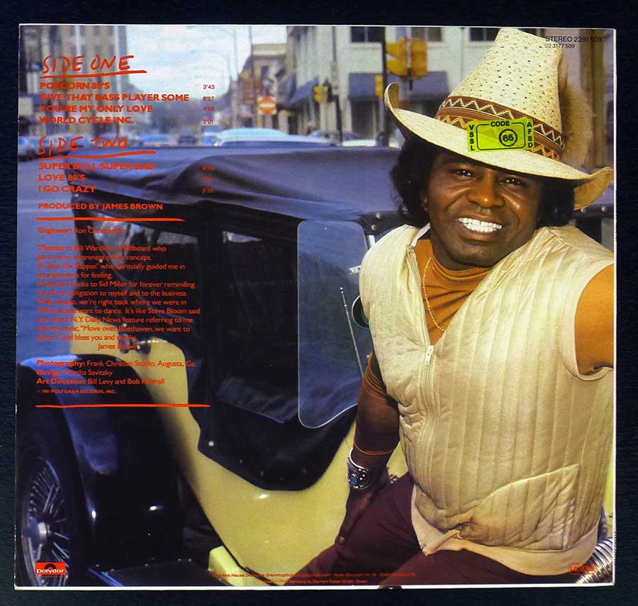
Musically, this thing leans on vamp, momentum, and attack more than on neatly packaged song craft. "Popcorn 80's" moves with that familiar Brown logic where the groove does the arguing and the vocal rides on top like an impatient foreman. "Give That Bass Player Some" is exactly the sort of title that sounds half joke, half demand, and the track follows through with low-end muscle and clipped rhythmic pressure. "Super Bull / Super Bad" keeps the band locked into a hard, repetitive chassis, and "I Go Crazy" drags an older Brown title into a tougher, less sentimental frame. There is less velvet here than on the old soul sides, more scrape, more jab, more sweat left on the floor after midnight.
Brown produced the album himself, which explains why even the rougher or more patched-together moments still carry his practical sense of control. The late-period band personnel tied to the album tell their own story: Jimmy Nolen's guitar still flickers and scratches with that mean little economy nobody ever duplicated cleanly, St. Clair Pinckney keeps the horn language from going soft, and the backing voices, with Martha High among them, stop the whole thing from drying out into pure mechanics. This is not the old imperial machine at full chrome shine, and pretending otherwise would be collector fantasy in platform shoes. But the rhythmic intelligence is still there, sometimes annoyingly so.
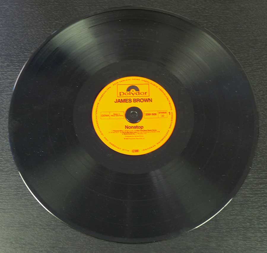
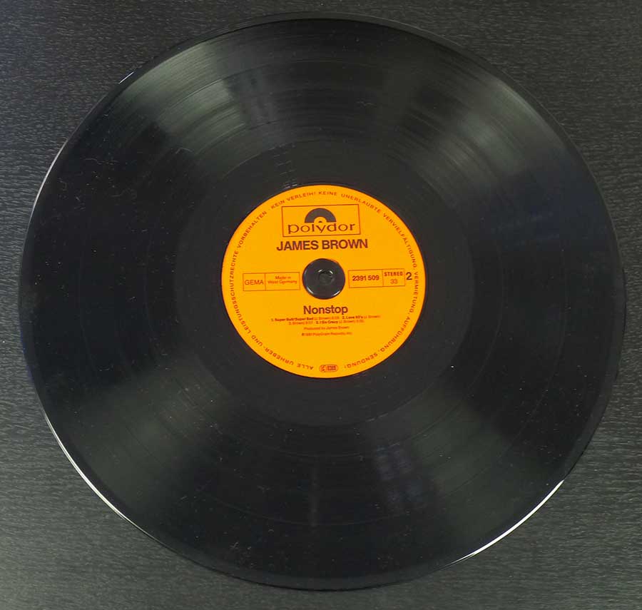
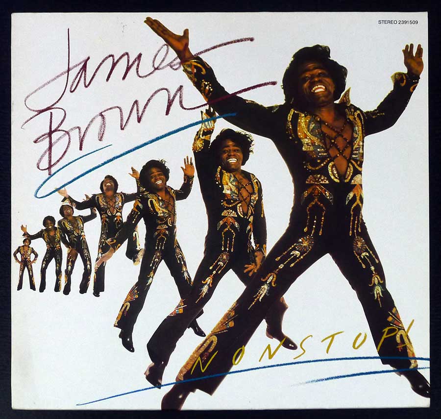
The sleeve and packaging credits also say something about the record's real station in life. Bill Levy and Bob Heimall handled the art direction, Martha Savitzky did the album design, and Frank Christian shot the cover photograph. It is a workmanlike visual package rather than one of those sleeves that starts fistfights in the shop window. Still, the German Polydor pressing has its own quiet usefulness: front cover, back cover, and both labels tell you this was a functioning catalog item from a major distribution network, not some mysterious private-press fever dream people suddenly pretend to have worshipped all along.
I remember records like this sitting in the soul section after the obvious Brown classics had already been plucked clean, the covers decent but not seductive, the promise tucked in the small print instead of the hype sticker. You turn one over, see a title like "World Cycle Inc.," and you know straight away this is either dead warehouse business or something stranger and better. Usually both.
Misread, not scandalous
There was no grand controversy tied to "Nonstop!" No banned sleeve, no moral panic, no dramatic career detonation. The usual misconception is duller than that: people assume a late James Brown album with a title like this must be empty contractual mop-up, and then they stop listening before the grooves have a chance to argue back. To be fair, the record does carry some of that obligation in its bones. Even sympathetic critics at the time heard it as a rehash of recent material. The difference is that Brown was still capable of making reworked parts hit harder than many artists' fully funded new ideas.
That is why this album earns space on a collector's site. Not because it is a monstrous rarity or some auction-room blood sport item, and not because every James Brown LP deserves a state funeral. It earns space because it catches him in an awkward, revealing phase: after the absolute peak, before the later mid-1980s rebound, still fighting for groove authority in a scene that had started dressing the future in shinier clothes. "Nonstop!" does not beg to be loved. It just keeps moving, slightly irritated, and that stubbornness is worth more than a lot of cleaner reputations.
References
- Vinyl Records Gallery page with high-resolution photos of the German Polydor pressing
- Discogs master release page for "Nonstop!" and international pressing history
- Album overview with release year, recording notes, and personnel
- Robert Christgau's 1981 review of "Nonstop!"
- Rick James "Street Songs" as 1981 funk scene comparison
- Prince "Controversy" for the early-1980s funk shift
- The Gap Band III for contemporary soul-funk context
- Zapp debut album as electro-funk comparison point
- Parliament's "Trombipulation" for late P-Funk context