Iron Maiden - Aces High (1984, UK, Maxi Single) 12" Vinyl Maxi Single

- Eddie takes to the skies in a brutal WWII dogfight scene

Album Front cover Photo of Iron Maiden - Aces High (1984, UK, Maxi Single) 12" Vinyl Maxi Single https://vinyl-records.nl/

Dead center, Eddie glares from a Spitfire cockpit, teeth clenched, canopy cracked with bullet hits. Planes dive and burn behind him, sky washed in pale war-light tones. The perspective pulls you straight into the nose of the aircraft—no distance, just impact and chaos.

"Aces High" tells the story of a British RAF pilot fighting against the German Luftwaffe during the Battle of Britain (1940), the first battle to be completely fought in the skies of the UK.

"Aces High" (1984) Album Description:

By 1984, Iron Maiden had stopped sounding like a gang of fast, hungry troublemakers and started sounding like a machine that knew exactly how much damage it could do. "Aces High" is only a UK 12-inch maxi single on paper, but it lands like a field report from the Powerslave campaign: the title track in full aerial panic, a clever swerve into Nektar territory with "King of Twilight," and a live "The Number of the Beast" there to remind anyone dozing in the cheap seats that Maiden could still turn a stage into a controlled riot.

What makes this record worth opening past the obvious is not just the dogfight sleeve, good though that is. It is the sly back-cover joke about Eddie's past lives, the black EMI label with its clipped UK efficiency, the choice of a progressive-rock cover for the B-side, and the way all three tracks catch Maiden at the exact moment NWOBHM stopped being a movement of hopeful hooligans and became international heavy metal without going soft. There is more going on here than a hit single and a famous chorus.

Britain in 1984 was tense, argumentative, and not exactly drifting on a warm breeze of optimism. The country had Thatcher, strike lines, police vans, and that familiar feeling that everything decent was being squeezed through a smaller opening. Metal answered in its own blunt way. NWOBHM had already burned through its first heroic rush, and plenty of bands were either cleaning themselves up for export, repeating themselves, or quietly falling apart. Maiden did the opposite. They took the gallop, the grit, the alleyway aggression, and pushed it into something broader and more cinematic without sanding the edges off.

Set against the year's other British heavy outfits, this single tells you where Maiden stood. Judas Priest were operating with chrome-plated precision, Saxon still had road-dust in the seams, Def Leppard had already started bottling their rough stuff for the American shelves, Motörhead remained gloriously unhousebroken, and Venom were dragging metal toward a dirtier kind of blasphemous chaos. Maiden sat in the sweet spot between all of them. More disciplined than Saxon, less lacquered than Leppard, more melodic than Motörhead, less primitive than Venom, and not as coldly engineered as Priest. That balance is why they kept winning.

Line-up changes had a lot to do with that. Bruce Dickinson replacing Paul Di'Anno a few years earlier did not simply change the voice; it changed the band's reach. Di'Anno brought street grime and a certain damaged snarl, but Dickinson gave Steve Harris a frontman who could carry narrative, altitude, and actual theatrical lift without collapsing into camp. Nicko McBrain, now fully settled in after Clive Burr, tightened the rhythm section into something more martial and more dependable. So when "Aces High" kicks off, it does not just move fast. It moves like a unit that has stopped arguing with itself.

The music itself still has that NWOBHM snap in the wrists. Harris's bass is not some buried rumour underneath the guitars; it clatters forward and pulls the track by the collar. Dave Murray and Adrian Smith work like twin blades, one more fluid, one more cutting, both locked into the same forward rush. McBrain does not merely keep time. He gives the thing lift and drag, the feeling of machinery under strain. Dickinson, meanwhile, sings this not as a detached history lesson but as if the cockpit glass is already cracking in front of him. Plenty of metal songs about war sound like lads waving model planes around. This one sounds like speed, fear, and duty colliding at altitude.

Martin Birch deserves a fair amount of the blame for how hard this still hits. He had already done the heavy lifting on the key Maiden records of the period, and on this release he keeps everything sharp without bleaching it sterile. Recorded at Compass Point Studios in Nassau and mixed at Electric Lady Studios in New York, the sound has weight but still breathes. No swamp, no fizz, no theatrical fog poured over the amps to impress people who think muddiness equals power. Birch understood a simple truth that a depressing number of producers never learned: when Steve Harris's bass, the twin guitars, and Dickinson's voice are all doing real work at once, clarity is not a luxury. It is survival.

Then there is the B-side decision, which says more about Maiden's taste than a hundred pious interviews. Choosing Nektar's "King of Twilight" was not some random cover-bin grab. It was a reminder that beneath the leather, rivets, and aviation panic, there was still progressive rock blood in the system. Maiden always had that side to them, no matter how many people preferred to pretend they were all gallop and slogans. The live "Number of the Beast" on the flip side does the opposite job: less taste, more threat. Smart pairing. One track says, "we know where this music came from," the other says, "and we can still flatten a room with it."

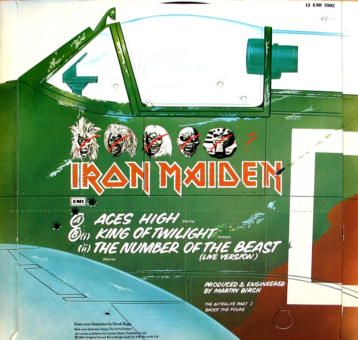
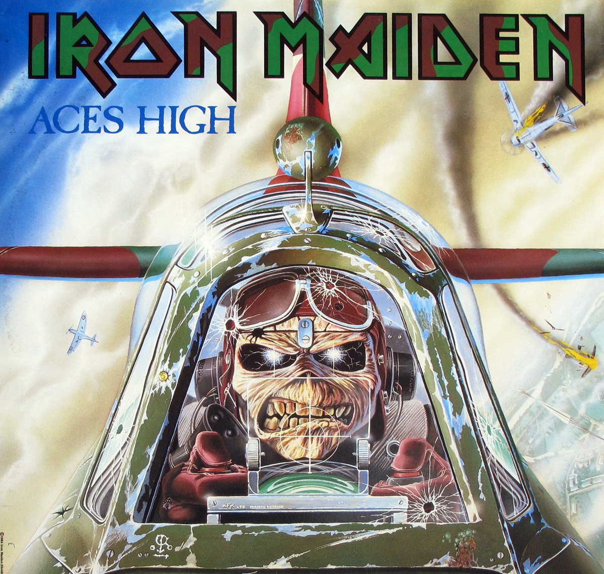
Derek Riggs and The Artful Dodgers did their bit too, and practically, not symbolically. Riggs gives the record its frontal snarl with Eddie in the Spitfire cockpit, while the back cover turns the aircraft fuselage into a stage for the track listing and that row of crossed-out earlier Eddies. It is funny, slightly juvenile, a touch obsessive, and exactly right for Maiden. The Artful Dodgers keep the layout from tipping into visual traffic. That mattered. A sleeve like this had to look fast, not busy.

There was no great public scandal tied specifically to this single, despite the usual lazy muttering that war imagery must mean war worship. Same old mistake. Maiden were not campaigning for battle; they were dramatizing peril, adrenaline, and perspective. Heavy metal has always had trouble with critics who hear a narrator and assume a manifesto. Easier to sneer than listen. Nothing new there.

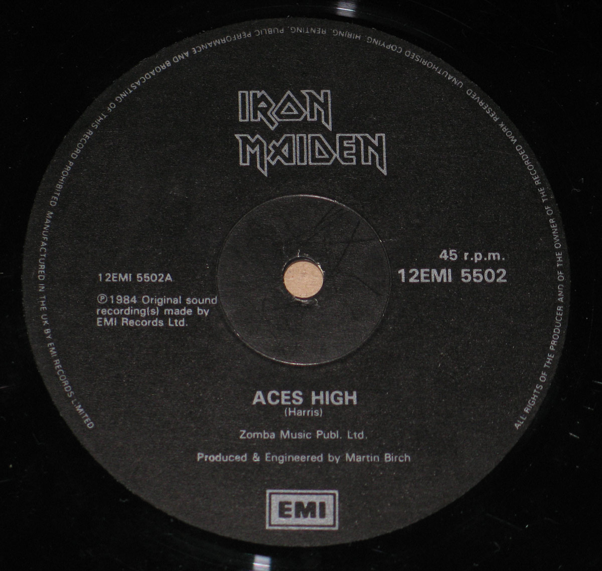
Under a low lamp, that black EMI label almost disappears until the silver text catches and the whole side suddenly looks official, severe, and very British. Found copies like this in shop bins where the sleeve corners had gone soft from being thumbed by people who probably bought the single, went home for the chorus, and stayed for the strange little details.

That is why this maxi single matters. Not because it is some impossible holy grail that only appears under a blood moon, and not because every Maiden release automatically deserves incense and kneeling. This one matters because it catches the band in that narrow, useful moment when ambition, discipline, visual identity, and sheer nerve all line up without becoming bloated. Plenty of bands made 12-inch singles in 1984. Very few managed to make one that still feels like a live wire when the sleeve comes back out of the shelf.

References

Album Key Details: Genre, Label, Format & Release Info

Music Genre:

NWOBHM New Wave of British Heavy Metal

A genre forged in late-70s Britain, where raw aggression meets working-class grit. Fast riffs, galloping rhythms, and a DIY attitude define the sound—less polished than arena rock, more melodic than punk, and built for denim, leather, and volume pushed just a bit too far.

Label & Catalognr:

Black EMI – Cat#: 12EMI 5502

Media Format:

Record Format: 12" LP Vinyl Stereo Gramophone Record
Total Weight: 230g

Release Details:

Release Date: 1984

Release Country: England

Production & Recording Information:

Producers:
  • Martin Birch – Producer, Sound Engineer
  • Martin Birch – Producer, Sound Engineer

    I first noticed Martin Birch on those early Iron Maiden sleeves—the ones with the typography that felt like a threat. At twelve, I didn’t care about "production value"; I just liked that the guitars didn't sound like mud. He was the man behind the sound mixer, the one who made the snare snap like a dry branch in a cold forest. He was "The Headmaster," and we were all just students of his high-voltage curriculum.

    Birch didn’t just record noise; he organized aggression. By 1972, he was already wrangling the messy brilliance of Deep Purple’s Machine Head, turning Ian Gillan’s banshee wails into something that didn't just clip the tape but lived inside it. In 1980, he pulled off the ultimate renovation, giving Black Sabbath a much-needed shower and a new spine. Heaven and Hell shouldn't have worked, but Martin polished that Birmingham sludge into something operatic and gleaming. It was a pivot that felt like fate, mostly because he refused to let the mid-range get lazy.

    Then came the long, obsessive stretch with Iron Maiden from 1981 to 1992. It was a twelve-year marriage to the fader. From the moment Killers (EMC 3357, for those who care) hit the shelves, the sound was physical. He knew how to let Steve Harris’s bass clatter like a machine gun without drowning out the melody—a sonic miracle that still feels fresh. You can almost smell the ozone and the dust on the Marshall stacks when the needle drops on The Number of the Beast. He stayed until Fear of the Dark, then simply walked away. No victory lap, no bloated memoir. He preferred the hum of the desk to the noise of the crowd, leaving us with nothing but the records and a slight sense of abandonment. But then, when you’ve already captured lightning on tape for twenty years, why bother hanging around for the rain?

Album Cover Design & Artwork:
  • Derek Riggs – Illustrator, Cover Artist
  • Derek Riggs – Illustrator, Cover Artist

    I have always liked the way Riggs made heavy metal look dangerous, not decorative.

    Derek Riggs is the British illustrator who gave Iron Maiden its face, its menace, and half its mythology. I still see him as one of the few cover artists who didn’t just package a band, he enlarged it. His run with Iron Maiden began in 1980 with the debut and stretched through the classic 1980s into the early 1990s, before later returns for Brave New World in 2000 and Somewhere Back in Time in 2008. Outside Maiden, he turned up on Budgie’s Nightflight in 1981, Bruce Dickinson’s Accident of Birth in 1997, Gamma Ray’s Power Plant in 1999, and Stratovarius’ Infinite in 2000. That is a proper career, not a side note.

  • The Artful Dodgers – Sleeve Design, Layout

    Never the flashy name on the credit line, but this was the design crew that stopped all that airborne chaos from turning into sleeve-shop wallpaper.

    The Artful Dodgers, a Hertfordshire-based graphic design company fronted by Keith Peacock, Neil Smith and Michael Faulkner, built a reputation in 1980s rock packaging for giving loud records a visual frame that looked sharp instead of cluttered. On "Aces High" they handled the sleeve design and layout, keeping Riggs' dogfight artwork under control with tight typography, balanced spacing and that crisp EMI-era discipline that makes the cover feel fast, aggressive and properly finished.

Complete Track-listing:

Tracklisting Side A:
  1. Aces High (4:31) Single
    Released as a single and one of Iron Maiden’s defining opening salvos—fast, sharp, and unapologetically loud.
  2. King of Twilight (4:54) Cover
    Cover of Nektar’s cult progressive rock track, reworked into a tighter, heavier frame without losing its oddball charm.
  3. The Number of the Beast (Live) (4:57)
    Live version capturing the band in full flight—less polished, more dangerous, and exactly how it should sound.

Disclaimer: Track durations shown are approximate and may vary slightly between different country editions or reissues. Variations can result from alternate masterings, pressing plant differences, or regional production adjustments.

You pick this one up and the first thing that hits is how clean that front still looks, even after decades—those blues and greys haven’t faded into mush like some cheaper pressings. The sleeve has that slightly glossy EMI finish, not thick, but not flimsy either. Edges show the usual soft wear if you’ve actually played it instead of framing it. Flip it over and the typography feels tight, no wasted space, just business. The label is classic black EMI—no nonsense, sharp print, catalogue number sitting there like it knows collectors will check it twice. Vinyl itself looks well-pressed, grooves cut deep enough to catch the light properly. Nothing flashy, just solid UK workmanship. The real story, though, sits in the small print and label details—worth digging into the hidden part of this gallery.

Album Front Cover Photo
Front cover of Iron Maiden Aces High UK maxi 12-inch vinyl sleeve showing Eddie as a skeletal RAF pilot centered in the cockpit of a green fighter plane, seen head-on in the foreground. Cracks and bullet holes mark the clear canopy around his goggles and headset. The Iron Maiden logo runs across the top in green and red, with Aces High in blue at upper left. Small aircraft peel away at left and right, one trailing smoke and fire, against a pale clouded wartime sky.

Straight in the hands, this sleeve does not bother with subtlety. Derek Riggs plants Eddie dead center in the cockpit like he is coming through the cardboard at you, and that is exactly why it works. No polite distance, no scenery first, no warm-up. Just that skull-face jammed behind a shot-up canopy, teeth out, eyes lit like bad news. The whole design is built around frontal impact. A fighter plane nose, full face, everything rushing forward. Old trick, yes. Still effective. Some sleeves bluff their menace from a safe distance. This one gets in your face and stays there.

What catches me every time is how cramped the image feels once you stop admiring it and actually look at it. The canopy bars, the targeting sight, the headset, the goggles shoved up on the forehead, all of it crowding Eddie into this steel-and-glass cage. Those white crack marks in the canopy are doing half the work. They are placed just where your eye wants clean space, which is annoying in the right way. Bullet holes along the left and lower right don’t just decorate the scene, they interrupt it. Good. War should interrupt things. The background aircraft are smaller, almost tossed in, one banking left, one up to the right, another dropping away in flame near the lower edge. Not carefully balanced either, thank God. Too much symmetry would have killed the panic.

The colour is smarter than it first appears. That pale dirty sky would be dull on a weaker sleeve, but here it acts like a stage light, pushing the green fuselage and red wing bands forward. The blue title at upper left always feels a little odd next to the huge Iron Maiden logo above it, almost too delicate, but maybe that is the point. The band name comes in like a brick through the window, then the song title hangs there cooler and thinner, as if pretending this is all under control. It isn’t. The logo itself sits hard across the top edge, with those green fills and red shadowing still looking sharp on this copy, though the black outlines tell you immediately whether the print has held up or gone soft. On a tired sleeve, that is where the rot shows first.

Handling the cover close up, the small physical irritations start to matter. Light rubbing along the lower edge knocks the dark paint back and exposes tiny pale flecks that cameras love to ignore. A faint scuff through the upper sky area breaks the smooth wash just enough to remind you this is a played copy, not some fantasy museum piece. Near the lower right nose section there is visible brownish wear in the printed metal effect, exactly the sort of corner-of-the-stack abrasion these glossy EMI sleeves pick up when they have been slid in and out a hundred times too many. Even the left edge has that slight softening where the board gives up pretending it is still factory crisp. None of this ruins the image. Quite the opposite. This sleeve looks like it has been owned, which is more than can be said for half the lifeless “mint” copies people wave around like investments.

Best detail of the lot might be the absurd little world globe perched above the cockpit spine. Such a strange Riggs touch. Half mascot joke, half target marker, maybe both. It should look silly. Somehow it doesn’t. Same goes for the starburst glare on the canopy and goggles, which is exactly the kind of airbrush flash that can date an image horribly, yet here it adds to the violence and speed. The whole cover is overcooked, theatrical, and slightly ridiculous. That is why it tells the truth. Aces High was never meant to look tasteful on a shelf between sensible records. It was built to sell danger to kids with fast eyes and no patience, and four decades later it still does the job with more conviction than most sleeves ever manage.

Album Back Cover Photo
Back cover of Iron Maiden Aces High UK maxi 12-inch vinyl sleeve showing the side of a green fighter aircraft filling most of the layout. White handwritten-style track listing sits across the fuselage at center, with the Iron Maiden logo below five small Eddie head illustrations crossed out in red and a red question mark beside them. The catalog number 12 EMI 5502 appears at top right with a handwritten price mark nearby. The pale blue wing cuts across the lower left foreground, and small credits are printed along the bottom edge.

Back in the hands, this is where the joke turns sly. Front cover gives you the full dogfight and all the noise; the back strips the drama down to the side of the aircraft and lets the typography do the heavy lifting. Smart move. The whole sleeve is basically one slab of green fuselage chopped up by canopy framing, rivet lines and painted panel edges, with the tracklisting dropped across it in fat white brush-lettering that looks half military chalk, half dressing-room graffiti. That loose script should have been a mess against this much painted metal, but it lands cleanly and fast. No fuss. No clutter. Just enough attitude.

Best bit, naturally, is the row of Eddie heads above the logo. Five little past incarnations, each one crossed out with a red slash, then that red question mark hanging at the end like the sleeve is smirking at its own mythology. That is pure Maiden nonsense, and it works because it does not overexplain itself. A weaker band would have turned it into a lecture. Here it reads like a private joke left on the plane before takeoff. Underneath, the IRON MAIDEN logo sits in orange-red with white edging, sharp enough on this copy to keep its bite. When these get worn, that white outline is one of the first things to look tired. This one still holds together nicely, though not without the usual little scars.

And yes, the physical wear tells its own story once the sleeve is close enough to stop pretending. The top right corner has that old shop price written in pen, “15.-”, which will annoy purists and delight anyone who likes records to feel lived through. Along the left spine there is soft rubbing and slight browning where the board has aged and the laminate or coating has stopped acting brave. Across the green paint there are scattered pale scuffs and scrapes, especially around the canopy frame and mid-panel areas, like this copy spent years sliding against other sleeves with no dignity at all. A small crease line near the upper edge breaks the white background just enough to catch the eye. Nothing catastrophic, but definitely the sort of honest wear collectors notice before they admit they are noticing it.

The layout itself is more deliberate than it first looks. That pale blue wing in the lower left corner gives the whole thing a strange balance, almost like the design needed one last shape to stop the text block floating off into nowhere. Credits are shoved down at the bottom in tiny print where they belong, including Derek Riggs and The Artful Dodgers, both doing their jobs without demanding applause. Even the bullet-hole graphics near the EMI box and logo are placed with a kind of casual precision. One thing does irritate, though: the bright white strip at the far right side is so stark it nearly looks unfinished until the eye adjusts and reads it as part of the aircraft marking. Annoying at first glance. Effective after a minute. Like most good sleeve design, it wins by being slightly stubborn.

What really sells this back cover is that it does not behave like filler. Too many maxi singles throw the front image away and dump information on the reverse like an invoice. This one stays in character. Same aircraft, same wartime paint, same sense that the machine itself is carrying the songs. “Aces High,” “King of Twilight,” and “The Number of the Beast (Live Version)” are not just listed here; they look stencilled onto the side of something already shot at. That is the whole design concept in one glance. Ridiculous, of course. Also dead right. Maiden understood better than most that cardboard should do more than protect the record. It should keep telling the lie loudly enough that you want to believe it.

Close up of Side One record’s label
Close up of Side One label for Iron Maiden Aces High UK maxi 12-inch vinyl showing a matte black EMI label with silver-grey text. The stylized Iron Maiden band logo sits at the top, catalogue numbers 12EMI 5502 and 12EMI 5502A appear left and right of the spindle hole, and the song title Aces High is printed in the lower half above the EMI box logo. Fine circular rim text runs around the outer edge, and the glossy black vinyl grooves surround the label.

Get this under a decent light and the first thing that stands out is how deliberately restrained it is. No colour, no illustration, no Eddie grinning at you—just a near-matte black label that almost disappears into the vinyl until the silver-grey text catches the light. The surface has a faint grain to it, not perfectly smooth, which gives it a slightly industrial feel. Around the centre hole you can see the usual light spindle marks, fine arcs where the record has been dropped on a turntable more than a few times. Nothing brutal, but enough to tell you this copy has been used properly, not sealed away for bragging rights.

The layout is pure mid-80s EMI logic. At the very top sits the Iron Maiden logo, drawn in that sharp, angular lettering that looks like it was cut from metal rather than inked on paper. It is not decorative fluff—it is a brand mark, a quick visual hit that tells you what you are holding before your eyes even start reading. The spindle hole divides the label into left and right information blocks. On the left: “12EMI 5502A” and the copyright line. On the right: “45 r.p.m.” and the main catalogue number “12EMI 5502,” printed slightly bolder so your eye lands there first.

Below the centre, the title “ACES HIGH” sits in clean capitals, followed by “(Harris)” and the publishing credit to Zomba Music. Then the production credit—“Produced & Engineered by Martin Birch”—quietly anchoring the whole thing in the lower half. At the bottom, the boxed EMI logo appears, a simple rectangular wordmark doing its job without any attempt at flair. Around the outer edge runs a tight ring of legal text, small enough to be annoying but clear enough to confirm “Made in the U.K. by EMI Records Limited,” along with the usual warnings about copying, broadcasting and hiring.

What really defines this label is the absence of excess. No rights society logo jumping out, no marketing code cluttering the field, no decorative background—just text arranged with intent. Even the negative space is doing work here, giving the label a slightly severe, almost bureaucratic look. Typical EMI. It does not try to entertain you. It tells you what you need, then gets out of the way. And honestly, after that front cover chaos, that restraint feels earned.

EMI, United Kingdom Label

EMI’s black label design from the mid-1980s strips everything back to function: dark matte background, high-contrast silver text, and a strict hierarchy of information. On this 1984 UK maxi single, the label prioritises speed, catalogue number, and production credits while confirming manufacture in England directly in the rim text. The result is a no-nonsense presentation that reflects EMI’s industrial approach to vinyl production during this period. This particular label design was used by EMI between approximately 1983 and 1986.

Colours
Matte black label background with silver-grey text; glossy black vinyl surrounding the label.
Design & Layout
Highly structured and minimal layout: band logo at top, technical data split left/right of spindle hole, title and credits centred below, EMI logo at bottom, with continuous legal rim text.
Record company logo
Boxed EMI logo at the bottom; a rectangular wordmark used to identify EMI as manufacturer and rights holder, functioning as both branding and legal attribution.
Band/Performer logo
Iron Maiden’s custom angular logo appears at the top, composed of sharp geometric letterforms designed for immediate recognition across sleeves, labels, and merchandise.
Unique features
Black EMI label variant, 45 r.p.m. marking, dual catalogue references (12EMI 5502 and 12EMI 5502A), Martin Birch production credit, and clearly printed UK manufacturing statement in rim text.
Side designation
Side One indicated by suffix “A” in catalogue code 12EMI 5502A.
Rights society
No explicit rights society logo or code visible on this label.
Catalogue number
12EMI 5502 (main); 12EMI 5502A (side-specific identifier).
Rim text language
English, printed in a continuous circular format around the label edge.
Track list layout
Single-track presentation with “ACES HIGH” centred prominently, followed by songwriter, publisher, and production credits.
Rights info placement
Copyright line placed in the left lower quadrant; full legal disclaimer in rim text.
Pressing info
“Made in the U.K. by EMI Records Limited” printed within the outer rim text.
Marketing codes
No distinct marketing or price codes visible on this label.
Background image
No pictorial imagery; subtle textured black surface only, designed to emphasise readability and contrast.

IRON MAIDEN - Vinyl Records Discography Home Page