- Bob Geldof steps out of the Boomtown Rats shadow with a widescreen 1986 solo debut
Deep in the Heart of Nowhere captures Bob Geldof at a crossroads in 1986, stepping out from the Boomtown Rats shadow and into a widescreen solo debut shaped by producer Rupert Hine. It’s pure mid-80s British pop-rock: big drums, clean guitars, restless hooks, and that unmistakable sense of urgency. Singles like This Is the World Calling and Love Like a Rocket bring radio-ready punch, while deeper cuts lean inward and reflective. Released on Mercury as a heavyweight 12" LP with a printed inner sleeve packed with lyrics and artwork, this Dutch-pressed edition feels unapologetically physical—an era where albums were statements, not playlists, and vinyl still mattered as an object you lived with.
Deep in the Heart of Nowhere is the moment Bob Geldof steps out from under the Boomtown Rats shadow and tries on a solo suit in full daylight. It’s a big, restless 1986 pop-rock record—equal parts bruised confession and stadium-ready shout—built to prove he’s more than a famous mouth with a microphone.
In 1986, British pop was polished to a mirror shine: synths everywhere, drums with that gated “thwack,” and chorused guitars trying to sound like neon. The UK was deep in the MTV era, and post-Live Aid pop had this weird mix of glossy ambition and moral hangover—like everyone wanted to dance, but also wanted to feel like it meant something.
For Geldof, this album feels like a reset button with fingerprints all over it: leaving the band identity behind, keeping the urgency, and aiming it inward. Bringing in Rupert Hine as producer gives the whole thing a controlled burn—enough space for the songs to breathe, but tight enough to survive 1986 radio.
Sonically, it’s British 80s pop with bite: crisp edges, a widescreen mix, and that slightly dramatic “everything matters” mood that the decade practically patented. This Is the World Calling kicks the door in like a headline, while Love Like a Rocket leans into velocity—romance as propulsion, not poetry.
Then it gets more human (and honestly, more interesting): In the Pouring Rain and August Was a Heavy Month sound like late-night thoughts you don’t say out loud until the room is quiet enough to hear yourself. By the time the title track Deep in the Heart of Nowhere lands, it doesn’t feel like a place on a map—it feels like a mood you carry home.
Put this next to other big 1986 statements and you can hear the same era DNA—clean production, bold hooks, emotional theatricality—but Geldof keeps a rougher edge in the voice, like he refuses to sand himself down completely.
Deep in the Heart of Nowhere sits somewhere between all that shine and an older punk instinct: the tunes want to soar, but the attitude still wants to argue.
The “tension” here isn’t tabloid drama—it’s artistic physics: the pull between the blunt-force directness people expected from him, and the polished pop language the mid-80s demanded. You can feel that push-pull in the way the album swings from anthems to private rooms, like he’s testing how loud he needs to be to still sound honest.
This record didn’t become a universal holy relic, and that’s kind of the point—solo debuts rarely arrive fully formed, they arrive hungry. The singles did the heavy lifting, and This Is the World Calling is the one that still snaps into focus decades later: urgent, hooky, and unapologetically alive.
As a collector, I love it for the physical story too: the Mercury label, the proper LP heft, and that original inner sleeve packed with lyrics and artwork—because in 1986, albums still wanted to be objects, not just “content.”
When I drop the needle on Deep in the Heart of Nowhere, I hear a man stepping out into a very loud decade and insisting he still has something personal to say. It’s not perfect, but it’s real in the way good vinyl is real—tiny flaws, big emotion, and a lot of life pressed into grooves. Decades later, the songs still smell faintly of rain on pavement, backstage sweat, and that stubborn 80s belief that a chorus can change your mood—and maybe the world.
Bob Geldof was born 5 October 1951 in Dún Laoghaire, near Dublin—an Ireland that still felt small, watchful, and tightly buttoned-up, even as the modern world kept knocking on the door. Losing his mother when he was a kid didn’t give him a “tragic backstory” so much as it gave him a sharper edge and a radar for unfairness. School, odd jobs, and that constant Irish hum of “don’t get notions” all shaped him into someone who’d eventually get very loud about not staying quiet.
Before he became the guy yelling into the cultural weather, he worked as a music journalist in Vancouver for The Georgia Straight. That matters, because it trained him to watch scenes like a hawk: who’s faking it, who’s starving, who’s being ignored, and who’s about to explode. He didn’t just want to be in a band—he wanted to say something, and saying something is easier when you’ve spent time documenting other people’s noise first.
The Boomtown Rats formed in 1975 in Dublin, then did what ambitious bands did in that era: they went where the industry actually was—London—and tried to survive. The late ’70s were basically a cultural bar fight: punk had cracked the old rules, new wave was turning rage into hooks, and pop was learning how to be sharp again. Geldof fit right into that chaos, because he could sound theatrical and furious in the same breath, like he was reporting live from the inside of the song.
The Rats didn’t just flirt with success—they landed real punches. “Rat Trap” hit No. 1 in the UK in 1978, with Bob Geldof writing it and Robert John “Mutt” Lange producing it—yes, that Mutt Lange, the guy who knew how to make rock sound huge without sanding off the teeth. It mattered culturally because it was an Irish band muscling into the UK charts during an era when rock was being rewritten in real time.
Then came “I Don’t Like Mondays”—a massive hit, and also a lightning rod. The song was inspired by the 1979 Cleveland Elementary School shooting in San Diego, after the shooter’s chilling quote got repeated in the news like the world’s worst catchphrase. Musically it’s polished new wave-pop; emotionally it’s a cold stare. It was recorded at Trident Studios in London and produced by Phil Wainman, and it raised the obvious debate: should a chart single go anywhere near real tragedy—or is that exactly what art is supposed to do when reality gets unbearable?
In 1982, Geldof starred as Pink in Pink Floyd – The Wall, directed by Alan Parker and written by Roger Waters. It’s not a cute cameo; it’s a full-body plunge into a bleak, surreal story about fame, isolation, and psychological collapse. If you ever wondered whether Geldof could project “tired of the circus” without saying a word—yeah, he could.
By the early to mid-’80s, pop had become truly global—satellite TV, mass broadcasting, superstar branding—while politics and humanitarian crises were landing in living rooms with brutal clarity. The 1983–1985 Ethiopian famine hit Western screens in a way that bypassed polite distance, especially after BBC reporting shook the public. This is where Geldof’s story swerves: instead of just writing another angry song, he tried to weaponize celebrity attention for actual money and actual logistics.
In 1984, Geldof and Midge Ure pulled together Band Aid and co-wrote “Do They Know It’s Christmas?” to raise funds for famine relief. The track was recorded at Sarm West Studios in Notting Hill, London in late November 1984, produced by Midge Ure, and released in early December. The concept was simple and kind of audacious: trap the entire pop ecosystem in a room, remove the usual ego choreography, and press “record” before anyone can overthink it.
Live Aid followed on 13 July 1985, staged simultaneously at Wembley Stadium in London and John F. Kennedy Stadium in Philadelphia. Geldof and Ure didn’t just “host a concert”—they engineered a media moment that made charity look urgent, mainstream, and unavoidable. It became a blueprint for how benefit events could work at scale: broadcast-first, globally coordinated, and emotionally direct enough that you couldn’t just shrug and change the channel.
In 1986, the idea expanded again with Sport Aid, which culminated in the Race Against Time, a 10K run held simultaneously across dozens of countries. It wasn’t only about star power; it was about mass participation—millions of ordinary people turning movement into fundraising. Geldof was among the organizers alongside partners linked with UNICEF, which shows how his activism was shifting from “rock star initiative” into bigger institutional territory.
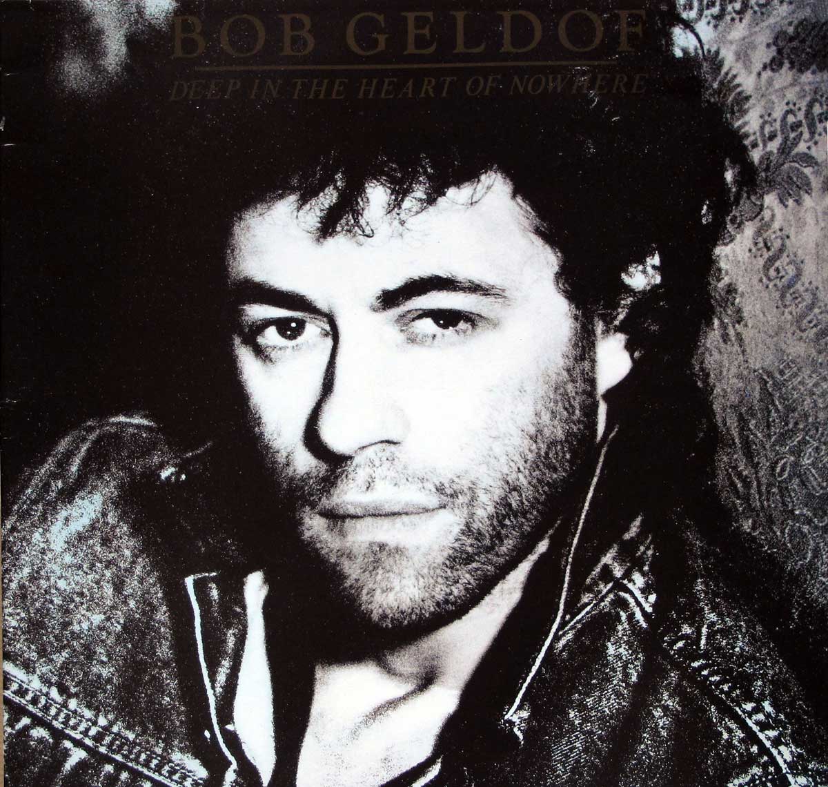
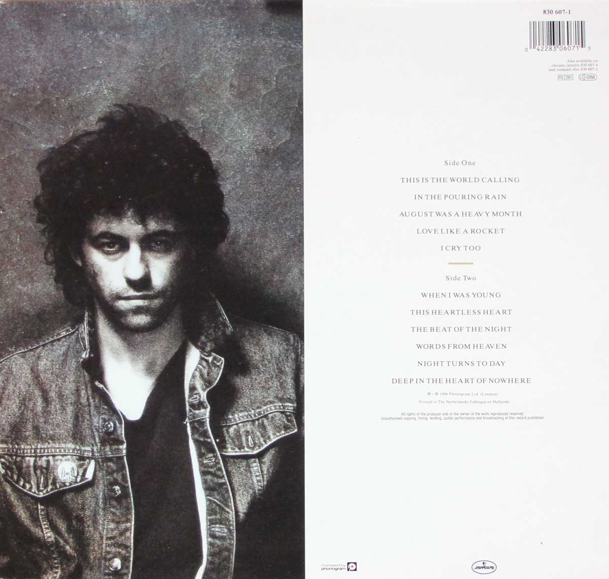
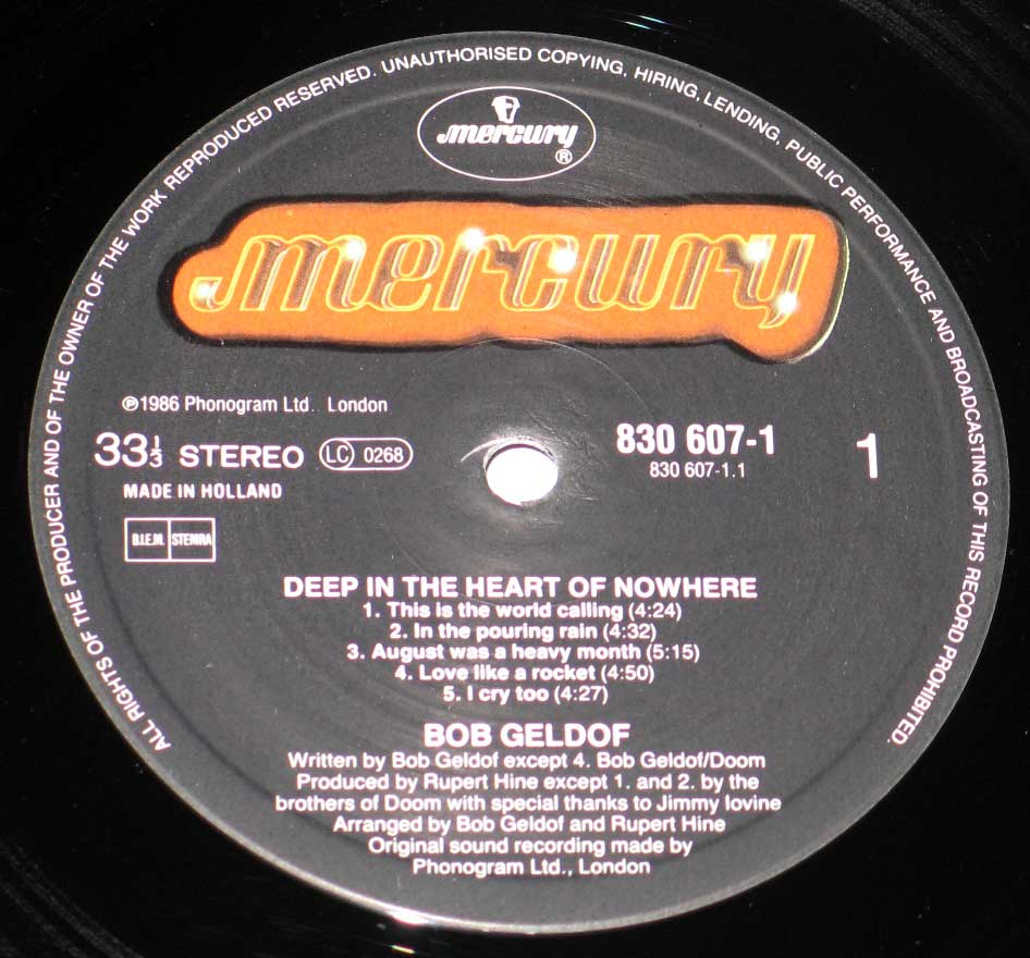
In late 1986, Geldof released his first solo studio album, Deep in the Heart of Nowhere, on Mercury, produced by Rupert Hine. The timing is telling: post-Live Aid fame could’ve turned him into a permanent spokesperson, but he still insisted on being a working songwriter. In my head, this is the era where he sounds like a man trying to balance two lives—artist and agitator—without tearing in half.
If you want the connective tissue across his career, follow the production fingerprints. You’ve got Mutt Lange producing “Rat Trap”—tight, punchy, radio-ready rebellion. You’ve got Phil Wainman producing “I Don’t Like Mondays” and the recording tied to Trident Studios in London—a classic studio name that screams “real deal” era. Then you’ve got the charity end: “Do They Know It’s Christmas?” cut at Sarm West Studios with Midge Ure producing—proof that a studio can become a temporary command center when the mission is bigger than the music.
Geldof’s controversies mostly come from the same engine that powers his best moments: blunt urgency. “I Don’t Like Mondays” got pushback because it turns a real atrocity into a pop narrative, and some listeners will always find that line uncomfortable—fair. On the activism side, “Do They Know It’s Christmas?” and the broader Band Aid/Live Aid era has been criticized for oversimplifying Africa, leaning into stereotypes, and giving off “white savior” vibes even when the intent was genuine. The hard truth is that global charity is never a clean story, and Geldof has never pretended he’s a soft-spoken diplomat about it.
In 2005, Geldof and Ure returned with Live 8, a series of concerts timed right before the G8 summit at Gleneagles. The point wasn’t only fundraising; it was political pressure—debt relief, aid commitments, trade issues, the whole messy policy buffet. Live 8 showed how his activism had evolved: less “emergency response,” more “systemic argument,” delivered through the loudest megaphone pop culture can build.
In 1986, he received an honorary KBE (KBE stands for Knight Commander of the Order of the British Empire) for his charity work—an Irishman getting a British honour, which is historically… loaded, to put it politely. It’s one of those moments where the system basically says, “We don’t know what to do with you, so here’s a medal—please don’t bite.” Of course, people still call him “Sir Bob,” even though it’s honorary, because the internet loves a shortcut almost as much as it loves an argument.
When I map Bob Geldof as a whole, I don’t see a neat “musician” lane and a separate “activist” lane—I see one person with a permanently switched-on sense of outrage, using whatever platform is available. Sometimes that platform is a three-minute single, sometimes it’s a global broadcast, sometimes it’s an argument with the world about how charity should look. The vibe is consistent: restless, direct, and allergic to doing nothing just because doing something is complicated.
British 80s Pop
Mercury – Cat#: 830 697
Gatefold/FOC (Fold Open Cover) album cover design with artwork and photos printed on the inside cover pages.
Record Format: 12" LP Vinyl, Stereo Gramophone Record
Total Weight: 280g
1986 – Made in Holland
Disclaimer: Track durations shown are approximate and may vary slightly between different country editions or reissues. Variations can result from alternate masterings, pressing plant differences, or regional production adjustments.
This is the original front cover of Deep in the Heart of Nowhere, presented as a stark, high-contrast black-and-white portrait of Bob Geldof, cropped tightly so the face dominates almost the entire sleeve. The composition is deliberately intimate: eyes centered slightly above the horizontal midpoint, staring straight at the viewer with a fixed, unsmiling intensity that feels confrontational rather than glamorous. There is no attempt at pop-star polish here; the image leans hard into seriousness and emotional weight.
Hair is dark, thick, and loosely curled, falling naturally without styling tricks, reinforcing the stripped-back tone. The face shows visible stubble and uneven shadowing, emphasizing texture rather than smoothness. Lighting is directional and somewhat harsh, creating deep shadows along one side of the face and under the eyes, while the opposite side is washed in pale light. This contrast gives the portrait a slightly worn, nocturnal look that fits the album’s introspective mood.
Clothing details are minimal but telling. The collar and shoulder of what appears to be a dark leather jacket or heavy outer layer are visible, catching light in a rough, grainy way. The material looks textured and scuffed rather than pristine, adding to the sense that this record is about lived experience, not image management. No jewelry, no props, no background narrative elements distract from the face.
Typography is understated and easy to miss at first glance. The artist name BOB GELDOF and album title DEEP IN THE HEART OF NOWHERE are printed near the top edge in small, muted lettering that blends into the dark background. The font is restrained and traditional, avoiding flashy 1980s design trends. This choice forces attention onto the photograph itself and signals an adult, serious release rather than a chart-driven pop product.
From a collector’s perspective, this cover is all about mood and restraint. There are no barcodes, hype stickers, or visual clutter on the front, just image and text working together to set expectations. The photograph reproduces cleanly on vinyl, with visible grain that feels intentional rather than a printing flaw. It is a sleeve designed to be held, studied, and remembered, communicating the album’s tone before the needle ever touches the groove.
This image shows the full back cover of Deep in the Heart of Nowhere, designed as a strict vertical split between image and information. The left half reprises the album’s visual identity with a black-and-white portrait of Bob Geldof, while the right half is a stark white field dedicated entirely to text. The contrast is intentional and sharp, making the functional elements of the sleeve immediately readable while keeping the mood consistent with the front cover.
On the left side, the portrait is framed looser than the front cover. The upper torso is visible, with Geldof wearing a worn-looking denim jacket over a dark shirt. The jacket’s seams, pockets, and metal buttons are clearly defined, adding texture and realism. The lighting remains directional and unforgiving, emphasizing facial shadows and giving the image a serious, slightly fatigued expression. This is not a decorative image; it reinforces the album’s restrained, adult tone.
The right side is dominated by clean, centered typography. At the top, the barcode sits near the upper-right corner, accompanied by the catalog number 830 607-1. Below it, the track listing is presented in two clearly separated sections labeled Side One and Side Two. Each song title is set in a small, elegant serif font with generous spacing, making the list easy to scan and visually calm. There are no durations, credits, or embellishments here—just titles and order.
Side One lists This Is the World Calling, In the Pouring Rain, August Was a Heavy Month, Love Like a Rocket, and I Cry Too. Side Two follows with When I Was Young, This Heartless Heart, The Beat of the Night, Words from Heaven, Night Turns to Day, and the title track Deep in the Heart of Nowhere. The alignment and spacing suggest a deliberate attempt to let the song titles stand on their own without distraction.
At the bottom of the white panel, fine-print copyright and production text appears, including the © notice for Phonogram Ltd. (London) and confirmation that the record was printed in the Netherlands. The Mercury logo is placed subtly near the lower edge, small and unobtrusive. From a collector’s point of view, this back cover is clean, uncluttered, and practical, with no visual noise, making condition issues like ring wear, discoloration, or seam damage easy to assess at a glance.
This image shows one side of the original printed inner sleeve from Deep in the Heart of Nowhere, reproduced in stark black-and-white and focused entirely on the lower half of a standing person. The frame is cropped at roughly knee height, cutting off the upper body completely and forcing attention onto posture, clothing texture, and the surface beneath the feet. The result feels intentionally anonymous and physical, aligning with the album’s inward-looking tone rather than presenting a conventional band image.
The trousers are dark and appear heavy, possibly denim or similarly thick fabric, with visible creases and wear patterns along the legs. The stance is uneven, suggesting weight shifted slightly forward, as if caught mid-step or just after movement. The shoes are dark and solid, with scuffed surfaces that catch light unevenly. One shoe shows a small, bright typographic mark near the toe area, standing out sharply against the otherwise muted tones.
The floor beneath the feet is textured and messy, possibly concrete or a rough interior surface, with scratches, stains, and irregular marks clearly visible. These details are not cleaned up or softened; the grain of the photograph exaggerates every imperfection. There is a faint sense of motion blur around the legs, implying movement rather than a posed studio shot, which reinforces the restless mood carried throughout the album.
The image spans what appears to be a gatefold or folded inner sleeve surface, with a subtle vertical seam visible toward one side, reminding the viewer that this is a printed object designed to be handled, unfolded, and refolded. The print quality shows deliberate grain and contrast rather than smooth tonal transitions, typical of mid-1980s sleeve photography that favored atmosphere over clarity.
From a collector’s perspective, this inner sleeve matters because it completes the album as a physical statement. It is not decorative filler; it extends the visual language of the cover into the packaging itself. Condition issues like creasing along the fold, paper wear at the edges, or fading in the dark areas are immediately noticeable on this kind of high-contrast print, making original, well-preserved copies especially desirable.
This image shows the reverse side of the original printed inner sleeve from Deep in the Heart of Nowhere, executed in the same stark black-and-white aesthetic used throughout the album packaging. The layout is deliberately layered: a smaller, rectangular image sits centered within a larger, heavily textured background, immediately reading as a framed object rather than a full-bleed photograph.
The central image is not a modern portrait at all, but a deliberate reference to Federico da Montefeltro (1422–1482), the Renaissance Duke of Urbino, best known from profile portraits attributed to Piero della Francesca. The distinctive hooked nose, receding hairline, strong brow, and rigid profile are unmistakable markers drawn directly from that visual tradition. The pose—turned away yet glancing back—mirrors the formal authority of 15th-century court portraiture, where power was conveyed through restraint rather than expression. This is not a likeness in the photographic sense, but a conscious reuse of a historical image language, pulling a symbol of intellect, isolation, and control into a modern vinyl inner sleeve context.
The clothing reinforces this historical reference. The heavy, layered garment wraps tightly around the body, forming dense folds that dominate the lower half of the composition. These folds are treated as sculptural mass rather than fashion detail, mirroring how power and status were communicated in Renaissance painting through fabric weight and restraint rather than ornament.
Surrounding the inner image is a deliberately distressed surface filled with scratches, blotches, and uneven tonal patches. These marks are printed, not damage, but they convincingly mimic age and wear. A vertical fold line near the left edge is clearly visible, grounding the image as a physical inner sleeve meant to be handled, folded, and returned to the jacket.
From a collector’s perspective, this inner sleeve completes the album’s visual argument. It borrows the visual authority of Renaissance portraiture and drags it into a mid-1980s vinyl context, reinforcing themes of inward focus and gravity. Because the image relies on deep blacks and subtle midtones, condition issues such as creasing, edge wear, and fading are immediately apparent, making clean originals especially important for archival collections.
This image shows a close-up of the Side One record label from the original 1986 Dutch pressing of Deep in the Heart of Nowhere. The label uses Mercury’s late-1970s to mid-1980s black-background design, dominated by a large, horizontally stretched Mercury logo in orange with a soft yellow outline. The logo sits prominently across the upper half of the label, acting as immediate brand identification even when the record is spinning on the turntable.
At the very top edge, the classic Mercury emblem appears again in miniature: a stylized head-with-helmet icon referencing the Roman messenger god Mercury, enclosed in an oval. This symbol historically functioned as a visual shorthand for speed, communication, and modernity—qualities the label leaned on heavily during the vinyl era. Around the outer rim runs dense legal text in English, warning against unauthorized copying, hiring, lending, public performance, and broadcasting.
The center area contains all functional playback information. On the right, the catalogue number 830 607-1 is printed clearly, with a smaller matrix-style extension beneath it. The large numeral 1 confirms this is Side One. On the left, the speed designation 33⅓ STEREO is printed alongside the boxed LC 0268 label code, a European marketing identifier used for rights administration and distribution tracking. Below that, MADE IN HOLLAND confirms the manufacturing country of this pressing.
The track listing is neatly centered and stacked, listing the five Side One tracks with full titles and running times. Typography is compact and functional, optimized for readability rather than decoration. Beneath the tracks, artist and production credits appear, noting that all songs were written by Bob Geldof except one, and that production duties were handled primarily by Rupert Hine, with specific exceptions called out. At the bottom, Phonogram Ltd. London is credited as the original sound recording owner.
From a collector’s standpoint, this label is textbook mid-80s Mercury: clean print registration, high contrast between text and background, and no background imagery beyond the solid black field. Any spindle wear, fading of the orange logo, or scuffing around the center hole becomes immediately visible on this design, making clean labels an important indicator of overall record condition.
This is the classic Mercury Records black label with orange logo, widely used across Europe for LP releases in the late 1970s and 1980s. The design prioritizes strong brand visibility and clear playback information, with all essential data arranged symmetrically around the center spindle hole. This particular label design was used by Mercury between approximately 1977 and the late 1980s.
All images on this site are photographed directly from the original vinyl LP covers and record labels in my collection. Earlier blank sleeves were not archived due to past storage limits, and Side Two labels are often omitted when they contain no collector-relevant details. Photo quality varies because the images were taken over several decades with different cameras. You may use these images for personal or non-commercial purposes if you include a link to this site; commercial use requires my permission. Text on covers and labels has been transcribed using a free online OCR service.