Birch didn’t just record noise; he organized aggression. By 1972, he was already wrangling the messy brilliance of Deep Purple’s Machine Head, turning Ian Gillan’s banshee wails into something that didn't just clip the tape but lived inside it. In 1980, he pulled off the ultimate renovation, giving Black Sabbath a much-needed shower and a new spine. Heaven and Hell shouldn't have worked, but Martin polished that Birmingham sludge into something operatic and gleaming. It was a pivot that felt like fate, mostly because he refused to let the mid-range get lazy.
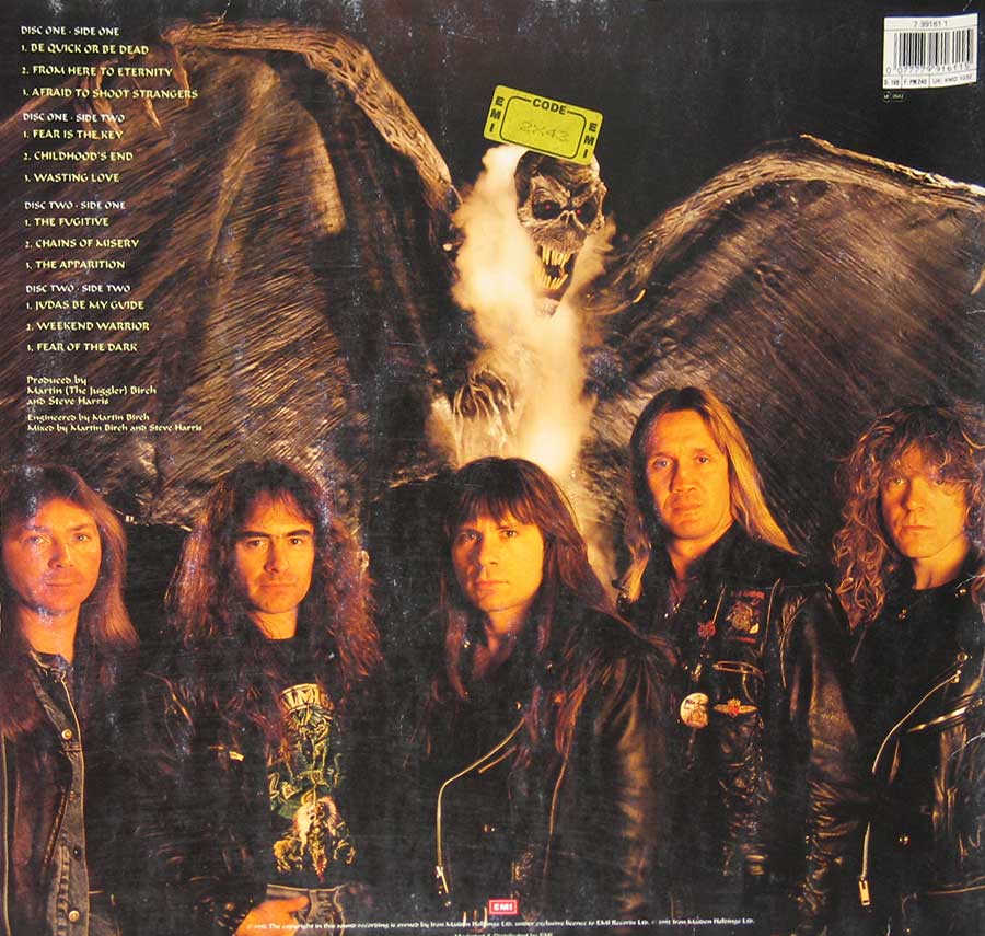
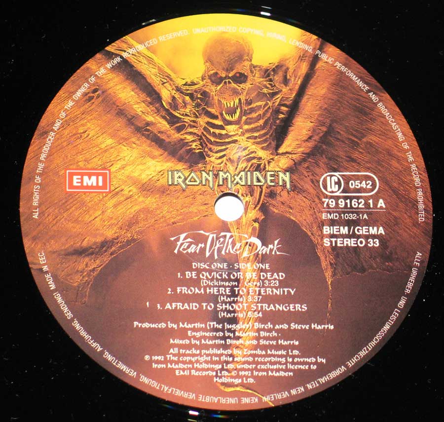
Then came the long, obsessive stretch with Iron Maiden from 1981 to 1992. It was a twelve-year marriage to the fader. From the moment Killers (EMC 3357, for those who care) hit the shelves, the sound was physical. He knew how to let Steve Harris’s bass clatter like a machine gun without drowning out the melody—a sonic miracle that still feels fresh. You can almost smell the ozone and the dust on the Marshall stacks when the needle drops on The Number of the Beast. He stayed until Fear of the Dark, then simply walked away. No victory lap, no bloated memoir. He preferred the hum of the desk to the noise of the crowd, leaving us with nothing but the records and a slight sense of abandonment. But then, when you’ve already captured lightning on tape for twenty years, why bother hanging around for the rain?