Hörzu’s Secret Vinyl Empire: How a TV Magazine Stamped Pink Floyd & Kraftwerk

After the war, people didn’t need inspiration. They needed a week that made sense. And there was HÖR ZU—December 1946—turning up like a dependable knock at the door. Not glamorous. Useful. A radio guide at first, which mattered when the radio was basically the room’s pulse and everybody listened as if it might explain tomorrow.

Then it started spreading. Quietly, annoyingly. By the 1950s it was already everywhere, and by the early 60s the numbers got absurd—millions of copies, the kind of reach that makes you wonder if anyone in West Germany ever had a clean coffee table. Television arrived, turned into the second fireplace, and Hörzu didn’t “cover” that change. It ran alongside it, pen in hand, telling households what time their evenings belonged to.


Large Album Front Cover Photo of

"Hörzu" The history of Germany's Popular Magazine

I don’t think Hörzu “became” a national institution so much as it quietly moved in and refused to leave. Postwar Germany was rebuilding everything — houses, routines, even the idea of a normal week — and there it was: a weekly paper planting itself right on the living-room table. It starts in 1946 as a radio-program guide, which sounds humble until you remember what radio was then: the room’s heartbeat. Hörzu didn’t preach. It just pointed. And people followed.

By 1950 it’s already pushing one million in circulation. That’s not “growth,” that’s a habit forming. Then the numbers get almost rude: about 4.2 million copies in 1962, with one media study saying it was read by “every third” West German. Around 1969 it crests at roughly 4.3 million, and the same study frames it as Europe’s highest-circulation magazine at the time. At that point you’re not buying a magazine. You’re participating in a weekly ritual whether you admit it or not.

The 1970s and 1980s don’t magically grant Hörzu its power — they just make the power visible. Television stops being a novelty and starts acting like the second fireplace. Color shows up, variety multiplies, and suddenly the week is organized around broadcast hours the way it used to be organized around train times. Hörzu doesn’t “cover” that shift. It rides it, like it planned the whole thing.

And then there’s the ceremonial flex: the “Goldene Kamera” award, introduced in 1965. That’s Hörzu stepping off the sidelines and onto the stage, going from “here’s what’s on” to “here’s what matters.” Even later, the print run stays absurdly big — the German-language record gives 4,438,600 copies for 1979. Nobody prints that many copies for a niche. That’s furniture-level presence. You don’t notice it until it’s gone.

In the 1980s, the air gets noisier. More channels, sharper competition, audiences splintering into smaller and smaller tastes. Hörzu still hangs on, partly because it has a recognizable personality — including Mecki the hedgehog mascot — and partly because it leans into what it’s always been good at: comfortable, mainstream entertainment served with a reassuring sameness. Not edgy. Not trying to impress you. More like, “Relax, I’ve got the week handled.” Which is either comforting or mildly annoying, depending on your mood.

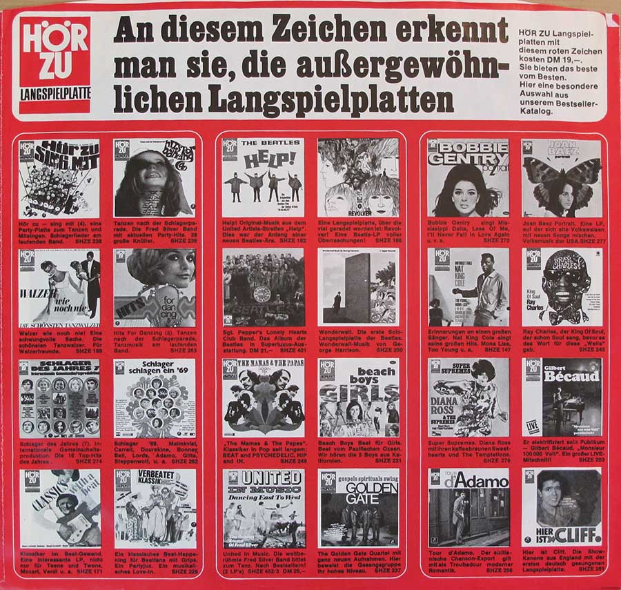
People love to add the little disclaimer: “It wasn’t a music magazine.” Fine. But it still got its hands on music in a very direct way. The English-language record notes Hörzu produced and released LPs from 1963, tied to Electrola in Cologne — which is basically the magazine saying, “You know what? We’re not just listing culture. We’re selling it too.” Then in 1968 it goes further and launches “HÖRZU Black,” aimed at more progressive and avant-garde material. That’s the fun part: the safe weekly guide also had a darker little side-pocket for the adventurous stuff. People contain multitudes. Magazines do too.

The covers help explain why it stuck. During the 1970s and 1980s, the German-language record points out that artist Jörn Meyer painted 65 Hörzu cover images in a naïve-painting style — and that run both boosted his reputation and supported the magazine’s popularity. Sixty-five covers is not a “collaboration,” it’s a whole era of visual wallpaper. You see that kind of imagery over and over — kitchens, waiting rooms, kiosks — and it stops being “art.” It becomes background memory. The kind you don’t realize you’ve stored.

Later, Axel Springer press material still talks up Hörzu’s reach, pitching it as a leading weekly program magazine in Europe with millions of readers. Corporate language always tries to sound eternal, which is cute. But the real point is simpler: Hörzu lasted because it sat where schedules, celebrities, and shared leisure all bumped elbows. Not glamorous. Just effective. Like a well-used remote with the labels worn off.

So yeah, in the 1970s and early 1980s Hörzu isn’t a “trend.” It’s infrastructure — the weekly dashboard for the German living room, where TV, radio, and even record-buying lived in the same evening ecosystem. In my head, it’s always the same picture: the latest issue folded once, corners getting soft, somebody circling a program with a pen that barely works, and everyone pretending they’ll throw it away on time. They never do. Of course they never do.

Do Hörzu Front Covers Become Famous?
Yes — not “museum famous,” more like “your living room recognizes it first.”

If you’re hunting for the one legendary Hörzu cover that shook the nation and ended up framed like a historical declaration… yeah, no. That’s not how Hörzu worked. It didn’t do fireworks. It did repetition. The kind that sneaks up on you until one day you spot it at a kiosk from ten meters away and your brain goes: “Yep. That one.” No drama. Just recognition.

1) Mecki: the hedgehog who basically moved in

The real celebrity is Mecki. Not a “cute extra.” Not a side gag for kids. He’s the face that keeps showing up, like a neighbor you pretend you don’t know but somehow you do. Mecki on the cover was Hörzu making eye contact without raising its voice. Friendly. Familiar. Slightly smug about it.

2) The 1970s & 1980s: the “Jörn Meyer” look

Then you hit the 1970s and 1980s, and a big slice of the “that’s Hörzu” feeling comes from the painted cover run linked to Jörn Meyer. Seasonal stuff. Holiday moods. The kind of covers that feel warm even when the weather isn’t. You didn’t study them — you lived around them. Kitchen table, waiting room, somebody’s living room with the TV already on. And there it is again, pretending to be disposable while it quietly becomes part of the wallpaper of the decade.

Hörzu Label and EMI/Electrola Partnership

There’s a very German kind of magic trick that happens on these records: you pull a serious LP from the rack and—surprise—the name on it belongs to a weekly TV/radio magazine. That’s Hörzu in a nutshell. In 1963, it didn’t suddenly decide to become a studio or a talent scout. It did something far more practical (and honestly, more devious): it stepped into records as an imprint under EMI’s German arm, Electrola in Cologne, and started licensing albums that already existed. Mostly from EMI/Electrola, and early on also from Teldec/Decca. Same music, different flag on the sleeve.

You can picture the pitch without even trying: a magazine with a massive weekly readership, and a label that would love a louder megaphone. Hörzu gets a shiny extra identity. EMI gets built-in promotion before the needle even drops. Everybody wins—except maybe the poor soul who thinks the logo means “rare recording” and then learns it’s the same pressing with better marketing manners.

By 1968, Hörzu even sprouted a second badge: the “HÖRZU Black Label”, aimed at the more adventurous end of rock and avant-garde material. Which is funny, in a way—the cozy household schedule guide also wanted a little midnight corner of the catalog. Across Germany the Hörzu mark started showing up on all kinds of international releases, from classical to pop, like a familiar stamp wandering into places it technically didn’t belong.

This is exactly why several Pink Floyd albums show up in West Germany wearing Hörzu branding. Take Pink Floyd’s Atom Heart Mother (1970) : a limited “Hörzu Edition” (catalog SHZE 297) via EMI-Electrola/Harvest. Reportedly linked to Hörzu’s record club, it carries the magazine’s mark on the inner gatefold and on the record label itself. Not a new mix, not secret tracks—just a clear little signal: this one is a licensed club-style edition. The distinction is mostly in the packaging, and in that quiet hint of “exclusive” that collectors absolutely cannot resist.

Kraftwerk gets the same treatment through Kling Klang and EMI licensing deals. The early German issue of Kraftwerk’s 1975 album Radio-Aktivität first arrived with a small Hörzu logo sticker on the front cover; later pressings printed the logo into the artwork. That’s the whole story in one physical detail: first a sticker you could peel (but shouldn’t), then ink that won’t ever come off. Electrola distributed it, Hörzu lent its name, and the record got a little extra visibility at the counter.

So when the Hörzu logo turns up on Pink Floyd or Kraftwerk in Germany, it isn’t some random design flourish. It’s marketing with a handshake—magazine reach meeting label distribution—turning mainstream albums into “special” Hörzu-branded editions under EMI’s umbrella. Subtle, effective… and just irritating enough to make it collectible.

Collectible Hörzu Pressings – Sound and Packaging

Label of Kraftwerk’s 1975 “Radio-Aktivität” German first pressing, co-branded with the Hörzu logo (right side) under Kling Klang/EMI.

A tiny logo shouldn’t matter. It’s ink. It’s branding. It’s a little mark sitting there like it pays rent. And yet—here we are. On German pressings, that Hörzu name has a way of turning an ordinary copy into the one people keep circling back to, the one that “used to be cheap” right up until the week you finally decided you wanted it.

The reason is rarely romantic. It’s timing. Hörzu-branded Pink Floyd and Kraftwerk pressings often sit in those early German runs that later editions quietly cleaned up or simplified, which is collector language for: “good luck finding one when you’re ready.” They feel like first pressings in practice, and first pressings don’t disappear with drama. They just slip out of reach. One day there are a few. Next day there’s one, and it’s overpriced. Then there’s nothing.

Take Pink Floyd’s Atom Heart Mother (1970). The first Hörzu issue shows up before later German re-pressings drop the Hörzu mark, so the logo becomes a little timestamp—proof you’re holding an early moment before the branding got tidied away. Same music. Different “story.” Collectors are suckers for that, and I say that with affection.

Kraftwerk’s Radio-Aktivität makes it even harder to stay rational. The initial batch came with a Hörzu sticker on the sleeve and a sheet of sixteen stickers—one meant to be affixed as the Hörzu logo on the cover. Later pressings did without. That’s the kind of packaging nonsense that should be trivial and somehow becomes everything. Add identifiers like the “SHZE” catalog series and suddenly a sleeve turns into evidence, and evidence turns into a chase.

Then there’s the sound argument, which collectors love because it feels scientific. German EMI pressings from that era were well regarded, and Hörzu editions get talked about like they’re “audiophile-grade.” The famous example people trot out is the German Hörzu edition of the Beatles’ Magical Mystery Tour, praised for true stereo mixes and what collectors call “exceptionally clear, punchy sound.” Whether you hear angels or just a well-cut record, it does point to the standards behind the imprint.

Pink Floyd and Kraftwerk Hörzu vinyl was pressed by EMI Electrola, so the expectation of top-notch fidelity comes with the territory. And yes, sometimes the format bait is real: a rare Hörzu/EMI quadraphonic LP of Atom Heart Mother surfaced in the early 1970s—the kind of thing that appears like a rumor, gets whispered about, and then vanishes into somebody’s shelf forever.

Packaging quality could also outclass plenty of contemporaries. One collector notes a German Hörzu LP had “much better” sound and “top notch” presentation, including plastic-lined inner sleeves, compared with the regular version {index=12}. Tiny upgrades. The kind you don’t brag about until you’ve handled both copies and suddenly you can’t un-know the difference.

So yeah: limited availability, logos you can spot across the room, odd little inserts, the occasional special format, and a reputation for strong German pressing quality—this is how Hörzu editions end up desirable. It’s a magazine’s name hitching a ride on rock history, and it works far better than it has any right to. The worst part is how normal it starts to feel once you’ve been bitten.

HÖR ZU / HÖRZU: The Tiny Space That Drives Collectors Insane

From a 1946 radio guide to a logo on legendary 60s German vinyl labels

The funny thing about German postwar routine is how quickly it grew a paper skin. A week needed structure again, and in December 1946 a modest radio guide arrived to provide it. The first issue dated 11 December 1946 carried the title “HÖR ZU! Die Rundfunkzeitung”, launched by Axel Springer in the British occupation zone. It sat there on the masthead with a space—HÖR ZU—as if it were nothing. Just two words. Just a pause. The sort of thing nobody notices until collectors do.

For years it stayed that way: two words, often printed as HÖR ZU, turning up weekly like the same familiar knock at the door. Then, around 1972, the pause vanished and the name tightened into Hörzu/HÖRZU. One word. Cleaner. Easier to set in type. Also—if you care about these things—less charming.

The magazine found its face early, too. Mecki, the hedgehog mascot, appears on the cover by October 1949. A small creature, but a durable one; he looks like he was designed to survive coffee tables, children’s hands, and time itself. And while Hörzu belonged to paper, it never stayed politely in its lane. By the 1960s the name started showing up on vinyl labels, and suddenly that little split mark—HÖR ZU—wasn’t only a magazine title. It was a stamp on records, the kind that makes a perfectly normal German pressing start behaving like a collectible.

“Hör zu” isn’t mystical German branding. It’s just what you say when you want someone to pay attention: Listen. The “du” form. Friendly, direct, slightly bossy—like a hand on your elbow. With the space, it still reads like speech. Fuse it into one word, Hörzu, and it stops sounding like a person and starts sounding like a product. Useful for mastheads and advertising, sure. But it changes the feel. It turns a nudge into a label.

And that is why the spelling shift matters. Around 1972 it wasn’t merely “cosmetics.” It was the magazine getting itself ready for modern layouts—spines, headlines, the whole television-age presentation. A compact wordmark behaves better on the page. A space is awkward. A space invites punctuation. A space refuses to be bullied by graphic design. So the space went.

Collectors, meanwhile, kept the space alive like a grudge. Because once you’ve seen it—once you’ve compared the old HÖR ZU to the later Hörzu—you start spotting it everywhere. On paper. On sleeves. On labels. And then you start noticing which pressings carry which version. And then, well… you’re one of them.

  • 11 Dec 1946: First issue as “HÖR ZU! Die Rundfunkzeitung” (Axel Springer, British zone).
  • Oct 1949: Mecki appears on the cover as the magazine mascot.
  • c. 1972: Branding commonly shifts away from “HÖR ZU!” toward “Hörzu/HÖRZU” (two words to one).
  • 2013: Axel Springer agrees to sell Hörzu (and other magazines) to Funke Mediengruppe.
  • Vinyl hook: “Die Beatles” (HZE 117, 1964) is documented as a German HÖR ZU release; collector references describe the red label with the white rectangular HÖR ZU logo.

Index of My HÖRZU Label LPs: German Pressing Weirdness, Gatefold Glory & Studio Sorcery

THE BEATLES - Sgt Pepper's Lonely Hearts Club Band album front cover vinyl LP album https://vinyl-records.nl

The Beatles' wild 1967 mind-bender: gatefold art, cut-outs, studio sorcery

THE BEATLES - Sgt Pepper's Lonely Hearts Club Band

"Sgt. Pepper's Lonely Hearts Club Band" is The Beatles at their most psychedelic and fearless: a kaleidoscopic concept-LP where the studio becomes an instrument and the whole era seems to leak out of the speakers. This German Horzu edition leans into the collectible glory, with the original custom cut-outs insert and the iconic gatefold cover photo by Michael Cooper. Part of a set of 4 European releases collectors love to compare.

Sgt Pepper's Lonely Hearts Club Band (German Hörzu Release)
KRAFTWERK - Radio-Aktivität album front cover vinyl LP album https://vinyl-records.nl

The 1975 Kraftwerk LP that turned radio waves into pure sci-fi pop hypnosis

KRAFTWERK - Radio-Aktivität

"Radio-Aktivität" by KRAFTWERK is a pioneering 1970s electronic landmark, captured here as a 1975 Horzu/Kling-Klang 12" vinyl LP. Minimal, machine-cool, and weirdly emotional, it’s the sound of modern life tuning in: clean pulses, crisp melodies, and that unmistakable German futurism that still feels ahead of us.

PINK FLOYD - Atom Heart Mother (HorZu Limited Edition) album front cover vinyl LP album https://vinyl-records.nl

The secret-club 1970 Pink Floyd gatefold: minimalist cow cover, maximal prog mood

PINK FLOYD - Atom Heart Mother (HÖRZU Limited Edition)

Pink Floyd’s "Atom Heart Mother" in this 1970 German HÖRZU club-only limited edition is pure collector bait: a minimalist sleeve with no band/album text, the HÖRZU logo tucked inside, and that gatefold vibe that screams “you had to be there.” Musically it’s peak early-’70s prog ambition—big, bold, and gloriously weird on 12" vinyl.

PINK FLOYD - Atom Heart Mother (Germany HÖRZU) album front cover vinyl LP album https://vinyl-records.nl

The German “HÖRZU” detail-nerd edition: logo inside, missing on the label—collector chaos

PINK FLOYD - Atom Heart Mother (Germany HÖRZU)

This is the 1970 German second release of Pink Floyd’s "Atom Heart Mother" tied to HÖRZU: the HÖRZU logo shows up on the inside cover, but weirdly disappears from the record label. That tiny mismatch is exactly the kind of detail collectors obsess over. Same big, ambitious prog trip—just with a sharper “spot the difference” twist on the packaging.