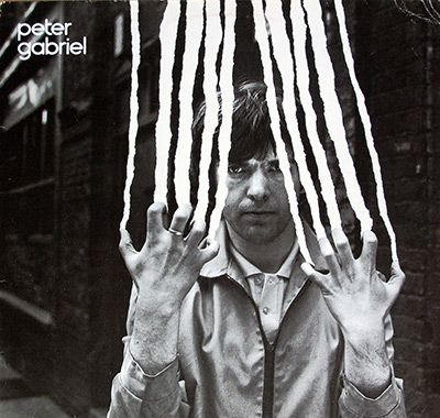
- Prog Rock 12" Vinyl LP Album
Released in 1982, “Peter Gabriel 4”—also known as “Security”—is the album where Peter Gabriel fully commits to rhythm, tension, and early digital muscle. Recorded largely at home and mixed at Crescent Studios, Bath, it blends tribal percussion, Fairlight experiments, and razor-sharp production into something both physical and unsettling. Tracks like “The Rhythm of the Heat”, “San Jacinto”, and the hit single “Shock the Monkey” define its nervous pulse, while the German Charisma pressing adds real collector appeal with its weighty vinyl and stark presentation. This record doesn’t ease you in—it locks the doors and dares you to listen closer.
This is the moment Peter Gabriel stops politely knocking on the door of the 80s and kicks it open with a drum the size of a weather system. "PETER GABRIEL - 4 aka Security" feels like a night drive with the headlights off: tense, hypnotic, weirdly beautiful, and absolutely not here to comfort anyone. It’s his fourth solo album, and it plays like a confident artist deciding that “accessible” is fine… as long as it still has teeth.
In 1982, the air in Europe was thick with Cold War anxiety, synth-pop gloss, post-punk nerves, and a brand-new obsession with rhythm you could actually feel in your ribs. In Germany, electronic music and forward-leaning studio craft weren’t niche hobbies; they were basically part of the cultural weather report. This record lands right in that era where musicians start flirting with machines, and the machines flirt back—sometimes a little too successfully.
By the time this one was made, Gabriel had already burned the “ex-Genesis front person” label into ash and used the smoke to write new rules. The album arrives as his fourth eponymous chapter, while the USA stamped it as "Security"—which honestly fits, because these songs scan your nervous system like airport metal detectors. It was recorded partly at home (with an early stretch using Mobile One) and then tightened up and mixed at Crescent Studios in Bath, like a DIY experiment that still demanded a professional finish.
The heartbeat here is rhythm: layered, physical, sometimes tribal, sometimes mechanical, always intentional. "The Rhythm of the Heat" doesn’t “start” so much as it materializes, like something ancient waking up under fluorescent studio lights. "San Jacinto" is the slow-burn centerpiece—spacious, cinematic, and quietly devastating in a way that sneaks up on you after the needle has already done damage.
Then there’s the stuff that made this album leak into the mainstream without losing its edge. "Shock the Monkey" is pop-shaped, sure, but it’s pop with a clenched jaw and a stare that doesn’t blink. "Lay Your Hands on Me" hits like a moral panic with percussion—urgent, physical, and built for that early-80s world where the dancefloor and the news cycle started sharing the same soundtrack.
If you zoom out and look at 1982, you can hear this record arguing with the year’s biggest moods—sometimes politely, sometimes with a chair. A few nearby reference points from the same time:
What Gabriel brings that most don’t is that balance of precision and menace: the grooves are tight, but the atmosphere is unsettling on purpose. This isn’t prog-rock showing off; it’s progressive music trying to feel human while the future keeps interrupting.
This album didn’t explode into scandal, but it did confuse people in that classic “wait… what is he doing now?” way. Some listeners heard the title "Shock the Monkey" and assumed it was novelty, activism, or a joke—when the song is really about jealousy and emotional combustion, dressed in a hook. Others called the whole record cold or clinical, which is funny, because it mostly sounds like the opposite: a warm body wrestling with a machine that refuses to flinch.
You can feel the push-pull of a strong ensemble here: players like Tony Levin, David Rhodes, and Jerry Marotta give the music muscle, while the electronics and sampling ideas keep trying to evolve mid-song. The tension isn’t “band drama” in tabloid form; it’s creative friction—how far you can modernize a sound before it stops bleeding. Gabriel threads that needle by making the tech serve the pulse, not the other way around.
Over time, "Security" has aged like the best kind of ominous prophecy: it still sounds sharp, still sounds brave, and still sounds like it was recorded slightly ahead of everyone else’s comfort level. It helped cement Gabriel as a serious architect of the 80s—someone who could land a single without sanding off the strange corners. You can draw a straight line from this record’s rhythmic obsession to the bigger, more welcoming rooms he’d enter later, without pretending this album ever wanted to be “easy.”
British Progressive Rock
The Famous Charisma Label – Cat#: 6302 201
Record Format: 12" LP Vinyl Stereo Gramophone Record
Total Weight: 230g
1982 – Germany
David Lord makes the room sound like a character—notice how the air and the silence keep the groove on a tight leash. Read more...
David Lord comes across as the calm architect behind the album’s stark, late-night sound. To my ears, his producing and engineering choices keep performances close and human, while the mix stays lean, tense, and full of air. Room tone, placement, and restraint do the work quietly; details that could have been busy are kept disciplined, so rhythm and texture carry the drama without turning the record into glossy pop.
Peter Gabriel turns silence into percussion—those gaps feel as engineered as the hits, especially when the rhythm suddenly snaps shut. Read more...
Peter Gabriel, producing "Peter Gabriel 4" is mood-first and relentlessly intentional. To me, rhythms lead, silence gets treated like an instrument, and textures are chosen to unsettle—never to comfort. Home recording and hard edits give the tracks that close-up, locked-in feel, with no fat—only nerve. Even the ‘big’ moments feel controlled on purpose. "The Rhythm of the Heat" and "Shock the Monkey" land precise, modern, and oddly personal.
Neil Perry keeps the experiments from falling apart—those clean edges in messy sessions don’t happen by magic. Read more...
Neil Perry is the behind-the-scenes stabilizer who helps experimental sessions behave like real sessions. To my relief, his assistant engineering keeps the technical side reliable—mics placed, patching sorted, takes logged, and problems solved fast. He keeps edits and recalls organised, so strange textures and sharp rhythms can be revisited without losing the thread. That backbone lets the album’s tension and atmosphere survive.
Julian Mendelsohn sharpens the remixes—same dark mood, but the rhythm suddenly locks in like a trap. Read more...
Julian Mendelsohn’s remix work tightens the album’s impact without diluting its darkness. To my ears, balance, punch, and clarity are refined so key elements read cleaner and hit harder, especially where rhythm is the narrative engine. Stereo space and low-end weight get more controlled, and transients feel cleaner, so the groove becomes inevitable. The vibe stays stark, but the presentation turns sharper—same scene, brighter lamp.
Danny Heaps is the “make-it-work” force—tiny tweaks and clean recalls that keep the remixes moving without killing the vibe. Read more...
Danny Heaps supports the remix sessions in the practical trenches—setting up, recalling, editing, and keeping revisions moving with precision. To me, that technical follow-through becomes creative fuel: moves get implemented fast, levels and automation stay consistent, and recalls happen cleanly. It means the mix can be tightened without the mood being broken by delays, mistakes, or “wait, where did that sound go?” moments.
Crescent Studios – Bath, England
Malcolm Poynter extends the album’s unease into visuals—minimal on the surface, weirdly sticky in the memory. Read more...
Malcolm Poynter’s video imagery extends the album’s uneasy mood beyond the speakers. For me, the visuals lean into isolation, restraint, and that slightly haunted modern edge, so the record feels like a complete world rather than just a set of tracks. It reinforces the same tension the music builds: minimal on the surface, loaded underneath, with images that linger like after-effects and become part of the album’s myth.
Peter Gabriel keeps the visuals as disciplined as the sound—concept, pacing, and tension all marching together. Read more...
Peter Gabriel’s input on the video imagery keeps the project visually disciplined, not decorative. To my eye, the images mirror the music’s restraint and tension, aligning the album’s presentation with its sound-world so nothing feels accidental. Pacing, cuts, and concept feel as controlled as the arrangements. That matters here: when the songs are built from nuance and atmosphere, the visuals need the same deliberate tone.
David Gardner turns abstract ideas into finished images—continuity and framing that make the concept actually land. Read more...
David Gardner helps translate abstract video concepts into finished images that actually land. To my eye, his contribution adds visual coherence—framing, continuity, and practical execution—so experimental ideas feel intentional and complete rather than like loose extras. In the context of "Peter Gabriel 4", that matters: the album’s identity is as much about atmosphere and presentation as it is about notes and chords.
Ron Hart’s typesetting is the quiet flex—spacing and hierarchy that make the sleeve feel designed, not dumped. Read more...
Ron Hart’s typesetting quietly shapes how the album is read and remembered. To me, clean, controlled typography supports the modern, slightly clinical atmosphere—information presented without clutter or fuss. Spacing and hierarchy keep credits and details legible while staying out of the way of the imagery. Good typesetting is invisible when it works; here it helps the package feel designed with intent, too.
dj keeps the look mood-first—texture over glamour, assembly that makes the package feel curated, not accidental. Read more...
dj’s photography and assembly complete the package by choosing mood over spectacle. For me, images emphasize texture and restraint, then get assembled into a coherent, intentional flow—more curated object than random paperwork. Layout choices and sequencing give the visuals a pulse that matches the music. For this album, that matters: the sound thrives on controlled tension, and the photos echo that same quiet confidence.
Electronic production and processing by Fast and Peter Gabriel.
Digital editing at Adivision Studios, with thanks to Mike King.
Digital mixing facilities provided by a Sony PCM 1610 system supplied by Digital Audio Systems.
Mobile One operated by Andy Rose and Tim Wybrow.
Recording, programming, and development by Stephen Paine of Syco Systems, with Peter Gabriel, David Lord, and Fast.
Digital delays and reverberation provided by AMS, with thanks to Stuart Nevison and Mark Crabtree.
Albert Lawrence, Mal Craggs, Alan Terry, and Ian Tucker.
Gailforce, with special thanks to Gail Colson and Norma Bishop.
Thanks to Jill, Stephanie, Tattie, Eda, Glenn, and Gaynor.
The architect, the voice, and the nervous system of the record. Read more...
Peter Gabriel, former Genesis frontman turned sonic explorer, is the gravitational center of this album. I hear him shaping everything: the songs, the atmosphere, the rhythmic tension. His vocals move from intimate to ritualistic, while his keyboards and conceptual direction pull in African rhythms, early digital textures, and experimental studio ideas. This album feels less like a collection of songs and more like a carefully wired system, and Gabriel is clearly the one soldering the connections.
A familiar, slightly haunted voice drifting through the background. Read more...
Peter Hammill, best known as the voice of Van der Graaf Generator, appears here not as a dominant presence but as a textural one. I hear his backing vocals adding emotional grit and a faintly unsettling edge, reinforcing the album’s darker, more introspective moments. Rather than drawing attention to himself, Hammill blends into the vocal fabric, thickening the atmosphere and giving certain passages a quietly dramatic weight that feels deliberate and restrained.
One of those voices you feel more than you notice. Read more...
John Ellis contributes backing vocals that work almost subliminally. I don’t hear him stepping forward, but I definitely hear the result: stacked harmonies that deepen the choruses and widen the emotional space around Gabriel’s lead. His role feels supportive in the best sense, reinforcing melodies and moods without distracting from the core message, helping the album sound fuller, more human, and less isolated despite its experimental edge.
A personal voice adding warmth and intimacy. Read more...
Jill Gabriel’s backing vocals bring a softer, more intimate layer to the album. I hear her voice as a human counterbalance to the electronics and rhythmic experimentation, especially in passages that need emotional grounding. Her contribution feels personal rather than performative, adding warmth and subtle harmony that smooths the album’s sharper edges without diluting its tension or sense of unease.
Guitars that think before they speak. Read more...
David Rhodes supplies guitar parts that feel architectural rather than flashy. I hear him carving out space with carefully chosen tones, delays, and muted figures instead of traditional riffs. His playing locks into the rhythms and electronics, often acting as a structural element rather than a lead voice. The result is a guitar sound that supports the album’s mood, tension, and dynamics without ever stealing the spotlight.
Saxophone pushed far beyond jazz habits. Read more...
Roberto Laneri’s treated saxophone adds an otherworldly texture rather than a melodic lead. I hear his sound warped, processed, and woven into the album’s experimental fabric, sometimes barely recognizable as a sax at all. It contributes to the sense of unease and abstraction, blurring the line between acoustic performance and studio manipulation, which fits perfectly with the album’s exploratory mindset.
Bass lines that anchor the entire experiment. Read more...
Tony Levin’s bass work is the album’s backbone. I hear him laying down elastic, rhythmically inventive lines that hold everything together while still leaving space for experimentation. His playing interacts tightly with the drums and percussion, grounding the more abstract elements and giving the songs physical weight. Beyond this record, he’s brought that same authority to bass guitar work with John Lennon, Pink Floyd, Peter Gabriel, Alice Cooper, Lou Reed, and many others—so that sense of control and confidence here is no accident.
Analog muscle behind the electronic textures. Read more...
Larry Fast brings a deep synthesizer vocabulary to the album. I hear his contribution in the dense pads, pulsing sequences, and evolving textures that give the record its futuristic edge. His synth work doesn’t just decorate the songs; it actively shapes their mood and direction, reinforcing the sense that this album is as much about sound design as it is about traditional songwriting.
Studio intelligence translated into sound. Read more...
David Lord’s synthesizer contributions feel tightly integrated with the album’s production approach. I hear him using electronics not as spectacle but as precision tools, shaping tones that interact smoothly with vocals, rhythms, and samples. His work helps the album feel controlled and intentional, ensuring that even its most experimental moments remain coherent and emotionally focused.
Early digital tech put to serious use. Read more...
Stephen Paine operates the Fairlight CMI, and I hear its fingerprints all over the album. The sampled sounds, clipped rhythms, and unusual textures push the music firmly into early-1980s digital territory. His work with the Fairlight adds unpredictability and modern tension, expanding the sonic palette far beyond conventional rock instrumentation and helping define the album’s forward-looking character.
Precision drumming with human feel intact. Read more...
Jerry Marotta’s drumming brings discipline and drive to the album. I hear tight patterns, controlled dynamics, and a deep understanding of how rhythm shapes emotion. His playing works seamlessly with both live percussion and programmed elements, giving the music momentum without overpowering its subtler details. It’s rhythmic confidence that keeps the album moving forward.
Power and finesse in controlled bursts. Read more...
Simon Phillips contributes drums that add weight and authority where needed. I hear his style in the more forceful passages, where clarity and impact matter most. His precise technique complements the album’s layered production, reinforcing key moments without overwhelming them, and giving certain tracks a harder, more physical edge. That power and control come from a career spent performing with artists and bands like Deep Purple, Nazareth, Michael Schenker Group, Jon Lord, Mike Oldfield, Peter Gabriel, Pete Townshend, and many others.
Machine rhythm used with taste, not laziness. Read more...
Chris Hughes programs the LinnDrum parts that give the album its crisp, modern pulse. I hear the machine rhythms adding sharp definition and forward momentum, especially where repetition and precision are essential. Rather than sounding cold or generic, the LinnDrum here feels carefully placed, supporting the songs while reinforcing the album’s contemporary, experimental identity.
Percussion that adds ritual and movement. Read more...
Morris Pert’s timbales contribute a distinctive percussive color to the album. I hear his playing adding sharp accents and rhythmic complexity, especially in sections influenced by non-Western rhythms. His contribution enhances the album’s sense of motion and ritual, complementing both the drum kit and electronic elements without crowding the mix.
Traditional rhythm meeting modern studio craft. Read more...
The Ekome Dance Company brings authentic Ghanaian drumming into the album’s sonic world. I hear their rhythms adding cultural depth and organic complexity that no machine or Western kit could replicate. Their presence reinforces the album’s global perspective, grounding its experiments in real communal rhythm and giving the music a sense of tradition woven into innovation.
Disclaimer: Track durations shown are approximate and may vary slightly between different country editions or reissues. Variations can result from alternate masterings, pressing plant differences, or regional production adjustments.
This front cover image presents a tightly cropped human face, centered and pressed forward as if viewed through layers of translucent material or textured glass. The facial features are intentionally obscured: the eyes appear dark and recessed, the nose flattened by perspective, and the mouth partially lost in shadow. The effect is claustrophobic and confrontational, not decorative. The image looks deliberately degraded, with visible grain, soft focus, and uneven color saturation that immediately places it in the early 1980s transition period between analog photography and emerging digital processing.
The background shows vague, block-like shapes that resemble concrete or architectural forms, blurred to the point where they function more as structure than scenery. These shapes frame the head vertically, reinforcing the boxed-in feeling. The color palette is dominated by muted yellows, dirty blues, and greyed blacks, with no clean whites. This restrained palette gives the sleeve a cold, industrial tone that matches the album’s rhythmic and mechanical reputation.
Typography is minimal and purposeful. The artist name appears in the top left corner in small, clean, lowercase lettering, printed directly onto the image without a background box. Its placement avoids balance or symmetry, signaling that the image is the priority, not the branding. In the lower right corner, a small “digital mastering” logo is visible, sharply printed and modern compared to the rest of the artwork. This detail matters to collectors, as it helps distinguish specific pressings and later-era production choices.
From a physical-condition perspective, the photographed sleeve surface shows subtle wear consistent with handling: faint scuffs, light edge softening, and mild tonal inconsistency that suggests an original, used copy rather than a reproduction. There is no high-gloss sheen; the finish appears matte or semi-matte, which enhances the gritty texture of the image. Overall, this cover is not designed to look pristine or friendly. It is built to unsettle, to signal experimentation, and to stand apart visually from conventional rock sleeves of the same era.
This back cover image continues the album’s uneasy visual language, dominated by a large, abstract, and heavily blurred facial form occupying the left half of the sleeve. The face is reduced to color, shadow, and motion rather than recognizable features, with smeared reds, yellows, and dark tones that feel more like an impression than a portrait. The image appears intentionally soft and degraded, reinforcing the album’s themes of tension, distortion, and psychological pressure rather than clarity or glamour.
On the right side, the layout becomes more functional and structured. Two small rectangular inset photographs are stacked vertically, each showing close-up performance shots of Peter Gabriel singing into a microphone. These images are warmer in tone, sharply framed, and more representational than the abstract background, creating a deliberate contrast between human presence and visual abstraction. The microphone, facial tension, and sweat-lit skin emphasize physical performance and intensity rather than stage spectacle.
Above the inset photos, the track listings for Side One and Side Two are printed in clean, uppercase typography. The text is aligned with precision and spaced for readability, listing song titles without durations or embellishment. This utilitarian approach reflects a design choice where information is presented clearly but never allowed to dominate the visual mood. In the top right corner, catalog numbers for different formats are printed alongside the Charisma label logo, essential details for identifying specific pressings.
Along the bottom edge, small-print production and copyright credits confirm the album’s German manufacturing origin, including the “Printed in West Germany” statement and LC code. These details are subtle but crucial to collectors, as they help distinguish this pressing from UK or later reissues. The sleeve surface shows mild wear and tonal inconsistency consistent with age and handling, reinforcing that this is an original, working object rather than a pristine archive piece. The overall design balances abstraction with information, never relaxing the sense of controlled unease established by the front cover.
This inner sleeve image is all about information density and controlled intensity. The background is almost entirely black, serving as a hard contrast field for tightly set white text. Lyrics dominate the layout, arranged in multiple narrow columns that run from top to bottom with minimal spacing. Song titles for both sides of the album are clearly separated and aligned, making it immediately obvious that this sleeve is meant to be read, studied, and followed while listening, not glanced at casually.
Between the lyric blocks, detailed musician and instrument credits are woven directly into the text flow. Names, roles, and instruments are listed without decorative breaks, reinforcing the utilitarian, no-frills design approach. Typography is consistent, clean, and functional, prioritizing legibility over style. This is a classic early-1980s inner sleeve layout where clarity and seriousness outweigh visual comfort, and it reflects the album’s rhythm-driven, uncompromising character.
The right side of the sleeve breaks away from the text with a stark, high-contrast black-and-white performance photograph. The person is shown in profile and partial silhouette, wearing headphones and leaning into a microphone. Lighting is harsh and directional, blowing out highlights while burying surrounding details in shadow. The image feels documentary rather than staged, emphasizing physical effort, focus, and isolation inside the recording or performance environment.
From a collector’s standpoint, this inner sleeve shows expected signs of age and handling: slight creasing, soft edge wear, and minor surface marks that do not interfere with readability. There is no gloss finish; the paper appears matte, which helps reduce glare but also makes wear more visible over time. This sleeve is a functional artifact, designed to carry information and atmosphere together, and it completes the album package by reinforcing the seriousness and intensity established by the outer sleeve.
This second inner sleeve continues the album’s uncompromising, information-heavy approach while pushing the visual language further into abstraction. The left and central areas are dominated by tightly packed white text set against a deep black background. Full lyrics for multiple tracks are presented in narrow, carefully aligned columns, with no decorative spacing. Song sections, verses, and refrains are clearly separated by line breaks rather than graphic devices, reinforcing that this sleeve is meant to be read closely, not skimmed.
Interwoven with the lyrics are extensive production and technical credits. Names, roles, studios, equipment, and acknowledgements are printed in the same restrained typographic style, keeping everything visually uniform. This layout reflects a deliberate design choice: no hierarchy beyond function. Lyrics, credits, and technical details are treated with equal weight, which mirrors the album’s focus on process, rhythm, and construction rather than personality or star image.
On the right side, two vertically stacked photographic panels break the monochrome discipline. These images are heavily processed and color-shifted, showing fragmented human figures rendered in harsh blues, yellows, reds, and black. The forms are distorted to the point where anatomy becomes ambiguous, reading more like movement or energy than bodies. Edges glow, colors bleed, and contrast is pushed hard, suggesting early analog-to-digital experimentation rather than clean photographic reproduction.
From a collector’s perspective, this inner sleeve shows typical handling wear: slight corner softening, faint creases, and surface scuffs that catch the light on the matte paper stock. The print remains sharp and legible, indicating a well-preserved original rather than a later facsimile. This sleeve completes the package by combining exhaustive textual documentation with unsettling imagery, reinforcing the album’s identity as a constructed, intentional object rather than a casual listening product.
This image shows a full, centered close-up of the Side One label from the original German pressing of PETER GABRIEL – 4 aka Security. The label uses the classic Famous Charisma design, printed in muted earthy tones with an illustrated scene wrapped around the upper half of the circle. The artwork features a theatrical, mask-like human face wearing a cap, flanked by surreal figures, all rendered with fine line detail that remains sharp despite the small scale. The spindle hole cuts cleanly through the center of the illustration, confirming precise alignment typical of early-1980s German pressings.
Text layout is clean and disciplined. The artist name PETER GABRIEL is printed prominently above the track listing, followed by the four Side One tracks with durations. The titles are set in a straightforward sans-serif style, evenly spaced and easy to read, which matters when cueing tracks manually. Below the track list, songwriting and production credits are clearly stated, naming David Lord and Peter Gabriel as producers. The presence of “Digital Mastering” printed at the bottom immediately signals the album’s transitional production era.
On the left side of the label, the catalog number 6302 201 is printed along with the matrix-style code, while “Made in West Germany” appears directly beneath it. On the right side, the ST 33 speed marking is enclosed in a circular frame, accompanied by the GEMA logo and the LC 1409 rights society code. These identifiers are essential for collectors, as they confirm this as a German Charisma pressing rather than a UK or later reissue variant.
The vinyl surface around the label shows light hairline marks consistent with careful play, not abuse. There is no warping visible, and the label itself appears clean, with no spindle trails or tearing around the center hole. Ink density is even, with no color bleed or fading, indicating a well-preserved original copy. This label encapsulates the album’s era perfectly: serious, information-forward, and quietly experimental, with every detail serving identification, playback, and archival clarity.
This image shows a centered, full-frame close-up of the Side Two label from the original German pressing of PETER GABRIEL – 4 aka Security. The Famous Charisma label artwork fills the upper arc of the label, featuring the familiar theatrical illustration with a mask-like human face and surreal companion figures rendered in muted greens, browns, and ochre tones. The illustration remains crisp despite the circular crop, and the spindle hole passes cleanly through the design without tearing or distortion.
Below the artwork, the label layout becomes strictly functional. The artist name PETER GABRIEL is printed clearly above the Side Two track listing, which includes “Shock the Monkey,” “Lay Your Hands on Me,” “Wallflower,” and “Kiss of Life,” each with precise durations. The typography is consistent with Side One: simple, evenly spaced, and easy to read when cueing tracks manually. Songwriting and production credits are printed beneath, confirming that all songs were written and arranged by Peter Gabriel and produced by David Lord and Peter Gabriel.
On the left side of the label, the catalog number 6302 201 appears again, accompanied by the matrix-style suffix and the “Made in West Germany” designation. On the right, the ST 33 speed marking is enclosed in a circular frame, next to the GEMA logo and the LC 1409 rights code. These elements are critical for collectors, as they verify this copy as a German Charisma pressing rather than a UK or later European variant.
The vinyl surface surrounding the label shows light, radial hairlines consistent with careful use, but no deep scratches or groove damage are visible. The label itself is clean, with no spindle marks, writing, or discoloration around the center hole. Ink density remains even across text and illustration, indicating minimal fading. Overall, this Side Two label confirms a well-preserved original pressing and completes the visual and technical documentation of the album’s German release.
All images on this site are photographed directly from the original vinyl LP covers and record labels in my collection. Slight differences in color may occur due to lighting and camera flash. Images can be zoomed on supported devices. You may use these images for personal or non-commercial purposes if you include a link to this site; commercial use requires my permission. Text on covers and labels has been transcribed using a free online OCR service.
"Deutsches Album" with Peter Hammill stands as a testament to the boundless potential of musical collaboration and technological innovation. This extraordinary album encapsulates the creative spirit of Peter Gabriel, Peter Hammill, and the era in which it was released.
Deutches Album 12" Vinyl LP
Charisma Records 6302 201 , 1982 , Germany
Released in 1982, “4 aka Security” marks the moment Peter Gabriel fully locks into rhythm, tension, and early digital experimentation. Built around tribal percussion, Fairlight textures, and controlled studio precision, the album feels physical and unsettling rather than melodic or polite. Tracks like “The Rhythm of the Heat” and “Shock the Monkey” balance experimental ambition with real impact, making this German Charisma pressing a key document of early-80s progressive rock evolution.
The year was 1983, and the world of music was about to be enthralled by a live recording that would captivate audiences for decades to come. Peter Gabriel's "Plays Live" was not just any ordinary concert recording; it was an immersive journey through the power of performance and the raw energy of a live show.
Plays Live 12" Vinyl LP
In the transformative year of 1977, amidst the rise of punk and new wave, Peter Gabriel, the enigmatic former frontman of Genesis, unveiled his debut self-titled solo album, often referred to as "Car" due to its distinctive cover art. This album marked a significant departure from his progressive rock origins
1 CAR 12" Vinyl LP
In the musical landscape of 1978, Peter Gabriel, the enigmatic former frontman of Genesis, released his second self-titled solo album, affectionately nicknamed "Scratch" by fans. Following his 1977 debut, "Scratch" solidified Gabriel's departure from his progressive rock roots,
2 Scratch 12" Vinyl LP
Released in 1986, Peter Gabriel’s So became his most acclaimed and commercially successful album, blending progressive rock with pop, soul, and world music. Produced with Daniel Lanois, it features iconic tracks like Sledgehammer, Don’t Give Up with Kate Bush, and In Your Eyes. The minimalist artwork and innovative production cemented Gabriel’s reputation as a visionary artist.
So 12" Vinyl LP