"Révolté / Mort Au Punk" (2003) Album Description:
This split doesn’t stroll in with a handshake; it barges in, drops a stapled booklet on your table, and dares you to pretend you didn’t see it. "Révolté / Mort Au Punk" pits Urban Blight’s clenched-jaw rants against Pekatralatak’s deliberately poisoned slogan-work, all wrapped in black-and-white graphics that look like they were designed to start arguments in a cramped squat kitchen.
What it is, before the myths start breeding
The page you built tells the basic truth without dressing it up: French punk, 12" LP, two sides split between two names, plus a poster and a booklet that comes with “offensive lyrics and photos.” The title gets filed under 2003 in some places and 2004 in others, which is the kind of paperwork mess you usually see when something is self-produced, passed hand to hand, and never given the dignity of a clean catalog number.
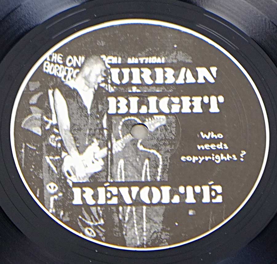
The tracklists read like a pair of manifestos written on different types of anger. Urban Blight fires off “Sunday Ballots,” “Carwash,” “Telly Lies,” and two versions of “Solidarité,” like the same point needed repeating because the world is slow. Pekatralatak answers with “L' Instinct De Mort,” “A Tous Les Etages,” “Cours Vite ...,” “N.g.s.,” and “Double Peine,” titles that sound less like songs and more like doors slamming.
France in the early 2000s: the air tasted like politics
Early-2000s France wasn’t short on reasons to shout. After the Le Pen shock of 2002, “normal” politics suddenly felt like a bad joke told by a cop, and everyone learned new vocabulary for fear and disgust. Add the Iraq War protests, the anti-globalization aftershocks, and the everyday grind of precarious work, and you get a scene that didn’t want party-punk smiles or faux-danger fashion shoots.
The anarcho-punk corner of that world behaved like a parallel postal system: squats, benefit gigs, hand-to-hand distro, photocopied zines, and a stubborn refusal to ask permission. That’s the ecosystem this record lives in. It’s not trying to win your approval; it’s trying to keep its own little network from rotting into a brand.
Where it sits, and who it’d pick a fight with
This split doesn’t sound like the glossy end of French punk, the stuff that can survive daylight and radio DJs. It leans toward the DIY/anarcho lane where the vocals come out more like warnings than hooks, and where the point isn’t “anthem,” it’s “argument.”
- Against the singalong charm of bands like Les Wampas, this feels grimier and more suspicious.
- Next to Burning Heads’ skate-punk drive, it’s more abrasive and less interested in your good mood.
- Beside Uncommonmenfrommars’ tight, American-leaning punch, this is rougher, more pamphlet than party.
- Put it near Tagada Jones and you can hear a shared taste for confrontation, but this is less stage-ready and more basement-ready.
- In the same era as Guerilla Poubelle starting to bubble up, this reads like the older sibling rolling its eyes at any hint of “cool.”
Sound: attack, space, and the pleasure of ugliness
Urban Blight’s side carries the feel of a one-person operation: tight control, sharp edits, and rhythms that snap rather than swing. The song titles give away the targets, and the delivery sounds built for close rooms where the PA is cheap and the message has to land anyway. It’s punk as a bad headline you can’t stop reading.
Pekatralatak comes off more like a group argument that never fully resolves. The French titles move between menace and sarcasm, and the pacing feels like it could accelerate mid-phrase just to keep you off balance. The energy is not “fun,” unless your definition of fun includes being told you’re part of the problem.
No one here is polishing the edges. The whole thing favors tension over comfort, and it wears that choice like a jacket that’s been slept in and fought in.
Key people, in the practical sense
Urban Blight is essentially one set of hands doing the work and taking the blame. That matters because it changes the shape of the songs: decisions are quicker, stubbornness is easier, and there’s no committee meeting to water down the venom. The booklet translation work tied to this material has Urban Blight’s Laurent connected directly to getting the message across in English, which is a very specific kind of DIY generosity.
Pekatralatak comes out of the mid-’90s Paris-area anarcho-punk churn, a band built around the idea that autonomy isn’t a slogan, it’s a workflow. When a band is wired that way, a split isn’t a “collaboration,” it’s a practical alliance: shared costs, shared networks, shared trouble.
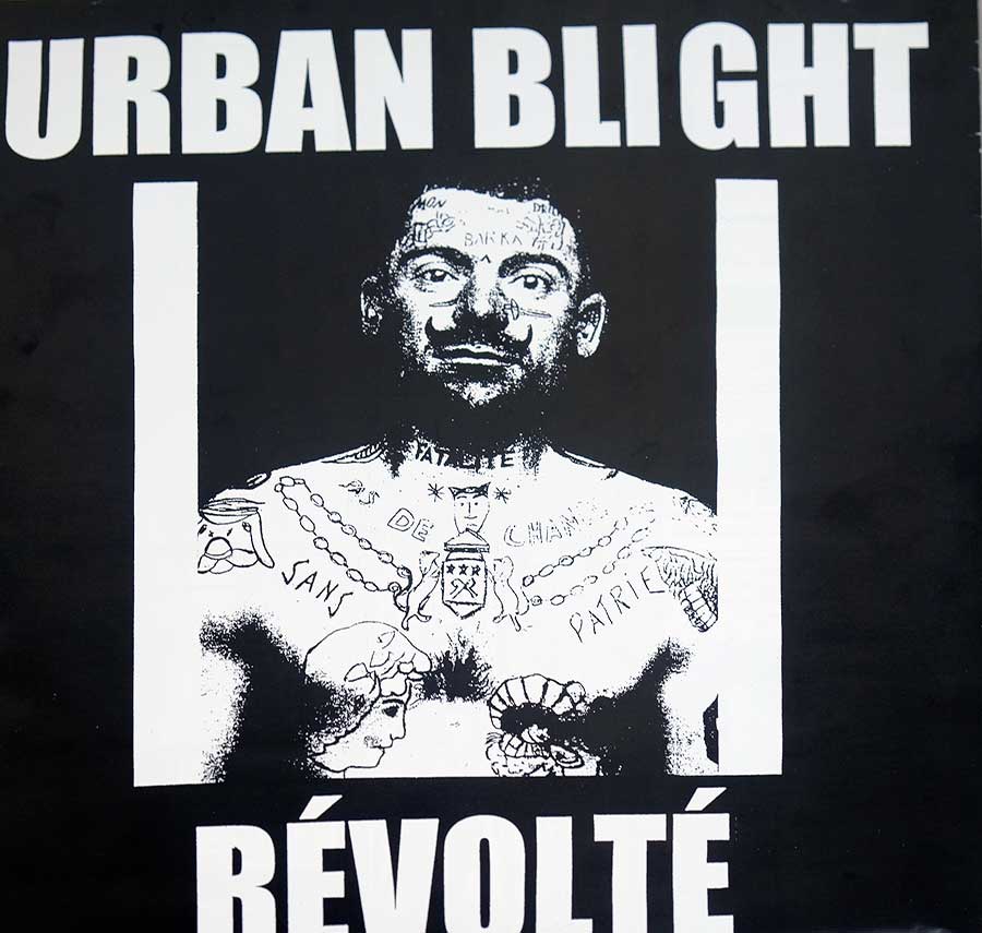
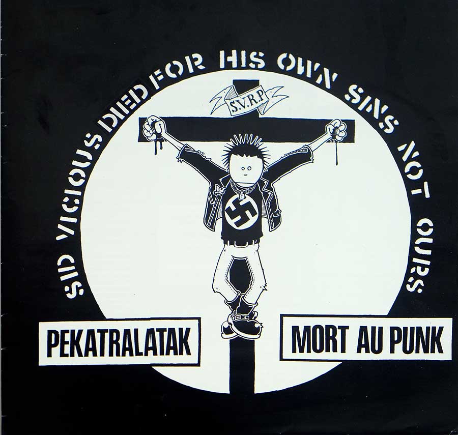
The packaging tells on the record
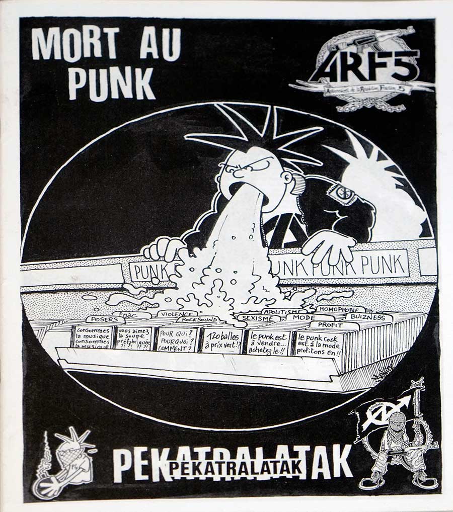
The sleeve art is not trying to be lovable. The front cover’s shock imagery is the kind of thing that guarantees the wrong person will buy it for the wrong reason, which is exactly why it’s a risky move and also why it still stings. The poster doubles down with a cartoon puking onto record bins labeled with things like “mode,” “profit,” and “bizness,” because subtle satire is for people with marketing budgets.
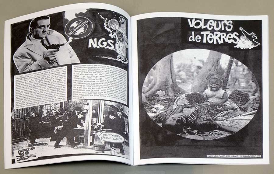
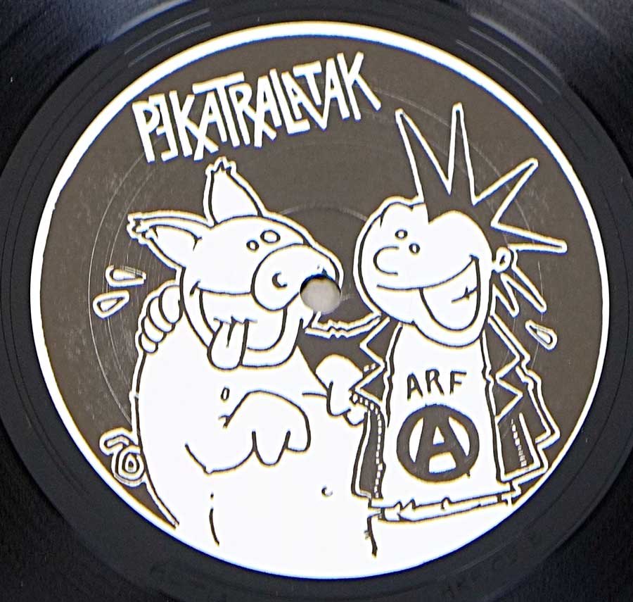
The manufacturing details whisper “autoproduction” even when the slogans are screaming. No neat catalog number, runout etchings doing the identification work, and a package fattened up by paper extras instead of glossy upgrades. The booklet’s collage style looks like it expects to be read with a finger tracing lines, not skimmed like a press kit.
Controversy: real, predictable, and mostly deserved
The obvious controversy is the use of Nazi imagery as a provocation device, which is always a blunt tool and never “just graphics.” Some people will read it as critique, some will read it as flirting, and some will just hear the dog-whistle and ignore the rest. That’s the price of shock tactics: you don’t control who shows up to the party.
No evidence suggests this release caused a clean, documented scandal with court dates and headlines. The more common mess is the misconception that "Mort Au Punk" is anti-punk in the stupid literal sense. The poster and the text around the project point the knife somewhere else: at commodified punk, punk-as-fashion, punk-as-product.
One quiet anchor, because records live in rooms
Late night, small lamp, the record pulled from the sleeve and the booklet left open like a warning sign on the table. The kind of listen where you keep the volume just low enough not to wake the neighbors, but you still feel like you’re doing something slightly illegal.
References used for verification
- Vinyl-Records.nl page: Pekatralatak / Urban Blight split photo set and tracklisting
- Discogs: Urban Blight / Pekatralatak – "Révolté / Mort Au Punk" (release data, notes, identifiers)
- Teknoboutik listing: notes on self-production, poster/booklet, and matrix/runout
- DIY Conspiracy: “Death To Punk!” (text context and translation credit)
- Vendettazine: Pekatralatak interview (DIY stance and scene perspective)
- ET HOP!! interview page: Pekatralatak (French interview archive)
- YouTube: Pekatralatak – “Mort au Punk” (audio upload used for cross-checking release framing)
- DIY Conspiracy: history overview of French anarcho-punk (scene context)